Categories
20c pace of historical change statistics

You say you found a revolution.

by Ted Underwood, Hoyt Long, Richard Jean So, and Yuancheng Zhu

This is the second part of a two-part blog post about quantitative approaches to cultural change, focusing especially on a recent article that claimed to identify “stylistic revolutions” in popular music.

Although “The Evolution of Popular Music” (Mauch et al.) appeared in a scientific journal, it raises two broad questions that humanists should care about:

  1. Are measures of the stylistic “distance” between songs or texts really what we mean by cultural change?
  2. If we did take that approach to measuring change, would we find brief periods where the history of music or literature speeds up by a factor of six, as Mauch et al. claim?

Underwood’s initial post last October discussed both of these questions. The first one is more important. But it may also be hard to answer — in part because “cultural change” could mean a range of different things (e.g., the ever-finer segmentation of the music market, not just changes that affect it as a whole).

So putting the first question aside for now, let’s look at the the second one closely. When we do measure the stylistic or linguistic “distance” between works of music or literature, do we actually discover brief periods of accelerated change?

The authors of “The Evolution of Popular Music” say “yes!” Epochal breaks can be dated to particular years.

We identified three revolutions: a major one around 1991 and two smaller ones around 1964 and 1983 (figure 5b). From peak to succeeding trough, the rate of musical change during these revolutions varied four- to six-fold.

Tying musical revolutions to particular years (and making 1991 more important than 1964) won the article a lot of attention in the press. Underwood’s questions about these claims last October stirred up an offline conversation with three researchers at the University of Chicago, who have joined this post as coauthors. After gathering in Hyde Park to discuss the question for a couple of days, we’ve concluded that “The Evolution of Popular Music” overstates its results, but is also a valuable experiment, worth learning from. The article calculates significance in a misleading way: only two of the three “revolutions” it reported are really significant at p < 0.05, and it misses some odd periods of stasis that are just as significant as the periods of acceleration. But these details are less interesting than the reason for the error, which involved a basic challenge facing quantitative analysis of history.

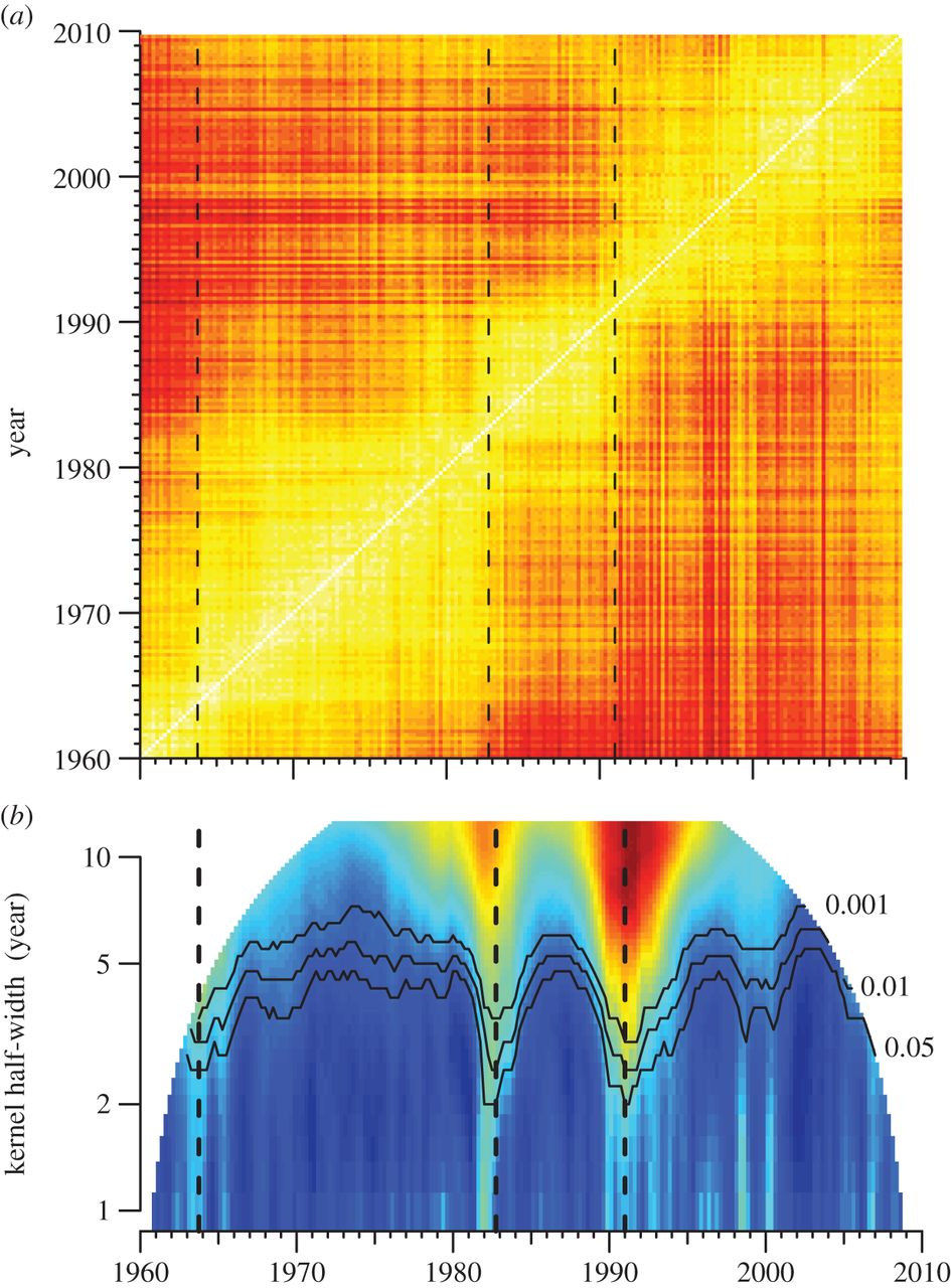
To explain that problem, we’ll need to explain the central illustration in the original article. The authors’ strategy was to take every quarter-year of the Billboard Hot 100 between 1960 and 2010, and compare it to every other quarter, producing a distance matrix where light (yellow-white) colors indicate similarity, and dark (red) colors indicate greater differences. (Music historians may wonder whether “harmonic and timbral topics” are the right things to be comparing in the first place, and it’s a fair question — but not central to our purpose in this post, so we’ll give it a pass.)

You see a diagonal white line in the matrix, because comparing a quarter to itself naturally produces a lot of similarity. As you move away from that line (to the upper left or lower right), you’re making comparisons across longer and longer spans of time, so colors become darker (reflecting greater differences).

F5.large
Figure 5 from Mauch, et. al., “The evolution of popular music” (RSOS 2015).

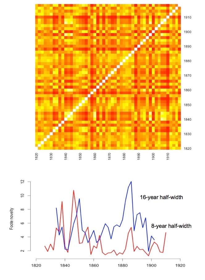
Then, underneath the distance matrix, Mauch et al. provide a second illustration that measures “Foote novelty” for each quarter. This is a technique for segmenting audio files developed by Jonathan Foote. The basic idea is to look for moments of acceleration where periods of relatively slow change are separated by a spurt of rapid change. In effect, that means looking for a point where yellow “squares” of similarity touch at their corners.

For instance, follow the dotted line associated with 1991 in the illustration above up to its intersection with the white diagonal. At that diagonal line, 1991 is (unsurprisingly) similar to itself. But if you move upward in the matrix (comparing 1991 to its own future), you rapidly get into red areas, revealing that 1994 is already quite different. The same thing is true if you move over a year to 1992 and then move down (comparing 1992 to its own past). At a “pinch point” like this, change is rapid. According to “The Evolution of Popular Music,” we’re looking at the advent of rap and hip-hop in the Billboard Hot 100. Contrast this pattern, for instance, to a year like 1975, in the middle of a big yellow square, where it’s possible to move several years up or down without encountering significant change.

matrix
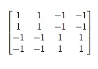
Mathematically, “Foote novelty” is measured by sliding a smaller matrix along the diagonal timeline, multiplying it element-wise with the measurements of distance underlying all those red or yellow points. Then you add up the multiplied values. The smaller matrix has positive and negative coefficients corresponding to the “squares” you want to contrast, as seen on the right.

As you can see, matrices of this general shape will tend to produce a very high sum when they reach a pinch point where two yellow squares (of small distances) are separated by the corners of reddish squares (containing large distances) to the upper left and lower right. The areas of ones and negative-ones can be enlarged to measure larger windows of change.

This method works by subtracting the change on either side of a temporal boundary from the changes across the boundary itself. But it has one important weakness. The contrast between positive and negative areas in the matrix is not apples-to-apples, because comparisons made across a boundary are going to stretch across a longer span of time, on average, than the comparisons made within the half-spans on either side. (Concretely, you can see that the ones in the matrix above will be further from the central diagonal timeline than the negative-ones.)

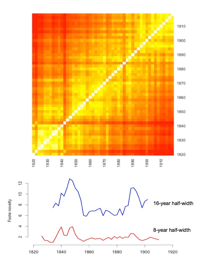
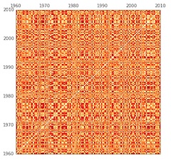
If you’re interested in segmenting music, that imbalance may not matter. There’s a lot of repetition in music, and it’s not always true that a note will resemble a nearby note more than it resembles a note from elsewhere in the piece. Here’s a distance matrix, for instance, from The Well-Tempered Clavier, used by Foote as an example.

GouldMatrix
From Foote, “Automatic Audio Segmentation Using a Measure of Audio Novelty.”

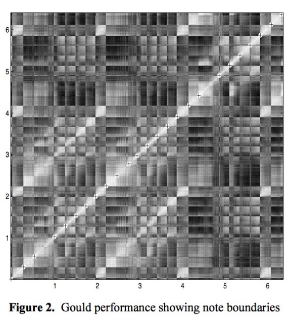
Unlike the historical matrix in “The Evolution of Popular Music,” this has many light spots scattered all over — because notes are often repeated.

OriginalMatrix
Original distance matrix produced using data from Mauch et al. (2015).

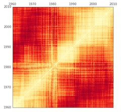
History doesn’t repeat itself in the same way. It’s extremely likely (almost certain) that music from 1992 will resemble music from 1991 more than it resembles music from 1965. That’s why the historical distance matrix has a single broad yellow path running from lower left to upper right.

As a result, historical sequences are always going to produce very high measurements of Foote novelty.  Comparisons across a boundary will always tend to create higher distances than the comparisons within the half-spans on either side, because differences across longer spans of time always tend to be bigger.

BadlyRandom
Matrix produced by permuting years and then measuring the distances between them.

This also makes it tricky to assess the significance of “Foote novelty” on historical evidence. You might ordinarily do this using a “permutation test.” Scramble all the segments of the timeline repeatedly and check Foote novelty each time, in order to see how often you get “squares” as big or well-marked as the ones you got in testing the real data. But that sort of scrambling will make no sense at all when you’re looking at history. If you scramble the years, you’ll always get a matrix that has a completely different structure of similarity — because it’s no longer sequential.

The Foote novelties you get from a randomized matrix like this will always be low, because “Foote novelty” partly measures the contrast between areas close to, and far from, the diagonal line (a contrast that simply doesn’t exist here).

Figure5

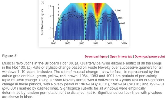
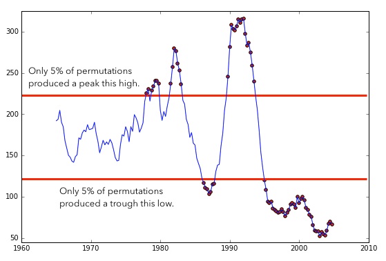
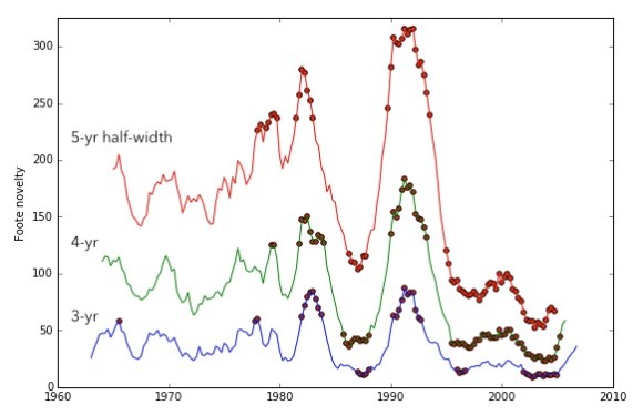
This explains a deeply puzzling aspect of the original article. If you look at the significance curves labeled .001, .01, and 0.05 in the visualization of Foote novelties (above), you’ll notice that every point in the original timeline had a strongly significant novelty score. As interpreted by the caption, this seems to imply that change across every point was faster than average for the sequence … which … can’t possibly be true everywhere.

All this image really reveals is that we’re looking at evidence that takes the form of a sequential chain. Comparisons across long spans of time always involve more difference than comparisons across short ones — to an extent that you would never find in a randomized matrix.

In short, the tests in Mauch et al. don’t prove that there were significant moments of acceleration in the history of music. They just prove that we’re looking at historical evidence! The authors have interpreted this as a sign of “revolution,” because all change looks revolutionary when compared to temporal chaos.

On the other hand, when we first saw the big yellow and red squares in the original distance matrix, it certainly looked like a significant pattern. Granted that the math used in the article doesn’t work — isn’t there some other way to test the significance of these variations?

It took us a while to figure out, but there is a reliable way to run significance tests for Foote novelty. Instead of scrambling the original data, you need to permute the distances along diagonals of the distance matrix.

diagonally_permuted
Produced by permuting diagonals in the original matrix.

In other words, you take a single diagonal line in the original matrix and record the measurements of distance along that line. (If you’re looking at the central diagonal, this will contain a comparison of every quarter to itself; if you move up one notch, it will contain a comparison of every quarter to the quarter in its immediate future.) Then you scramble those values randomly, and put them back on the same line in the matrix. (We’ve written up a Jupyter notebook showing how to do it.) This approach distributes change randomly across time while preserving the sequential character of the data: comparisons over short spans of time will still tend to reveal more similarity than long ones.

If you run this sort of permutation 100 times, you can discover the maximum and minimum Foote novelties that would be likely to occur by chance.

5yrFootes
Measurements of Foote novelty produced by a matrix with a five-year half-width, and the thresholds for significance.

Variation between the two red lines isn’t statistically significant — only the peaks of rapid change poking above the top line, and the troughs of stasis dipping below the bottom line. (The significance of those troughs couldn’t become visible in the original article, because the question had been framed in a way that made smaller-than-random Foote novelties impossible by definition.)

These corrected calculations do still reveal significant moments of acceleration in the history of the Billboard Hot 100: two out of three of the “revolutions” Mauch et al. report (around 1983 and 1991) are still significant at p < 0.05 and even p < 0.001. (The British Invasion, alas, doesn’t pass the test.) But the calculations also reveal something not mentioned in the original article: a very significant slowing of change after 1995.

Can we still call the moments of acceleration in this graph stylistic “revolutions”?

Foote novelty itself won’t answer the question. Instead of directly measuring a rate of change, it measures a difference between rates of change in overlapping periods. But once we’ve identified the periods that interest us, it’s simple enough to measure the pace of change in each of them. You can just divide the period in half and compare the first half to the second (see the “Effect size” section in our Jupyter notebook). This confirms the estimate in Mauch et al.: if you compare the most rapid period of change (from 1990 to 1994) to the slowest four years (2001 to 2005), there is a sixfold difference between them.

On the other hand, it could be misleading to interpret this as a statement about the height of the early-90s “peak” of change, since we’re comparing it to an abnormally stable period in the early 2000s. If we compare both of those periods to the mean rate of change across any four years in this dataset, we find that change in the early 90s was about 171% of the mean pace, whereas change in the early 2000s was only 29% of mean. Proportionally, the slowing of change after 1995 might be the more dramatic aberration here.

Overall, the picture we’re seeing is different from the story in “The Evolution of Popular Music.” Instead of three dramatic “revolutions” dated to specific years, we see two periods where change was significantly (but not enormously) faster than average, and two periods where it was slower. These periods range from four to fifteen years in length.

Humanists will surely want to challenge this picture in theoretical ways as well. Was the Billboard Hot 100 the right sample to be looking at? Are “timbral topics” the right things to be comparing? These are all valid questions.

But when scientists make quantitative claims about humanistic subjects, it’s also important to question the quantitative part of their argument. If humanists begin by ceding that ground, the conversation can easily become a stalemate where interpretive theory faces off against the (supposedly objective) logic of science, neither able to grapple with the other.

One of the authors of “The Evolution of Popular Music,” in fact, published an editorial in The New York Times representing interdisciplinary conversation as exactly this sort of stalemate between “incommensurable interpretive fashions” and the “inexorable logic” of math (“One Republic of Learning,” NYT Feb 2015). But in reality, as we’ve just seen, the mathematical parts of an argument about human culture also encode interpretive premises (assumptions, for instance, about historical difference and similarity). We need to make those premises explicit, and question them.

Having done that here, and having proposed a few corrections to “The Evolution of Popular Music,” we want to stress that the article still seems to us a bold and valuable experiment that has advanced conversation about cultural history. The basic idea of calculating “Foote novelty” on a distance matrix is useful: it can give historians a way of thinking about change that acknowledges several different scales of comparison at once.

The authors also deserve admiration for making their data available; that transparency has permitted us to replicate and test their claims, just as Andrew Goldstone recently tested Ted Underwood’s model of poetic prestige, and Annie Swafford tested Matt Jockers’ syuzhet package. Our understanding of these difficult problems can only advance through collective practices of data-sharing and replication. Being transparent in our methods is more important, in the long run, than being right about any particular detail.

The authors want to thank the NovelTM project for supporting the collaboration reported here. (And we promise to apply these methods to the history of the novel next.)

References:

Jonathan Foote. Automatic audio segmentation using a measure of audio novelty. In Proceedings of IEEE International Conference on Multimedia and Expo, vol. I, pp. 452-455, 2000.

Mauch et al. 2015. “The Evolution of Popular Music.” Royal Society Open Science. May 6, 2015. DOI: 10.1098/rsos.150081

Postscript: Several commenters on the original blog post proposed simpler ways of measuring change that begin by comparing adjacent segments of a timeline. This an intuitive approach, and a valid one, but it does run into difficulties — as we discovered when we tried to base changepoint analysis on it (Jupyter notebook here). The main problem is that apparent trajectories of change can become very delicately dependent on the particular window of comparison you use. You’ll see lots of examples of that problem toward the end of our notebook.

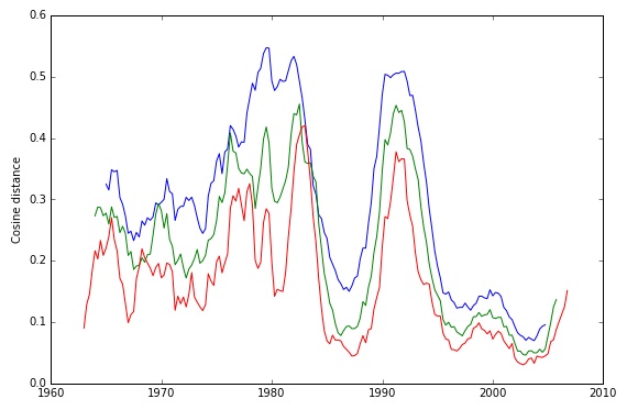
The advantage of the “Foote novelty” approach is that it combines lots of different scales of comparison (since you’re considering all the points in a matrix — some closer and some farther from the timeline). That makes the results more robust. Here, for instance, we’ve overlaid the “Foote novelties” generated by three different windows of comparison on the music dataset, flagging the quarters that are significant at p < 0.05 in each case.

3yrTo5yr

This sort of close congruence is not something we found with simpler methods. Compare the analogous image below, for instance. Part of the chaos here is a purely visual issue related to the separation of curves — but part comes from using segments rather than a distance matrix.

SegmentComparison

Categories
historicism math methodology pace of historical change

Can we date revolutions in the history of literature and music?

Humanists know the subjects we study are complex. So on the rare occasions when we describe them with numbers at all, we tend to proceed cautiously. Maybe too cautiously. Distant readers have spent a lot of time, for instance, just convincing colleagues that it might be okay to use numbers for exploratory purposes.

But the pace of this conversation is not entirely up to us. Outsiders to our disciplines may rush in where we fear to tread, forcing us to confront questions we haven’t faced squarely.

For instance, can we use numbers to identify historical periods when music or literature changed especially rapidly or slowly? Humanists have often used qualitative methods to make that sort of argument. At least since the nineteenth century, our narratives have described periods of stasis separated by paradigm shifts and revolutionary ruptures. For scientists, this raises an obvious, tempting question: why not actually measure rates of change and specify the points on the timeline when ruptures happened?

The highest-profile recent example of this approach is an article in Royal Society Open Science titled “The evolution of popular music” (Mauch et al. 2015). The authors identify three moments of rapid change in US popular music between 1960 and 2010. Moreover, they rank those moments, and argue that the advent of rap caused popular music to change more rapidly than the British Invasion — a claim you may remember, because it got a lot of play in the popular press. Similar arguments have appeared about the pace of change in written expression — e.g, a recent article argues that 1917 was a turning point in political rhetoric (h/t Cameron Blevins).

When disciplinary outsiders make big historical claims, humanists may be tempted just to roll our eyes. But I don’t think this is a kind of intervention we can afford to ignore. Arguments about the pace of cultural change engage theoretical questions that are fundamental to our disciplines, and questions that genuinely fascinate the public. If scientists are posing these questions badly, we need to explain why. On the other hand, if outsiders are addressing important questions with new methods, we need to learn from them. Scholarship is not a struggle between disciplines where the winner is the discipline that repels foreign ideas with greatest determination.

I feel particularly obligated to think this through, because I’ve been arguing for a couple of years that quantitative methods tend to reveal gradual change rather than the sharply periodized plateaus we might like to discover in the past. But maybe I just haven’t been looking closely enough for discontinuities? Recent articles introduce new ways of locating and measuring them.

This blog post applies methods from “The evolution of popular music” to a domain I understand better — nineteenth-century literary history. I’m not making a historical argument yet, just trying to figure out how much weight these new methods could actually support. I hope readers will share their own opinions in the comments. So far I would say I’m skeptical about these methods — or at least skeptical that I know how to interpret them.

How scientists found musical revolutions.

Mauch et al. start by collecting thirty-second snippets of songs in the Billboard Hot 100 between 1960 and 2010. Then they topic-model the collection to identify recurring harmonic and timbral topics. To study historical change, they divide the fifty-year collection into two hundred quarter-year periods, and aggregate the topic frequencies for each quarter. They’re thus able to create a heat map of pairwise “distances” between all these quarter-year periods. This heat map becomes the foundation for the crucial next step in their argument — the calculation of “Foote novelty” that actually identifies revolutionary ruptures in music history.

Figure 5 from Mauch, et. al., “The evolution of popular music” (RSOS 2015).
The diagonal line from bottom left to top right of the heat map represents comparisons of each time segment to itself: that distance, obviously, should be zero. As you rise above that line, you’re comparing the same moment to quarters in its future; if you sink below, you’re comparing it to its past. Long periods where topic distributions remain roughly similar are visible in this heat map as yellowish squares. (In the center of those squares, you can wander a long way from the diagonal line without hitting much dissimilarity.) The places where squares are connected at the corners are moments of rapid change. (Intuitively, if you deviate to either side of the narrow bridge there, you quickly get into red areas. The temporal “window of similarity” is narrow.) Using an algorithm outlined by Jonathan Foote (2000), the authors translate this grid into a line plot where the dips represent musical “revolutions.”

Trying the same thing on the history of the novel.

Could we do the same thing for the history of fiction? The labor-intensive part would be coming up with a corpus. Nineteenth-century literary scholars don’t have a Billboard Hot 100. We could construct one, but before I spend months crafting a corpus to address this question, I’d like to know whether the question itself is meaningful. So this is a deliberately rough first pass. I’ve created a sample of roughly 1000 novels in a quick and dirty way by randomly selecting 50 male and 50 female authors from each decade 1820-1919 in HathiTrust. Each author is represented in the whole corpus only by a single volume. The corpus covers British and American authors; spelling is normalized to modern British practice. If I were writing an article on this topic I would want a larger dataset and I would definitely want to record things like each author’s year of birth and nationality. This is just a first pass.

Because this is a longer and sparser sample than Mauch et al. use, we’ll have to compare two-year periods instead of quarters of a year, giving us a coarser picture of change. It’s a simple matter to run a topic model (with 50 topics) and then plot a heat map based on cosine similarities between the topic distributions in each two-year period.

Heatmap and Foote novelty for 1000 novels, 1820-1919. Rises in the trend lines correspond to increased Foote novelty.
Voila! The dark and light patterns are not quite as clear here as they are in “The evolution of popular music.” But there are certainly some squarish areas of similarity connected at the corners. If we use Foote novelty to interpret this graph, we’ll have one major revolution in fiction around 1848, and a minor one around 1890. (I’ve flipped the axis so peaks, rather than dips, represent rapid change.) Between these peaks, presumably, lies a valley of Victorian stasis.

Is any of that true? How would we know? If we just ask whether this story fits our existing preconceptions, I guess we could make it fit reasonably well. As Eleanor Courtemanche pointed out when I discussed this with her, the end of the 1840s is often understood as a moment of transition to realism in British fiction, and the 1890s mark the demise of the three-volume novel. But it’s always easy to assimilate new evidence to our preconceptions. Before we rush to do it, let’s ask whether the quantitative part of this argument has given us any reason at all to believe that the development of English-language fiction really accelerated in the 1840s.

I want to pose four skeptical questions, covering the spectrum from fiddly quantitative details to broad theoretical doubts. I’ll start with the fiddliest part.

1) Is this method robust to different ways of measuring the “distance” between texts?

The short answer is “yes.” The heat maps plotted above are calculated on a topic model, after removing stopwords, but I get very similar results if I compare texts directly, without a topic model, using a range of different distance metrics. Mauch et al. actually apply PCA as well as a topic model; that doesn’t seem to make much difference. The “moments of revolution” stay roughly in the same place.

2) How crucial is the “Foote novelty” piece of the method?

Very crucial, and this is where I think we should start to be skeptical. Mauch et al. are identifying moments of transition using a method that Jonathan Foote developed to segment audio files. The algorithm is designed to find moments of transition, even if those moments are quite subtle. It achieves this by making comparisons — not just between the immediately previous and subsequent moments in a stream of observations — but between all segments of the timeline.

It’s a clever and sensitive method. But there are other, more intuitive ways of thinking about change. For instance, we could take the first ten years of the dataset as a baseline and directly compare the topic distributions in each subsequent novel back to the average distribution in 1820-1829. Here’s the pattern we see if we do that:

byyearThat looks an awful lot like a steady trend; the trend may gradually flatten out (either because change really slows down or, more likely, because cosine distances are bounded at 1.0) but significant spurts of revolutionary novelty are in any case quite difficult to see here.

That made me wonder about the statistical significance of “Foote novelty,” and I’m not satisfied that we know how to assess it. One way to test the statistical significance of a pattern is to randomly permute your data and see how often patterns of the same magnitude turn up. So I repeatedly scrambled the two-year periods I had been comparing, constructed a heat matrix by comparing them pairwise, and calculated Foote novelty.

A heatmap produced by randomly scrambling the fifty two-year periods in the corpus. The “dates” on the timeline are now meaningless.
When I do this I almost always find Foote novelties that are as large as the ones we were calling “revolutions” in the earlier graph.

The authors of “The evolution of popular music” also tested significance with a permutation test. They report high levels of significance (p < 0.01) and large effect sizes (they say music changes four to six times faster at the peak of a revolution than at the bottom of a trough). Moreover, they have generously made their data available, in a very full and clearly-organized csv. But when I run my permutation test on their data, I run into the same problem — I keep discovering random Foote novelties that seem as large as the ones in the real data.

It’s possible that I’m making some error, or that we're testing significance differently. I'm permuting the underlying data, which always gives me a matrix that has the checkerboardy look you see above. The symmetrical logic of pairwise comparison still guarantees that random streaks organize themselves in a squarish way, so there are still “pinch points” in the matrix that create high Foote novelties. But the article reports that significance was calculated “by random permutation of the distance matrix.” If I actually scramble the rows or columns of the distance matrix itself I get a completely random pattern that does give me very low Foote novelty scores. But I would never get a pattern like that by calculating pairwise distances in a real dataset, so I haven’t been able to convince myself that it’s an appropriate test.

3) How do we know that all forms of change should carry equal cultural weight?

Now we reach some questions that will make humanists feel more at home. The basic assumption we’re making in the discussion above is that all the features of an expressive medium bear historical significance. If writers replace “love” with “spleen,” or replace “cannot” with “can’t,” it may be more or less equal where this method is concerned. It all potentially counts as change.

This is not to say that all verbal substitutions will carry exactly equal weight. The weight assigned to words can vary a great deal depending on how exactly you measure the distance between texts; topic models, for instance, will tend to treat synonyms as equivalent. But — broadly speaking — things like contractions can still potentially count as literary change, just as instrumentation and timbre count as musical change in “The evolution of popular music.”

At this point a lot of humanists will heave a relieved sigh and say “Well! We know that cultural change doesn’t depend on that kind of merely verbal difference between texts, so I can stop worrying about this whole question.”

Not so fast! I doubt that we know half as much as we think we know about this, and I particularly doubt that we have good reasons to ignore all the kinds of change we’re currently ignoring. Paying attention to merely verbal differences is revealing some massive changes in fiction that previously slipped through our net — like the steady displacement of abstract social judgment by concrete description outlined by Heuser and Le-Khac in LitLab pamphlet #4.

For me, the bottom line is that we know very little about the kinds of change that should, or shouldn’t, count in cultural history. “The evolution of popular music” may move too rapidly to assume that every variation of a waveform bears roughly equal historical significance. But in our daily practice, literary historians rely on a set of assumptions that are much narrower and just as arbitrary. An interesting debate could take place about these questions, once humanists realize what’s at stake, but it’s going to be a thorny debate, and it may not be the only way forward, because …

4) Instead of discussing change in the abstract, we might get further by specifying the particular kinds of change we care about.

Our systems of cultural periodization tend to imply that lots of different aspects of writing (form and style and theme) all change at the same time — when (say) “aestheticism” is replaced by “modernism.” That underlying theory justifies the quest for generalized cultural growth spurts in “The evolution of popular music.”

But we don’t actually have to think about change so generally. We could specify particular social questions that interest us, and measure change relative to those questions.

The advantage of this approach is that you no longer have to start with arbitrary assumptions about the kind of “distance” that counts. Instead you could use social evidence to train a predictive model. Insofar as that model predicts the variables you care about, you know that it’s capturing the specific kind of change that matters for your question.

Jordan Sellers and I took this approach in a working paper we released last spring, modeling the boundary between volumes of poetry that were reviewed in prominent venues, and those that remained obscure. We found that the stylistic signals of poetic prestige remained relatively stable across time, but we also found that they did move, gradually, in a coherent direction. What we didn’t do, in that article, is try to measure the pace of change very precisely. But conceivably you could, using Foote novelty or some other method. Instead of creating a heatmap that represents pairwise distances between texts, you could create a grid where models trained to recognize a social boundary in particular decades make predictions about the same boundary in other decades. If gender ideologies or definitions of poetic prestige do change rapidly in a particular decade, it would show up in the grid, because models trained to predict authorial gender or poetic prominence before that point would become much worse at predicting it afterward.

Conclusion

I haven’t come to any firm conclusion about “The evolution of popular music.” It’s a bold article that proposes and tests important claims; I’ve learned a lot from trying the same thing on literary history. I don’t think I proved that there aren’t any revolutionary growth spurts in the history of the novel. It’s possible (my gut says, even likely) that something does happen around 1848 and around 1890. But I wasn’t able to show that there’s a statistically significant acceleration of change at those moments. More importantly, I haven’t yet been able to convince myself that I know how to measure significance and effect size for Foote novelty at all; so far my attempts to do that produce results that seem different from the results in a paper written by four authors who have more scientific training than I do, so there’s a very good chance that I’m misunderstanding something.

I would welcome comments, because there are a lot of open questions here. The broader task of measuring the pace of cultural change is the kind of genuinely puzzling problem that I hope we’ll be discussing at more length in the IPAM Cultural Analytics workshop next spring at UCLA.

Postscript Oct 5: More will be coming in a day or two. The suggestions I got from comments (below) have helped me think the quantitative part of this through, and I’m working up an iPython notebook that will run reliable tests of significance and effect size for the music data in Mauch et al. as well as a larger corpus of novels. I have become convinced that significance tests on Foote novelty are not a good way to identify moments of rapid change. The basic problem with that approach is that sequential datasets will always have higher Foote novelties than permuted (non-sequential) datasets, if you make the “window” wide enough — even if the pace of change remains constant. Instead, borrowing an idea from Hoyt Long and Richard So, I’m going to use a Chow test to see whether rates of change vary.

Postscript Oct 8: Actually it could be a while before I have more to say about this, because the quantitative part of the problem turns out to be hard. Rates of change definitely vary. Whether they vary significantly, may be a tricky question.

References:

Jonathan Foote. Automatic audio segmentation using a measure of audio novelty. In Proceedings of IEEE International Conference on Multimedia and Expo, vol. I, pp. 452-455, 2000.

Matthias Mauch, Robert M. MacCallum, Mark Levy, Armand M. Leroi. The evolution of popular music. Royal Society Open Science. May 6, 2015.