I’ve been collaborating with Michael Simeone of I-CHASS on strategies for visualizing topic models. Michael is using d3.js to build interactive visualizations that are much nicer than what I show below, but since this problem is probably too big for one blog post I thought I might give a quick preview.
Basically the problem is this: How do you visualize a whole topic model? It’s easy to pull out a single topic and visualize it — as a word cloud, or as a frequency distribution over time. But it’s also risky to focus on a single topic, because in LDA, the boundaries between topics are ontologically sketchy.
After all, LDA will create as many topics as you ask it to. If you reduce that number, topics that were separate have to fuse; if you increase it, topics have to undergo fission. So it can be misleading to make a fuss about the fact that two discourses are or aren’t “included in the same topic.” (Ben Schmidt has blogged a nice example showing where this goes astray.) Instead we need to ask whether discourses are relatively near each other in the larger model.
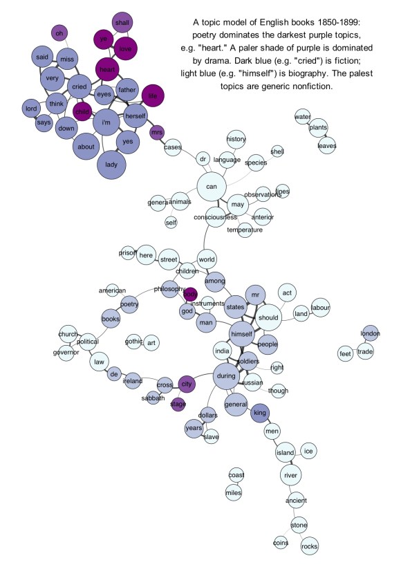
But visualizing the larger model is tricky. The go-to strategy for something like this in digital humanities is usually a network graph. I have some questions about that strategy, but since examples are more fun than abstract skepticism, I should start by providing an illustration. The underlying topic model here was produced by LDA on the top 10k words in 872 volume-length documents. Then I produced a correlation matrix of topics against topics. Finally I created a network in Gephi by connecting topics that correlated strongly with each other (see the notes at the end for the exact algorithm). Topics were labeled with their single most salient word, except in three cases where I changed the label manually. The size of each node is roughly log-proportional to the number of tokens in the topic; nodes are colored to reflect the genre most prominent in each topic. (Since every genre is actually represented in every topic, this is only a rough and relative characterization.) Click through for a larger version.

Since single-word labels are usually misleading, a graph like this would be more useful if you could mouseover a topic and get more information. E.g., the topic labeled “cases” (connecting the dark cluster at top to the rest of the graph) is actually “cases death dream case heard saw mother room time night impression.” (Added Nov 20: If you click through, I’ve now edited the underlying illustration as an image map so you get that information when you mouseover individual topics.)
A network graph does usefully dramatize several important things about the model. It reveals, for instance, that “literary” topics tend to be more strongly connected with each other than nonfiction topics (probably because topics dominated by nonfiction also tend to have a relatively specialized vocabulary).
On the other hand, I think a graph like this could easily be over-interpreted. Graphs are good models for structures that are really networks: i.e., structures with discrete nodes that may or may not be related to each other. But a topic model is not really a network. For one thing, as I was pointing out above, the boundaries between topics are at bottom arbitrary, so these nodes aren’t in reality very discrete. Also, in reality every topic is connected to every other. But as Scott Weingart has been pointing out, you usually have to cut edges to produce a network, and this means that you’re always losing some of the data. Every correlation below some threshold of significance will be lost.
That’s a nontrivial loss, because it’s not safe to assume that negative correlations between topics don’t matter. If two topics absolutely never occur together, that’s a meaningful relation! For instance, if language about the slave trade absolutely never occurred in books of poetry, that would tell us something about both discourses.
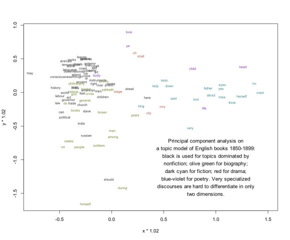
So I think we’ll also want to consider visualizing topic models through a strategy like PCA (Principal Component Analysis). Instead of simplifying the model by cutting selected edges, PCA basically “compresses” the whole model into two dimensions. That way you can include all of the data (even the evidence provided by negative correlations). When I perform PCA on the same 1850-99 model, I get this illustration. I’m afraid it’s difficult to read unless you click through and click again to magnify:

I think that’s a more accurate visualization of the relationship between topics, both because it rests on a sounder basis mathematically, and because I observe that in practice it does a good job of discriminating genres. But it’s not as fun as a network visually. Also, since specialized discourses are hard to differentiate in only two dimensions, specialized scientific topics (“temperature,” “anterior”) tend to clump in an unreadable electron cloud. But I’m hoping that Michael and I can find some technical fixes for that problem.
Technical notes: To turn a topic model into a correlation matrix, I simply use Pearson correlation to compare topic distributions over documents. I’ve tried other strategies: comparing distributions over the lexicon, for instance, or using cosine similarity instead of correlation.
The network illustration above was produced with Gephi. I selected edges with an ad-hoc algorithm: 1) take the strongest correlation for each topic 2) if the second-strongest correlation is stronger than .2, include that one too. 3) include additional edges if the correlation is stronger than .38. This algorithm is mathematically indefensible, but it produces pretty topic maps.
I find that it works best to perform PCA on the correlation matrix rather than the underlying word counts. Maybe in the future I’ll be able to explain why, but for now I’ll simply commend these lines of R code to readers who want to try it at home:
pca <- princomp(correlationmatrix)
x <- predict(pca)[,1]
y <- predict(pca)[,2]
