Categories
methodology ngrams

How to make the Google dataset work for humanists.

I started blogging about the Google dataset because it revealed stylistic trends so intriguing that I couldn’t wait to write them up. But these reflections are also ending up in a blog because they can’t yet go in an article. The ngram viewer, as fascinating as it is, is not yet very useful as evidence in a humanistic argument.

As I’ve explained at more length elsewhere, the problems that most humanists have initially pointed to don’t seem to me especially troubling. It’s true that the data contains noise — but so does all data. Researchers in other fields don’t wait for noiseless instruments before they draw any conclusions; they assess the signal/noise ratio and try to frame questions that are answerable within those limits.

It’s also true that the history of diction doesn’t provide transparent answers to social and literary questions. This kind of evidence will require context and careful interpretation. In which respect, it resembles every other kind of evidence humanists currently grapple with.
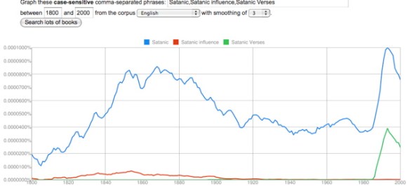
Satanic, Satanic influence, Satanic verses, in English corpus, 1800-2000

The problem that seems more significant to me is one that Matt Jockers has raised. We simply don’t yet know what’s in these corpora. We do know how they were constructed: that’s explained, in a fairly detailed way, in the background material supporting the original article in Science. But we don’t yet have access to a list of titles for each corpus.

Here differences between disciplines become amusing. For a humanist, it’s a little shocking that a journal like Science would publish results without what we would call simply “a bibliography” — a list of the primary texts that provide evidence for the assertion. The list contains millions of titles in this case, and would be heavy in print. But it seems easy enough for Google, or the culturomics research team, to make these lists available on the web. In fact, I assume they’re forthcoming; the datasets themselves aren’t fully uploaded yet, so apparently more information is on the way. I’ve written Google Labs asking whether they plan to release lists of titles, and I’ll update this post when they do.

Until they do, it will be difficult for humanists to use the ngram viewer as scholarly evidence. The background material to the Science article does suggest that these datasets have been constructed thoughtfully, with an awareness of publishing history, and on an impressive scale. But humanists and scientists understand evidence differently. I can’t convince other humanists by telling them “Look, here’s how I did the experiment.” I have to actually show them the stuff I experimented on — that is, a bibliography.

Ideally, one might ask even more from Google. They could make the original texts themselves available (at least those out of copyright), so that we could construct our own archives. With the ability to ask questions about genre and context of occurrence, we could connect quantitative trends to a more conventional kind of literary history. Instead of simply observing that a lot of physical adjectives peak around 1940, The Big Sleepwe could figure out how much of that is due to modernism (“The sunlight was hot and hard”), to Time magazine, or to some other source — and perhaps even figure out why the trend reversed itself.
Google seems unlikely to release all their digitized texts; it may not be in their corporate interest to do so. But fortunately, there are workarounds. HathiTrust, and other online archives, are making large electronic collections freely available, and these will eventually be used to construct more flexible tools. Even now, it’s possible to have the best of both worlds by pairing the scope of Google’s dataset with the analytic flexibility of a tool like MONK (constructed by a team of researchers funded by the Andrew W. Mellon Foundation, including several here at Illinois). When I discover an interesting 18c. or 19c. trend in the ngram viewer, I take it to MONK, which can identify genres, authors, works, or parts of works where a particular pattern of word choice was most prominent.

So, to make the ngram viewer useful, Google needs to release lists of titles, and humanists need to pair the scope of the Google dataset with the analytic power of a tool like MONK, which can ask more precise, and literarily useful, questions on a smaller scale. And then, finally, we have to read some books and say smart things about them. That part hasn’t changed.

But the ngram viewer itself could also be improved. It could, for instance

1) Give researchers the option to get rid of case sensitivity and (at least partly) undo the f/s substitution, which together make it very hard to see any patterns in the 18c.

2) Provide actual numbers as output, not just pretty graphs, so that we can assess correlation and statistical significance.

3) Offer better search strategies. Instead of plugging in words one by one to identify a pattern, I would like to be able to enter a seed word, and ask for a list of words that correlate with it across a given period, sorted by degree of positive (or inverse) correlation.

It would be even more interesting to do the same thing for ngrams. One might want the option to exclude phrases that contain only the original seed word(s) and stop words (“of,” “the,” and so on). But I suspect a tool like this could rapidly produce some extremely interesting results.
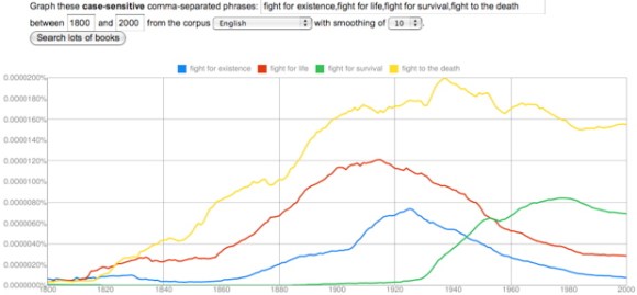
fight for existence, fight for life, fight for survival, fight to the death, in English, 1800-2000

4) Offer other ways to mine the list of 2,3,4, and 5-grams, where a lot of conceptually interesting material is hiding. For instance, “what were the most common phrases containing ‘feminine’ between 1950 and 1970?” Or, “which phrases containing ‘male’ increased most in frequency between 1940 and 1960?”

Of course, since the dataset is public, none of these improvements actually have to be made by Google itself.

Categories
methodology ngrams

Several varieties of noise, and the theme to Love Story.

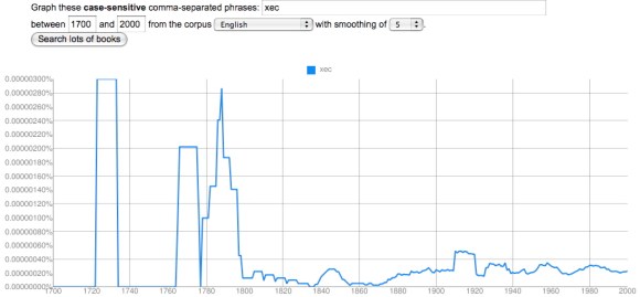
I’ve asserted several times that flaws in optical character recognition (OCR) are not a crippling problem for the English part of the Google dataset, after 1820. Readers may wonder where I get that confidence, since it’s easy to generate a graph like this for almost any short, random string of letters:

xec, in the English corpus, 1700-2000

It’s true that the OCR process is imperfect, especially with older typography, and produces some garbage strings of letters. You see a lot of these if you browse Google Books in earlier periods. The researchers who created the ngram viewer did filter out the volumes with the worst OCR. So the quality of OCR here is higher than you’ll see in Google Books at large — but not perfect.

I tried to create “xec” as a nonsense string, but there are surprisingly few strings of complete nonsense. It turns out that “xec” occurs for all kinds of legitimate reasons: it appears in math, as a model number, and as a middle name in India. But the occurrences before 1850 that look like the Chicago skyline are mostly OCR noise. Now, the largest of these is three millionths of a percent (10-6). By contrast, a moderately uncommon word like “apprehend” ranges from a frequency of two thousandths of a percent (10-3) in 1700 to about two ten-thousandths of a percent today (10-4). So we’re looking at a spike that’s about 1% of the minimum frequency of a moderately uncommon word.

In the aggregate, OCR failures like this are going to reduce the frequency of all words in the corpus significantly. So one shouldn’t use the Google dataset to make strong claims about the absolute frequency of any word. But “xec” occurs randomly enough that it’s not going to pose a real problem for relative comparisons between words and periods. Here’s a somewhat more worrying problem:

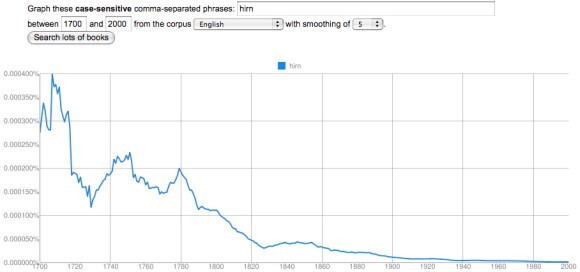
hirn, in the English corpus, 1700-2000

English unfortunately has a lot of letters that look like little bumps, so “hirn” is a very common OCR error for “him.” Two problems leap out here. First, the scale of the error is larger. At its peak, it’s four ten-thousandths of a percent (10-4), which is comparable to the frequency of an uncommon word. Second, and more importantly, the error is distributed very unequally; it increases as one goes back in time (because print quality is poorer), which might potentially skew the results of a diachronic graph by reducing the frequency of “him” in the early 18c. But as you can see, this doesn’t happen to any significant degree:
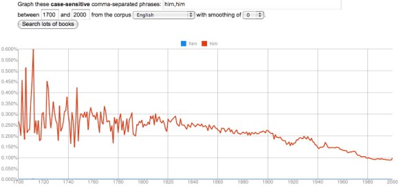
hirn, him, in the English corpus, 1700-2000

“Hirn” is a very common error because “him” is a very common word, averaging around a quarter of a percent in 1750. The error in this case is about one thousandth the size of the word itself, which is why “hirn” totally disappears on this graph. So even if we postulate that there are twenty equally common ways of getting “him” wrong in the OCR (which I doubt), this is not going to be a crippling problem. It’s a much less significant obstacle than the random year-to-year variability of sampling in the early eighteenth century, caused by a small dataset, which becomes visible here because I’ve set the smoothing to “0” instead of using my usual setting of “5.”

The take-away here is that one needs to be cautious before 1820 for a number of reasons. Bad OCR is the most visible of those reasons, and the one most likely to scandalize people, but (except for the predictable f/s substitution before 1820), it’s actually not as significant a problem as the small size of the dataset itself. Which is why I think the relatively large size of the Google dataset outweighs its imperfections.

By the way, the mean frequency of all words in the lexicon does decline over time, as the size of the lexicon grows, but that subtle shift is probably not the primary explanation for the downward slope of “him.” “Her” increases in frequency from 1700 to the present; “the” remains largely stable. The expansion of the lexicon, and proliferation of nonfiction genres, does however give us a good reason not to over-read slight declines in frequency. A word doesn’t have to be displaced by anything in particular; it can be displaced by everything in the aggregate.

An even better reason not to over-read changes of 5-10% is just that — frankly — no one is going to care about them. The connection between word frequency and discourse content is still very fuzzy; we’re not in a position to assume that all changes are significant. If the ngram viewer were mostly revealing this sort of subtle variation I might be one of the people who dismiss it as trivial bean-counting. In fact, it’s revealing shifts on a much larger scale, that amount to qualitative change: the space allotted to words for color seems to have grown more than threefold between 1700 and 1940, and possibly more than tenfold in fiction.

This is the fundamental reason why I’m not scandalized by OCR errors. We’re looking at a domain where the minimum threshhold for significance is very high from the start, because humanists basically aren’t yet convinced that changes in frequency matter at all. It’s unlikely that we’re going to spend much time arguing about phenomena subtle enough for OCR errors to make a difference.

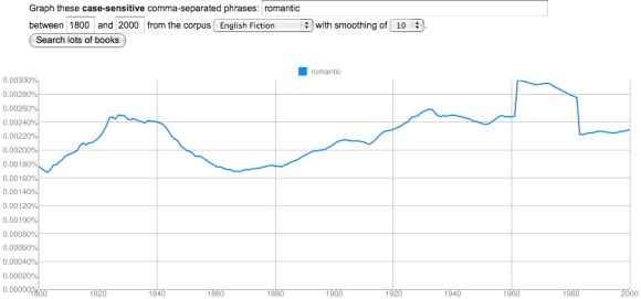
This isn’t to deny that one has to be cautious. There are real pitfalls in this tool. In the 18c, its case sensitivity and tendency to substitute f for s become huge problems. It also doesn’t know anything about spelling variants (antient/ancient,changed/changd) or morphology (run/ran). And once in a great while you run into something like this:

romantic, in English Fiction, 1800-2000

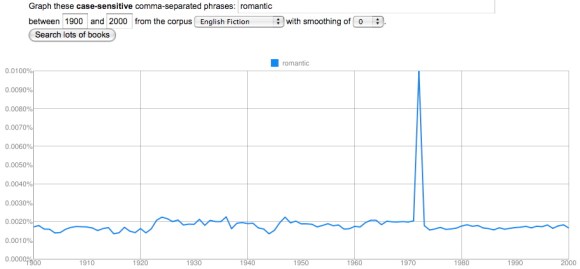
“Hmm,” I thought. “That’s odd. One doesn’t normally see straight-sided plateaus outside the 18c, where the sample size is small enough to generate spikes. Let’s have a bit of a closer look and turn off smoothing.”
English Fiction got very romantic indeed in 1972.

Yep, that’s odd. My initial thought was the overwhelming power of the movie Love Story, but that came out 1970, not 1972.

I’m actually not certain what kind of error this is — if it’s an error at all. (Some crazy-looking early 18c spikes in the names of colors turn out to be Isaac Newton’s Opticks.) But this only appears in the fiction corpus and in the general English corpus; it disappears in American English and British English (which were constructed separately and are not simply subsets of English). Perhaps a short-lived series of romance novels with “romantic” in the running header at the top of every page? But I’ve browsed Google Books for 1972 and haven’t found the culprit yet. Maybe this is an ill-advised Easter egg left by someone who got engaged then.

Now, I have to say that I’ve looked at hundreds and hundreds of ngrams, and this is the only case where I’ve stumbled on something flatly inexplicable. Clearly you have to have your wits about you when you’re working with this dataset; it’s still a construction site. It helps to write “case-sensitive” on the back of your hand, to keep smoothing set relatively low, to check different corpora against each other, to browse examples — and it’s wise to cross-check the whole Google dataset against another archive where possible. But this is the sort of routine skepticism we should always be applying to scholarly hypotheses, whether they’re based on three texts or on three million.

Categories
methodology ngrams

On different uses of structuralism; or, histories of diction don’t have to tell us anything about “culture” to be useful.

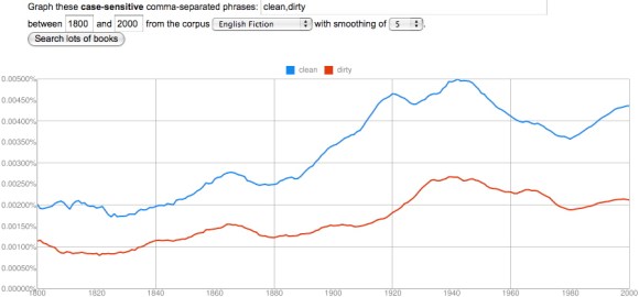
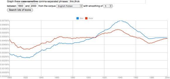
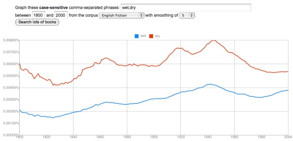
I’ve written several posts now on the way related terms (especially simple physical adjectives) tend to parallel each other in the Google dataset. The names of primary colors rise and fall together. So do “hot” and “cold,” “wet” and “dry,” “thin” and “thick,” “clean” and “dirty,” and the names of the seasons.

clean, dirty, in English Fiction, 1800-2000

These correlations tend to be strongest in the fiction corpus, but most of them hold in other corpora as well. Moreover, all the terms I just mentioned seem to have a minimum value in the early nineteenth century (around 1820) and a maximum around 1940.

Since I’ve listed a lot of binary oppositions, and playfully channeled Lévi-Strauss at the end of an earlier post, it may be time for me to offer a few disclaimers.

The title of the article published in Science was “Quantitative Analysis of Culture Using Millions of Digitized Books.” But I’m afraid I agree with Matthew Jockers, among others, that in this context the word “culture” is unhelpful. To be fair to the “culturomics” team, it’s an unhelpfully vague word in most other contexts too. Writers often invoke “culture” when they need to connect phenomena without an evident causal connection. The New York Times wedding pages may seem to have nothing to do with Facebook. But all I have to do is characterize them as coordinate expressions of a single “culture of narcissism” and — ta da!

Some of the blame for this habit of argument may rest with structural anthropologists who mapped different kinds of behavior onto each other (kinship relations, language, myth), and characterized them as expressions of the same underlying cultural oppositions. So when I start enumerating oppositions, I should stress that I don’t think the Google dataset proves a structuralist theory of culture, or that we have to assume one in order to use it.

I want to suggest that changes in diction are meaningful phenomena in their own right, and that the task of interpreting them is essentially descriptive. We don’t have to read diction as a symptom of something more abstract like culture. Of course, to say that this is a descriptive task is not to deny that it involves interpretation. Patterns don’t foreground themselves.
thin, thick, in English Fiction, 1800-2000

There’s interpretation involved in pairing “thick” and “thin,” just as there is whenever we highlight a pattern in a literary work. But we’re describing a pattern perceptible in the history of diction, not speculating about a hidden cultural agency.

To explain these patterns causally, they may need to be broken into smaller pieces. It’s possible, for instance, that the commonest concrete adjectives became less frequent in the early nineteenth century because they got partly displaced by Latinate near-synonyms, but became infrequent in the late twentieth century for a completely different reason — say, because adjectives in general became less common in prose. (I’m just speculating here.) Genres will also need to be distinguished. It seems likely that concrete adjectives peak around 1940 partly because modernist novels explore the hot, wet phenomenology of life, and partly because pulpy sci-fi stories describe the hot, wet jungles of Venus.
wet, dry, in English Fiction, 1800-2000

The relative contributions of different genres will need to be disentangled before we really understand what happened, and Google unfortunately is not going to do much to help us there.

All this is to say that I’m not offering an explanation when I mention structuralism. I certainly don’t mean to invoke “culture” as an explanation for these patterns. It will be far more interesting to understand them, eventually, as consequences of specific generic and stylistic shifts.

I mention structuralism only as a (very loose!) metaphor for one way of extracting literary significance from the history of diction. Right now a lot of humanists have the impression that this sort of interpretation would have to rely on sympathetic magic: the fact that the word “sentimental” peaked around 1930 would only interest us if we could assume that this somehow made the Thirties the most sentimental decade of all time. (Kirstin Wilcox pointed me to the history of “sentimental,” btw.)

Focusing on sets of antonyms has the advantage of ruling out this sort of sympathetic magic. The world can’t have become at once thinner and thicker, wetter and drier, in the early 20th century. When both parts of an opposition change in correlated ways, the explanation required is clearly stylistic. To put this another way, wet/dry and thin/thick are connected not by a mysterious black box called “culture” but by the patterns of selection writers had to learn in order to reproduce a historically specific style.

Categories
19c 20c methodology ngrams

More reflections on the apparent “structuralism” in the Google dataset

In my last post, I argued that groups of related terms that express basic sensory oppositions (wet/dry, hot/cold, red/green/blue/yellow) have a tendency to correlate strongly with each other in the Google dataset. When “wet” goes up in frequency, “dry” tends to go up as well, as if the whole sensory category were somehow becoming more prominent in writing. Primary colors rise and fall as a group as well.

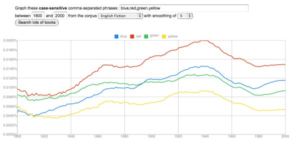
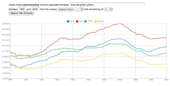
blue, red, green, yellow, in English fiction, 1800-2000

In that post I focused on a group of categories (temperature, color, and wetness) that all seem to become more prominent from 1820 to 1940, and then start to decline. The pattern was so consistent that you might start to wonder whether it’s an artefact of some flaw in the data. Does every adjective go up from 1820 to 1940? Not at all. A lot of them (say, “melancholy”) peak roughly where the ones I’ve been graphing hit a minimum. And it’s possible to find many paired oppositions that correlate like hot/cold or wet/dry, but peak at a different point.
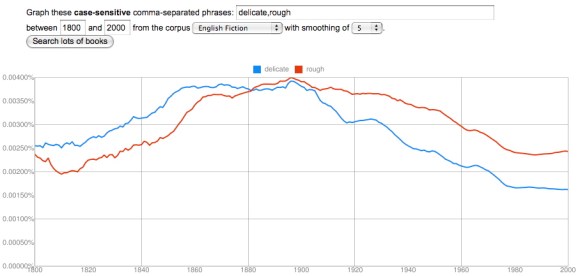
delicate, rough, in English fiction, from 1800 to 2000

“Delicate” and “rough” correlate loosely (with an interesting lag), but peak much earlier than words for temperature or color, somewhere between 1880 and 1900. Now, it’s fair to question whether “delicate” and “rough” are actually antonyms. Perhaps the opposite of “rough” is actually “smooth”? As we get away from the simplest sensory categories there’s going to be more ambiguity than there was with “wet” and “dry,” and the neat structural parallels I traced in my previous post are going to be harder to find. I think it’s possible, however, that we’ll be able to discover some interesting patterns simply by paying attention to the things that do in practice correlate with each other at different times. The history of diction seems to be characterized by a sequence of long “waves” where different conceptual categories gradually rise to prominence, and then decline.

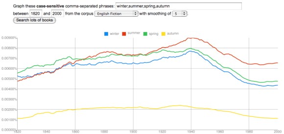
I should credit mmwm at the blog Beyond Rivalry for the clue that led to my next observation, which is that it’s not just certain sensory adjectives (like hot/cold/cool/warm) that rise to prominence from 1820 to 1940, but also a few nouns loosely related to temperature, like the seasons.
winter, summer, spring, autumn, in English fiction, 1820-2000

I’ve started this graph at 1820 rather than 2000, because the long s/f substitution otherwise creates noise at the very beginning. And I’ve chosen “autumn” rather than “fall” to avoid interference from the verb. But the pattern here is very similar to the pattern I described in my last post — there’s a low around 1820 and a high around 1940. (Looking at the data for fummer and fpring, I suspect that the frequency of all four seasons does increase as you go back before 1820.)

As I factor in some of this evidence, I’m no longer sure it’s adequate to characterize this trend generally as an increase in “concreteness” or “sensory vividness” — although that might be how Ernest Hemingway and D. H. Lawrence themselves would have imagined it. Instead, it may be necessary to describe particular categories that became more prominent in the early 20c (maybe temperature? color?) while others (perhaps delicacy/roughness?) began to decline. Needless to say, this is all extremely tentative; I don’t specialize in modernism, so I’m not going to try to explain what actually happened in the early 20c. We need more context to be confident that these patterns have significance, and I’ll leave the task of explaining their significance to people who know the literature more intimately. I’m just drawing attention to a few interesting patterns, which I hope might provoke speculation.

Finally, I should note that all of the changes I’ve graphed here, and in the last post, were based on the English fiction dataset. Some of these correlations are a little less striking in the main English dataset (although some are also more striking). I’m restricting myself to fiction right now to avoid cherry-picking the prettiest graphs.

Categories
19c 20c ngrams Uncategorized

The rise of a sensory style?

I ended my last post, on colors, by speculating that the best explanation for the rise of color vocabulary from 1820 to 1940 might simply be “a growing insistence on concrete and vivid sensory detail.” Here’s the graph once again to illustrate the shape of the trend.

blue, red, green, yellow, in the English fiction corpus, 1800-2000

It occurred to me that one might try to confirm this explanation by seeing what happened to other words that describe fairly basic sensory categories. Would words like “hot” and “cold” change in strongly correlated ways, as the names of primary colors did? And if so, would they increase in frequency across the same period from 1820 to 1940?

The results were interesting.

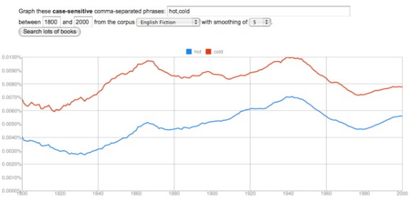
cold, hot, in the English fiction corpus, 1800-2000

“Hot” and “cold” track each other closely. There is indeed a low around 1820 and a peak around 1940. “Cold” increases by about 60%, “hot” by more than 100%.

cool, warm, in the English fiction corpus, 1800-2000

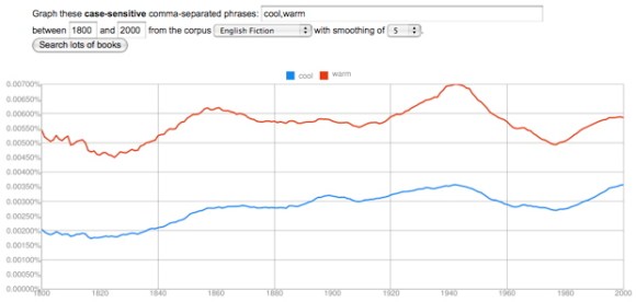
“Warm” and “cool” are also strongly correlated, increasing by more than 50%, with a low around 1820 and a high around 1940 — although “cool” doesn’t decline much from its high, probably because the word acquires an important new meaning related to style.

wet, dry, in the English fiction corpus, 1800-2000

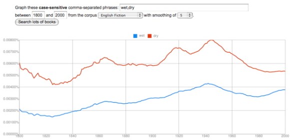
“Wet” and “dry” correlate strongly, and they both double in frequency. Once again, a low around 1820 and a peak around 1940, at which point the trend reverses.

There’s a lot of room for further investigation here. I think I glimpse a loosely similar pattern in words for texture (hard/soft and maybe rough/smooth), but it’s not clear whether the same pattern will hold true for the senses of smell, hearing, or taste.

More crucially, I have absolutely no idea why these curves head up in 1820 and reverse direction in 1940. To answer that question we would need to think harder about the way these kinds of adjectives actually function in specific works of fiction. But it’s beginning to seem likely that the pattern I noticed in color vocabulary is indeed part of a broader trend toward a heightened emphasis on basic sensory adjectives — at least in English fiction. I’m not sure that we literary critics have an adequate name for this yet. “Realism” and “naturalism” can only describe parts of a trend that extends from 1820 to 1940.

More generally, I feel like I’m learning that the words describing different poles or aspects of a fundamental opposition often move up or down as a unit. The whole semantic distinction seems to become more prominent or less so. This doesn’t happen in every case, but it happens too often to be accidental. Somewhere, Claude Lévi-Strauss can feel pretty pleased with himself.

Categories
19c 20c ngrams

Colors

It’s tempting to use the ngram viewer to stage semantic contrasts (efficiency vs. pleasure). It can be more useful to explore cases of semantic replacement (liberty vs. freedom). But a third category of comparison, perhaps even more interesting, involves groups of words that parallel each other quite closely as the whole group increases or decreases in prominence.

One example that is conveniently easy to visualize involves colors.

blue, red, green, yellow, in the English corpus, 1800-2000

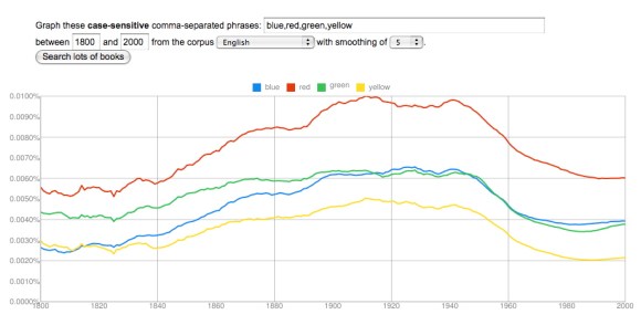
The trajectories of primary colors parallel each other very closely. They increase in frequency through the nineteenth century, peak in a period between 1900 and 1945, and then decline to a low around 1985, with some signs of recovery. (The recovery is more marked after 2000, but that data may not be reliable yet.) Blue increases most, by a factor of almost three, and green the least, by about 50%. Red and yellow roughly double in frequency.

Perhaps red increases because of red-baiting, and blue increases because jazz singers start to use it metaphorically? Perhaps. But the big picture here is that the relative prominence of different colors remains fairly stable (red being always most prominent), while they increase and decline significantly as a group. This is a bit surprising. Color seems like a basic dimension of human experience, and you wouldn’t expect its importance to fluctuate. (If you graph the numbers one, two, three, for instance, you get fairly flat lines all the way across.)

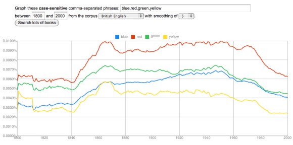
What about technological change? Color photography is really too late to be useful. Maybe synthetic dyes? They start to arrive on the scene in the 1860s, which is also a little late, since the curves really head up around 1840, but it’s conceivable that a consumer culture with a broader range of artefacts brightly differentiated by color might play a role here. If you graph British usage, there’s even an initial peak in the 1860s and 70s that looks plausibly related to the advent of synthetic dye.

blue, red, green, yellow, in the British corpus, 1800-2000

On the other hand, if this is a technological change, it’s a little surprising that it looks so different in different national traditions. (The French and German corpora may not be reliable yet, but at this point their colors behave altogether differently.) Moreover, a hypothesis about synthetic dyes wouldn’t do much to explain the equally significant decline from the 1950s to the 1980s. Maybe the problem is that we’re only looking at primary colors. Perhaps in the twentieth century a broader range of words for secondary colors proliferated, and subtracted from the frequency of words like red and green?
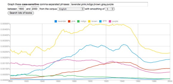
lavender, pink, indigo, brown, gray, purple, in English corpus, 1800-2000

This is a hard hypothesis to test, because there are a lot of different words for color, and you’d need to explore perhaps a hundred before you had a firm answer. But at first glance, it doesn’t seem very helpful, because a lot of words for minor colors exhibit a pattern that closely resembles primary colors. Brown, gray, purple, and pink — the leaders in the graph above — all decline from 1950 to 1980. Even black and white (not graphed here) don’t help very much; they display a similar pattern of increase beginning around 1840 and decrease beginning around 1940, until the 1960s, when the racial meanings of the terms begin to clearly dominate other kinds of variation.

At the moment, I think we’re simply looking at a broad transformation of descriptive style that involves a growing insistence on concrete and vivid sensory detail. One word for this insistence might be “realism.” We ordinarily apply that word to fiction, of course, and it’s worth noting that the increase in color vocabulary does seem to begin slightly earlier in the corpus of fiction — as early perhaps as the 1820s.

blue, red, green, yellow, in English Fiction, 1800-2000

But “realism,” “naturalism,” “imagism,” and so on are probably not adequate words for a transformation of diction that covers many different genres and proceeds for more than a century. (It proceeds fairly steadily, although I would really like to understand that plateau from 1860 to 1890.) More work needs to be done to understand this. But the example of color vocabulary already hints, I think, that broadly diachronic studies of diction may turn up literary phenomena that don’t fit easily into literary scholars’ existing grid of periods and genres. We may need to define a few new concepts.

Categories
Uncategorized

Efficiency and pleasure

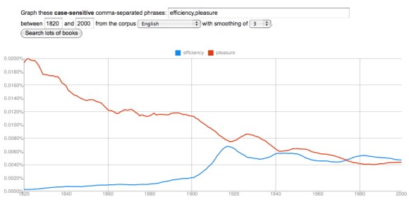
Okay, I’ve already spilled some ink railing against this application of the ngram viewer — using it to stage contests between abstract terms. In fact, I actually made this graph as a joke. But then, I found myself hypnotized by the apparent inverse correlation between the two curves in the 20c. So … shoot … here it is.

efficiency, pleasure, in English corpus, 1820-2000

I have to admit that at first glance it appears that Taylorist discourse about efficiency in the 20th century (and perhaps the pressures of war) correlated closely with a sort of embarrassment about mentioning pleasure. But for now, I’m going to treat this kind of contrast the way physicists treat claims about cold fusion. It may be visually striking, but we should demand more confirmation before we treat the correlation as meaningful. When you hold genre constant, by restricting the search to fiction, the correlation is a little less striking, so it may be at least partly a fluctuation in the genres that got published, rather than a fluctuation in underlying patterns of expression.

In any case, there’s a broad decline in “pleasure” from beginning to end that Frederick W. Taylor can hardly explain. To understand that, we still have to consult Lionel Trilling on “The Fate of Pleasure,” and perhaps Thomas Carlyle on “The Gospel of Work.”

Categories
methodology ngrams

On the imperfection of the Google dataset, and imperfection in general

The dataset that Google made public last week isn’t perfect. As Natalie Binder among others has pointed out, the dataset contains many OCR (optical character recognition) errors, and at least a few errors in dating. (UPDATE 12/22: It is worth noting, however, that the dataset will have many fewer errors than Google Books itself, because the dataset is based on a subset of volumes with relatively clean OCR.)

Moreover, as Dennis Baron argues in The Web of Language, “books don’t always reflect the spoken language accurately.” Informal words like “hello” are likely to be underrepresented in books.

The utility of the dataset is even more importantly reduced by Google’s decision to strip out all information about context of original occurrence, as Mark Liberman has noted. If researchers had unfettered access to the full text of original works, we could draw much more interesting conclusions about context, genre, and authorship.

Finally, I would add that — even with the present structure of the dataset — it’s possible to imagine search strategies other than simply graphing the frequencies of individual words and phrases, one by one. The ngram viewer is an elegant interface, but a limited one.

All true. But the Google dataset is also turning out to be tremendously useful, and it’s likely to become even more useful as researchers refine it and develop more flexible ways to query it.

Of course, it has to be used appropriately. This is not a tool you should use if you want to know exactly how often Laurence Sterne referred to noses. It’s a tool for statistical questions about the written language that involve very large numbers of examples. When it’s applied to questions on that scale, the OCR errors in the English corpus (after 1820) are not significant enough to prevent the ngram viewer from producing useful results. Before 1820 there are more significant OCR problems, especially with the substitution of f for “long s.” But even there, I don’t see the problem as insuperable; there are straightforward ways for researchers to compensate for the most predictable OCR errors.

The larger critique being leveled at the ngram viewer, by Natalie Binder and many other humanists, is that it’s impossible to know what an individual graph measures. Complex words have multiple meanings, Binder reminds us, so how should we interpret a graph showing a decline in the frequency of “nature”? How should we interpret a correlation between the increasing frequency of “vampire” and the declining frequency of “dilettante”?

The saying that correlation doesn’t prove causation definitely needs to be underlined in this domain. There are so many words in the language that a huge number of them will always correlate in largely accidental ways. More generally, it’s true that, in most cases, a graph of word frequency will not by itself tell us very much. You have to have some cultural context before the increasing frequency of “vampire” in the late twentieth century is going to mean anything at all to you. But of course, this is true of all historical evidence: no single poem or novel, in isolation, can tell us what was happening culturally around 1800. You need to compare different texts and authors from different social groups; it may be helpful to know that there was a revolution in France, and so on.

What puzzles me about humanistic disdain for the ngram viewer is that it often seems to presume that a piece of evidence must be legible in itself — naked and free of all context — in order to have any significance at all. If a graph doesn’t have a single determinate meaning, read from its face as easily as the value of a coin, then what is it good for? This critique seems to take hyper-positivism as a premise in order to refute a rather mild and contextual empiricism.

In short, the evidence produced by Google’s new tool is imperfect. It will have to be interpreted sensitively, by people who understand how it was produced. And it will need to be supplemented by multiple kinds of context (literary, social, political), before it acquires much historical significance. But these things are also true of all the other forms of evidence humanists invoke.

It seems likely that humanists are reluctant to take this kind of evidence seriously not because they find it too loose and indeterminate, but because they fear that the superficial certainty of quantitative evidence will seduce people away from more difficult kinds of interpretation. This concern can easily be exaggerated. If an awareness of social history doesn’t prevent us from reading sensitively (and I don’t think it does), then the much weaker evidence provided by text-mining isn’t likely to do so either. I’m reminded of an observation Matt Yglesias made in a different (political) context: that people are in general liable to take “an unduly zero-sum view of human interactions.” Different kinds of evidence needn’t be construed as competitive; they might conceivably enrich each other.

Categories
Uncategorized

What I hope this blog will do

Changing patterns of expression often imply interesting questions about literary or social history. Electronic archives with diachronic scope have made it easier to perceive these questions, and Google’s recent decision to make a very large dataset available has turned that trickle of questions into a flood. It’s not always possible to explain puzzling phenomena at first glance, let alone write them up in a journal article. But it might be useful to record them and share them with other scholars, in the hope that different pieces of a puzzle will make more sense in context.

That’s what I hope to accomplish here. I’m going to record interesting patterns of change as I encounter them, and invite speculation about what they mean. I invite other people to submit observations as well. At first, many of these observations are going to be based on results from Google’s ngram viewer, but I expect that other archives, and other ways of querying them, will play an increasingly important role.

The name of the blog is drawn from a dream described in the fifth book of Wordsworth’s Prelude, where a shell seems to represent poetry, and a stone mathematics — or at any rate, “geometric truth.” Toward the end of the book, Wordsworth observes that

                    Visionary power
Attends upon the motions of the winds
Embodied in the mystery of words;
There darkness makes abode, and all the host
Of shadowy things do work their changes there
As in a mansion like their proper home.

So, there’s a bit of poetry about changes worked through the mystery of words. Now for some math.

Categories
methodology

Using changes in diction to frame historical questions ≠ ‘culturomics’

I hope this blog will focus on recording specific puzzles, rather than debating method; this area of inquiry is really too young for claims about method to be more than speculative.

But Google released its ngram viewer in tandem with an article in Science that made fairly strong claims for a new discipline to be called culturomics, and strong claims about a whole new discipline have naturally been met with strong skepticism. So it’s impossible to avoid a few reflections on method.

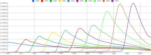
I don’t expect that quantitative studies of word frequency will in the end amount to a new discipline — although who knows? The team that published in Science chose questions where quantitative analysis could, in itself, count as proof — for instance, questions about the changing frequency and duration of references to dates.

References to dates, 1900-2000, image by Zach Seward, 12/18/10.

I don’t want to disparage this approach; posing a new kind of question is significant — although, if it does create a new discipline, I hope the discipline will be called “N-grammatology,” in homage to Derrida.

But most of the questions that interest humanists can’t be converted quite this directly into questions about the occurrence of a particular sign. We’re interested in questions about modes of thought and behavior that don’t map onto individual signs in a simple one-to-one fashion.

That doesn’t, of course, mean that there’s nothing to be gained by studying shifts in vocabulary, diction, and phraseology. But I think in most cases quantitative evidence about word choice will function as a clue rather than as demonstrative proof; it may alert scholars to a change in patterns of expression, and tell them where and when to look. But to actually understand what happened, we’ll still have to read books all the way through, and study social history.