Categories
19c 20c reception statistics

Finding the great divide

Last year, Jordan Sellers and I published an article in Modern Language Quarterly, trying to trace the “great divide” that is supposed to open up between mass culture and advanced literary taste around the beginning of the twentieth century.

I’m borrowing the phrase “great divide” from Andreas Huyssen, but he’s not the only person to describe the phenomenon. Whether we explain it neutrally as a consequence of widespread literacy, or more skeptically as the rise of a “culture industry,” literary historians widely agree that popularity and prestige parted company in the twentieth century. So we were surprised not to be able to measure the widening gap.
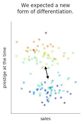
expectedWe could certainly model literary taste. We trained a model to distinguish poets reviewed in elite literary magazines from a less celebrated “contrast group” selected randomly. The model achieved roughly 79% accuracy, 1820-1919,  and the stability of the model itself raised interesting questions. But we didn’t find that the model’s accuracy increased across time in the way we would have expected in a period when elite and popular literary taste are specializing and growing apart.

Instead of concluding that the division never happened, we guessed that we had misunderstood it or looked in the wrong place. Algee-Hewitt and McGurl have pretty decisively confirmed that a divide exists in the twentieth century. So we ought to be able to see it emerging. Maybe we needed to reach further into the twentieth century — or maybe we would have better luck with fiction, since the history of fiction provides evidence about sales, as well as prestige?

In fact, getting evidence about that second, economic axis seems to be the key. It took work by many hands over a couple of years: Kyle Johnston, Sabrina Lee, and Jessica Mercado, as well as Jordan Sellers, have all contributed to this project. I’m presenting a preliminary account of our results at Cultural Analytics 2017, and this blog post is just a brief summary of the main point.

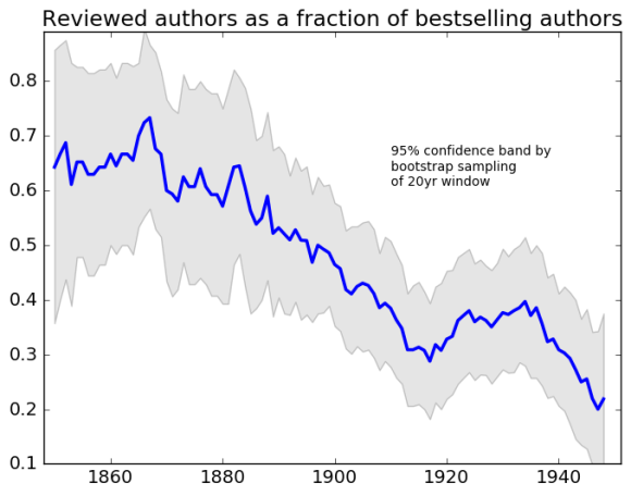
When you look at the books described as bestsellers by Publisher’s Weekly, or by book historians (see references to Altick, Bloom, Hackett, Leavis, below) it’s easy to see the two circles of the Venn diagram pulling apart: on the one hand bestsellers, on the other hand books reviewed in elite venues. (For our definition of “elite venues” see the “Table” in a supporting code & data repository.)
authorfractions2

On the other hand, when you back up from bestsellers to look at a broader sample of literary production, it’s still not easy to detect increasing stylistic differentiation between the elite “reviewed” texts and the rest of the literary field. A classifier trained on the reviewed fiction has roughly 72.5% accuracy from 1850 to 1949; if you break the century into parts, there are some variations in accuracy, but no consistent pattern. (In a subsequent blog post, I’ll look at the fiddly details of algorithm choice and feature engineering, but the long and short of that question is — it doesn’t make a significant difference.)

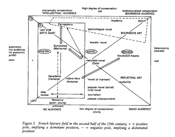
To understand why the growing separation of bestsellers from “reviewed” texts at the high end of the market doesn’t seem to make literary production as a whole more strongly stratified, I’ve tried mapping authors onto a two-dimensional model of the literary field, intended to echo Pierre Bourdieu’s well-known diagrams of the interaction between economic and cultural distinction.
bourdieufield
Pierre Bourdieu, The Field of Cultural Production (1993), p. 49.

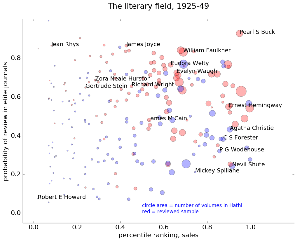
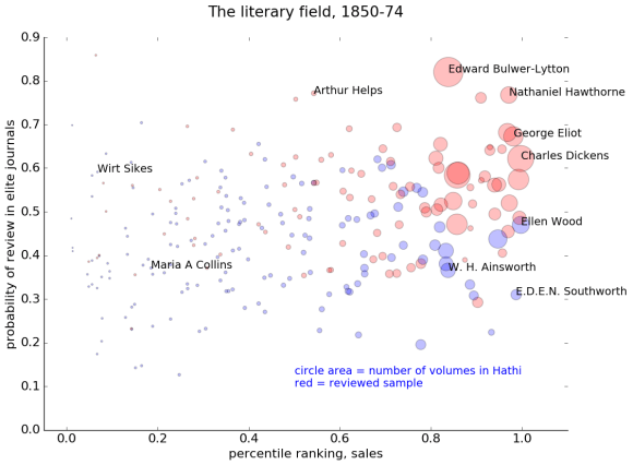
In the diagram below, for instance, the horizontal axis represents sales, and the vertical axis represents prestige. Sales would be easy to measure, if we had all the data. We actually don’t — so see the end of this post for the estimation strategy I adopted. Prestige, on the other hand, is difficult to measure: it’s perspectival and complex. So we modeled prestige by sampling texts that were reviewed in prominent literary magazines, and then training a model that used textual cues to predict the probability that any given book came from the “reviewed” set. An author’s prestige in this diagram is simply the average probability of review for their books. (The Stanford Literary Lab has similarly recreated Bourdieu’s model of distinction in their pamphlet “Canon/Archive,” using academic citations as a measure of prestige.)
field1850noline

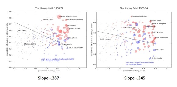
The upward drift of these points reveals a fairly strong correlation between prestige and sales. It is possible to find a few high-selling authors who are predicted to lack critical prestige — notably, for instance, the historical novelist W. H. Ainsworth and the sensation novelist Ellen Wood, author of East Lynne. It’s harder to find authors who have prestige but no sales: there’s not much in the northwest corner of the map. Arthur Helps, a Cambridge Apostle, is a fairly lonely figure.

Fast-forward seventy-five years and we see a different picture.

field1925noline

The correlation between sales and prestige is now weaker; the cloud of authors is “rounder” overall.

There are also more authors in the “upper midwest” portion of the map now — people like Zora Neale Hurston and James Joyce, who have critical prestige but not enormous sales (or not up to 1949, at least as far as my model is aware).

There’s also a distinct “genre fiction” and “pulp fiction” world emerging in the southeast corner of this map, ranging from Agatha Christie to Mickey Spillane. (A few years earlier, Edgar Rice Burroughs and Zane Gray are in the same region.)

Moreover, if you just look at the large circles (the authors we’re most likely to remember), you can start to see how people in this period might get the idea that sales are actually negatively correlated with critical prestige. The right side of the map almost looks like a diagonal line slanting down from William Faulkner to P. G. Wodehouse.

That negative correlation doesn’t really characterize the field as a whole. Critical prestige still has a faint positive correlation with sales, as people over on the left side of the map might sadly remind us. But a brief survey of familiar names could give you the opposite impression.

In short, we’re not necessarily seeing a stronger stratification of the literary field. The change might better be described as a decline in the correlation of two existing forms of distinction. And as they become less correlated, the difference between them becomes more visible, especially among the well-known names on the right side of the map.
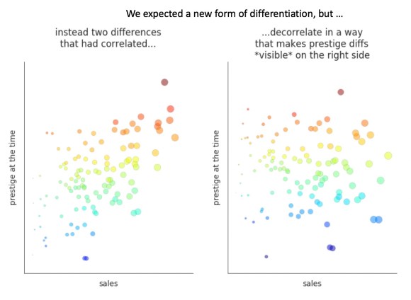
summary

So, while we’re broadly confirming an existing story about literary history, the evidence also suggests that the metaphor of a “great divide” is a bit of an exaggeration. We don’t see any chasm emerging.

Maps of the literary field also help me understand why a classifier trained on an elite “reviewed” sample didn’t necessarily get stronger over time. The correlation of prestige and sales in the Victorian era means that the line separating the red and blue samples was strongly tilted there, and may borrow some of its strength from both axes. (It’s really a boundary between the prominent and the obscure.)
cheating

As we move into the twentieth century, the slope of the line gets flatter, and we get closer to a “pure” model of prestige (as distinguished from sales). But the boundary itself may not grow more clearly marked, if you’re sampling a group of the same size. (However, if you leave The New Republic and New Yorker behind, and sample only works reviewed in little magazines, you do get a more tightly unified group of texts that can be distinguished from a random sample with 83% accuracy.)

This is all great, you say — but how exactly are you “estimating” sales? We don’t actually have good sales figures for every author in HathiTrust Digital Library; we have fairly patchy records that depend on individual publishers.
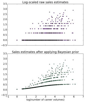
bayesiantransform
For the answer to that question, I’m going to refer you to the github repo where I work out a model of sales. The short version is that I borrow a version of “empirical Bayes” from Julia Silge and David Robinson, and apply it to evidence drawn from bestseller lists as well as digital libraries, to construct a rough estimate of each author’s relative prominence in the market. The trick is, basically, to use the evidence we have to construct an estimate of our uncertainty, and then use our uncertainty to revise the evidence. The picture on the left gives you a rough sense of how that transformation works. I think empirical Bayes may turn out to be useful for a lot of problems where historians need to reconstruct evidence that is patchy or missing in the historical record, but the details are too much to explain here; see Silge’s post and my Jupyter notebook.

Bubble charts invite mouse-over exploration. I can’t easily embed interactive viz in this blog, but here are a few links to plotly visualizations:

https://plot.ly/~TedUnderwood/8/the-literary-field-1850-1874/

https://plot.ly/~TedUnderwood/4/the-literary-field-1875-1899/

https://plot.ly/~TedUnderwood/2/the-literary-field-1900-1924/

https://plot.ly/~TedUnderwood/6/the-literary-field-1925-1949/

Acknowledgments

The texts used here are drawn from HathiTrust via the HathiTrust Research Center. Parts of the research were funded by the Andrew G Mellon Foundation via the WCSA+DC grant, and part by SSHRC via NovelTM.

Most importantly, I want to acknowledge my collaborators on this project, Kyle Johnston, Sabrina Lee, Jessica Mercado, and Jordan Sellers. They contributed a lot of intellectual depth to the project — for instance by doing research that helped us decide which periodicals should represent a given period of literary history.

References

Algee-Hewitt, Mark, and Mark McGurl. “Between Canon and Corpus: Six Perspectives on 20th-Century Novels.” Stanford Literary Lab, Pamphlet 9, 2015. https://litlab.stanford.edu/LiteraryLabPamphlet8.pdf

Algee-Hewitt, Mark, Sarah Allison, Marissa Gemma, Ryan Heuser, Franco Moretti, Hannah Walser. “Canon/Archive: Large-Scale Dynamics in the Literary Field.” Stanford Literary Lab, January 2016. https://litlab.stanford.edu/LiteraryLabPamphlet11.pdf

Altick, Richard D. The English Common Reader: A Social History of the Mass Reading Public 1800-1900. Chicago: University of Chicago Press, 1957.

Bloom, Clive. Bestsellers: Popular Fiction Since 1900. 2nd edition. Houndmills: Palgrave Macmillan, 2008.

Hackett, Alice Payne, and James Henry Burke. 80 Years of Best Sellers 1895-1975. New York: R.R. Bowker, 1977.

Leavis, Q. D. Fiction and the Reading Public. 1935.

Mott, Frank Luther. Golden Multitudes: The Story of Bestsellers in the United States. New York: R. R. Bowker, 1947.

Robinson, David. Introduction to Empirical Bayes: Examples from Baseball Statistics. 2017. http://varianceexplained.org/r/empirical-bayes-book/

Silge, Julia. “Singing the Bayesian Beginner Blues.” data science ish, September 2016. http://juliasilge.com/blog/Bayesian-Blues/

Unsworth, John. 20th Century American Bestsellers. (http://bestsellers.lib.virginia.edu)

Categories
20c pace of historical change statistics

You say you found a revolution.

by Ted Underwood, Hoyt Long, Richard Jean So, and Yuancheng Zhu

This is the second part of a two-part blog post about quantitative approaches to cultural change, focusing especially on a recent article that claimed to identify “stylistic revolutions” in popular music.

Although “The Evolution of Popular Music” (Mauch et al.) appeared in a scientific journal, it raises two broad questions that humanists should care about:

  1. Are measures of the stylistic “distance” between songs or texts really what we mean by cultural change?
  2. If we did take that approach to measuring change, would we find brief periods where the history of music or literature speeds up by a factor of six, as Mauch et al. claim?

Underwood’s initial post last October discussed both of these questions. The first one is more important. But it may also be hard to answer — in part because “cultural change” could mean a range of different things (e.g., the ever-finer segmentation of the music market, not just changes that affect it as a whole).

So putting the first question aside for now, let’s look at the the second one closely. When we do measure the stylistic or linguistic “distance” between works of music or literature, do we actually discover brief periods of accelerated change?

The authors of “The Evolution of Popular Music” say “yes!” Epochal breaks can be dated to particular years.

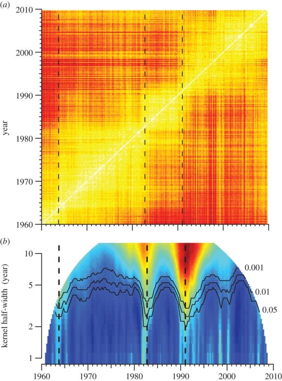
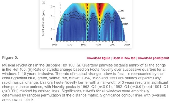
We identified three revolutions: a major one around 1991 and two smaller ones around 1964 and 1983 (figure 5b). From peak to succeeding trough, the rate of musical change during these revolutions varied four- to six-fold.

Tying musical revolutions to particular years (and making 1991 more important than 1964) won the article a lot of attention in the press. Underwood’s questions about these claims last October stirred up an offline conversation with three researchers at the University of Chicago, who have joined this post as coauthors. After gathering in Hyde Park to discuss the question for a couple of days, we’ve concluded that “The Evolution of Popular Music” overstates its results, but is also a valuable experiment, worth learning from. The article calculates significance in a misleading way: only two of the three “revolutions” it reported are really significant at p < 0.05, and it misses some odd periods of stasis that are just as significant as the periods of acceleration. But these details are less interesting than the reason for the error, which involved a basic challenge facing quantitative analysis of history.

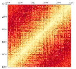
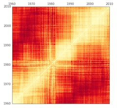
To explain that problem, we’ll need to explain the central illustration in the original article. The authors’ strategy was to take every quarter-year of the Billboard Hot 100 between 1960 and 2010, and compare it to every other quarter, producing a distance matrix where light (yellow-white) colors indicate similarity, and dark (red) colors indicate greater differences. (Music historians may wonder whether “harmonic and timbral topics” are the right things to be comparing in the first place, and it’s a fair question — but not central to our purpose in this post, so we’ll give it a pass.)

You see a diagonal white line in the matrix, because comparing a quarter to itself naturally produces a lot of similarity. As you move away from that line (to the upper left or lower right), you’re making comparisons across longer and longer spans of time, so colors become darker (reflecting greater differences).

F5.large
Figure 5 from Mauch, et. al., “The evolution of popular music” (RSOS 2015).

Then, underneath the distance matrix, Mauch et al. provide a second illustration that measures “Foote novelty” for each quarter. This is a technique for segmenting audio files developed by Jonathan Foote. The basic idea is to look for moments of acceleration where periods of relatively slow change are separated by a spurt of rapid change. In effect, that means looking for a point where yellow “squares” of similarity touch at their corners.

For instance, follow the dotted line associated with 1991 in the illustration above up to its intersection with the white diagonal. At that diagonal line, 1991 is (unsurprisingly) similar to itself. But if you move upward in the matrix (comparing 1991 to its own future), you rapidly get into red areas, revealing that 1994 is already quite different. The same thing is true if you move over a year to 1992 and then move down (comparing 1992 to its own past). At a “pinch point” like this, change is rapid. According to “The Evolution of Popular Music,” we’re looking at the advent of rap and hip-hop in the Billboard Hot 100. Contrast this pattern, for instance, to a year like 1975, in the middle of a big yellow square, where it’s possible to move several years up or down without encountering significant change.

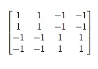
matrixMathematically, “Foote novelty” is measured by sliding a smaller matrix along the diagonal timeline, multiplying it element-wise with the measurements of distance underlying all those red or yellow points. Then you add up the multiplied values. The smaller matrix has positive and negative coefficients corresponding to the “squares” you want to contrast, as seen on the right.
As you can see, matrices of this general shape will tend to produce a very high sum when they reach a pinch point where two yellow squares (of small distances) are separated by the corners of reddish squares (containing large distances) to the upper left and lower right. The areas of ones and negative-ones can be enlarged to measure larger windows of change.

This method works by subtracting the change on either side of a temporal boundary from the changes across the boundary itself. But it has one important weakness. The contrast between positive and negative areas in the matrix is not apples-to-apples, because comparisons made across a boundary are going to stretch across a longer span of time, on average, than the comparisons made within the half-spans on either side. (Concretely, you can see that the ones in the matrix above will be further from the central diagonal timeline than the negative-ones.)

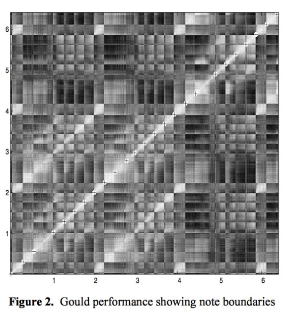
If you’re interested in segmenting music, that imbalance may not matter. There’s a lot of repetition in music, and it’s not always true that a note will resemble a nearby note more than it resembles a note from elsewhere in the piece. Here’s a distance matrix, for instance, from The Well-Tempered Clavier, used by Foote as an example.

GouldMatrix
From Foote, “Automatic Audio Segmentation Using a Measure of Audio Novelty.”

Unlike the historical matrix in “The Evolution of Popular Music,” this has many light spots scattered all over — because notes are often repeated.

OriginalMatrix
Original distance matrix produced using data from Mauch et al. (2015).

History doesn’t repeat itself in the same way. It’s extremely likely (almost certain) that music from 1992 will resemble music from 1991 more than it resembles music from 1965. That’s why the historical distance matrix has a single broad yellow path running from lower left to upper right.

As a result, historical sequences are always going to produce very high measurements of Foote novelty.  Comparisons across a boundary will always tend to create higher distances than the comparisons within the half-spans on either side, because differences across longer spans of time always tend to be bigger.

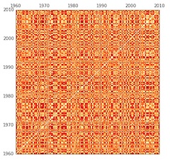
BadlyRandom
Matrix produced by permuting years and then measuring the distances between them.

This also makes it tricky to assess the significance of “Foote novelty” on historical evidence. You might ordinarily do this using a “permutation test.” Scramble all the segments of the timeline repeatedly and check Foote novelty each time, in order to see how often you get “squares” as big or well-marked as the ones you got in testing the real data. But that sort of scrambling will make no sense at all when you’re looking at history. If you scramble the years, you’ll always get a matrix that has a completely different structure of similarity — because it’s no longer sequential.

The Foote novelties you get from a randomized matrix like this will always be low, because “Foote novelty” partly measures the contrast between areas close to, and far from, the diagonal line (a contrast that simply doesn’t exist here).

Figure5

This explains a deeply puzzling aspect of the original article. If you look at the significance curves labeled .001, .01, and 0.05 in the visualization of Foote novelties (above), you’ll notice that every point in the original timeline had a strongly significant novelty score. As interpreted by the caption, this seems to imply that change across every point was faster than average for the sequence … which … can’t possibly be true everywhere.

All this image really reveals is that we’re looking at evidence that takes the form of a sequential chain. Comparisons across long spans of time always involve more difference than comparisons across short ones — to an extent that you would never find in a randomized matrix.

In short, the tests in Mauch et al. don’t prove that there were significant moments of acceleration in the history of music. They just prove that we’re looking at historical evidence! The authors have interpreted this as a sign of “revolution,” because all change looks revolutionary when compared to temporal chaos.

On the other hand, when we first saw the big yellow and red squares in the original distance matrix, it certainly looked like a significant pattern. Granted that the math used in the article doesn’t work — isn’t there some other way to test the significance of these variations?

It took us a while to figure out, but there is a reliable way to run significance tests for Foote novelty. Instead of scrambling the original data, you need to permute the distances along diagonals of the distance matrix.

diagonally_permuted
Produced by permuting diagonals in the original matrix.

In other words, you take a single diagonal line in the original matrix and record the measurements of distance along that line. (If you’re looking at the central diagonal, this will contain a comparison of every quarter to itself; if you move up one notch, it will contain a comparison of every quarter to the quarter in its immediate future.) Then you scramble those values randomly, and put them back on the same line in the matrix. (We’ve written up a Jupyter notebook showing how to do it.) This approach distributes change randomly across time while preserving the sequential character of the data: comparisons over short spans of time will still tend to reveal more similarity than long ones.

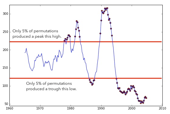
If you run this sort of permutation 100 times, you can discover the maximum and minimum Foote novelties that would be likely to occur by chance.

5yrFootes
Measurements of Foote novelty produced by a matrix with a five-year half-width, and the thresholds for significance.

Variation between the two red lines isn’t statistically significant — only the peaks of rapid change poking above the top line, and the troughs of stasis dipping below the bottom line. (The significance of those troughs couldn’t become visible in the original article, because the question had been framed in a way that made smaller-than-random Foote novelties impossible by definition.)

These corrected calculations do still reveal significant moments of acceleration in the history of the Billboard Hot 100: two out of three of the “revolutions” Mauch et al. report (around 1983 and 1991) are still significant at p < 0.05 and even p < 0.001. (The British Invasion, alas, doesn’t pass the test.) But the calculations also reveal something not mentioned in the original article: a very significant slowing of change after 1995.

Can we still call the moments of acceleration in this graph stylistic “revolutions”?

Foote novelty itself won’t answer the question. Instead of directly measuring a rate of change, it measures a difference between rates of change in overlapping periods. But once we’ve identified the periods that interest us, it’s simple enough to measure the pace of change in each of them. You can just divide the period in half and compare the first half to the second (see the “Effect size” section in our Jupyter notebook). This confirms the estimate in Mauch et al.: if you compare the most rapid period of change (from 1990 to 1994) to the slowest four years (2001 to 2005), there is a sixfold difference between them.

On the other hand, it could be misleading to interpret this as a statement about the height of the early-90s “peak” of change, since we’re comparing it to an abnormally stable period in the early 2000s. If we compare both of those periods to the mean rate of change across any four years in this dataset, we find that change in the early 90s was about 171% of the mean pace, whereas change in the early 2000s was only 29% of mean. Proportionally, the slowing of change after 1995 might be the more dramatic aberration here.

Overall, the picture we’re seeing is different from the story in “The Evolution of Popular Music.” Instead of three dramatic “revolutions” dated to specific years, we see two periods where change was significantly (but not enormously) faster than average, and two periods where it was slower. These periods range from four to fifteen years in length.

Humanists will surely want to challenge this picture in theoretical ways as well. Was the Billboard Hot 100 the right sample to be looking at? Are “timbral topics” the right things to be comparing? These are all valid questions.

But when scientists make quantitative claims about humanistic subjects, it’s also important to question the quantitative part of their argument. If humanists begin by ceding that ground, the conversation can easily become a stalemate where interpretive theory faces off against the (supposedly objective) logic of science, neither able to grapple with the other.

One of the authors of “The Evolution of Popular Music,” in fact, published an editorial in The New York Times representing interdisciplinary conversation as exactly this sort of stalemate between “incommensurable interpretive fashions” and the “inexorable logic” of math (“One Republic of Learning,” NYT Feb 2015). But in reality, as we’ve just seen, the mathematical parts of an argument about human culture also encode interpretive premises (assumptions, for instance, about historical difference and similarity). We need to make those premises explicit, and question them.

Having done that here, and having proposed a few corrections to “The Evolution of Popular Music,” we want to stress that the article still seems to us a bold and valuable experiment that has advanced conversation about cultural history. The basic idea of calculating “Foote novelty” on a distance matrix is useful: it can give historians a way of thinking about change that acknowledges several different scales of comparison at once.

The authors also deserve admiration for making their data available; that transparency has permitted us to replicate and test their claims, just as Andrew Goldstone recently tested Ted Underwood’s model of poetic prestige, and Annie Swafford tested Matt Jockers’ syuzhet package. Our understanding of these difficult problems can only advance through collective practices of data-sharing and replication. Being transparent in our methods is more important, in the long run, than being right about any particular detail.

The authors want to thank the NovelTM project for supporting the collaboration reported here. (And we promise to apply these methods to the history of the novel next.)

References:

Jonathan Foote. Automatic audio segmentation using a measure of audio novelty. In Proceedings of IEEE International Conference on Multimedia and Expo, vol. I, pp. 452-455, 2000.

Mauch et al. 2015. “The Evolution of Popular Music.” Royal Society Open Science. May 6, 2015. DOI: 10.1098/rsos.150081

Postscript: Several commenters on the original blog post proposed simpler ways of measuring change that begin by comparing adjacent segments of a timeline. This an intuitive approach, and a valid one, but it does run into difficulties — as we discovered when we tried to base changepoint analysis on it (Jupyter notebook here). The main problem is that apparent trajectories of change can become very delicately dependent on the particular window of comparison you use. You’ll see lots of examples of that problem toward the end of our notebook.

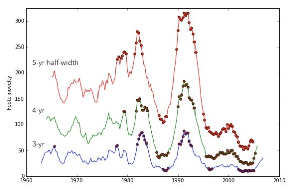
The advantage of the “Foote novelty” approach is that it combines lots of different scales of comparison (since you’re considering all the points in a matrix — some closer and some farther from the timeline). That makes the results more robust. Here, for instance, we’ve overlaid the “Foote novelties” generated by three different windows of comparison on the music dataset, flagging the quarters that are significant at p < 0.05 in each case.

3yrTo5yr

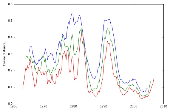
This sort of close congruence is not something we found with simpler methods. Compare the analogous image below, for instance. Part of the chaos here is a purely visual issue related to the separation of curves — but part comes from using segments rather than a distance matrix.

SegmentComparison

Categories
interpretive theory statistics

Do humanists get their ideas from anything at all?

My reaction to Stanley Fish’s third column on digital humanities was at first so negative that I thought it not worth writing about. But in the light of morning, there is something here worth discussing. Fish raises a neglected issue that I (and a bunch of other people cited at the end of this post) have been trying to foreground: the role of discovery in the humanities. He raises the issue symptomatically, by suppressing it, but the problem is too important to let that slide.

Fish argues, in essence, that digital humanists let the data suggest hypotheses for them instead of framing hypotheses that are then tested against evidence.

The usual way of doing this is illustrated by my example: I began with a substantive interpretive proposition … and, within the guiding light, indeed searchlight, of that proposition I noticed a pattern that could, I thought be correlated with it. I then elaborated the correlation.

The direction of my inferences is critical: first the interpretive hypothesis and then the formal pattern, which attains the status of noticeability only because an interpretation already in place is picking it out.

The direction is the reverse in the digital humanities: first you run the numbers, and then you see if they prompt an interpretive hypothesis. The method, if it can be called that, is dictated by the capability of the tool.

The underlying element of truth here is that all researchers — humanists and scientists alike — do need to separate the process of discovering a hypothesis from the process of testing it. Otherwise you run into what we unreflecting empiricists call “the problem of data dredging.” If you simply sweep a net through an ocean of data, and frame a conclusion based on whatever you catch, you’re not properly testing anything, because you’re implicitly testing an infinite number of hypotheses that are left unstated — and the significance of any single test is reduced when it’s run as part of a large battery.

That’s true, but it’s also a problem that people who do data mining are quite self-conscious about. It’s why I never stop linking to this xkcd comic about “significance.” And it’s why Matt Wilkens (mistargeted by Fish as an emblem of this interpretive sin) goes through a deliberately iterative process of first framing hypotheses about nineteenth-century geographical imagination and then testing them. (For instance, after noticing that certain states seem especially prominent in 19c American fiction, he tests whether this remains true after you compensate for differences in population size, and then proposes a pair of hypotheses that he suggests will need to be evaluated against additional “test cases.”)

Wiliam Blake, "Satan, Sin, and Death"

More importantly, Fish profoundly misrepresents his own (traditional) interpretive procedure by pretending that the act of interpretation is wholly contained in a single encounter with evidence. On his account we normally begin with a hypothesis (which seems to have sprung, like Sin, fully-formed from our head), and test it against a single sentence.

In reality, of course, our “interpretive proposition” is often suggested by the same evidence that confirms it. Or — more commonly — we derive a hypothesis from one example, and then read patiently through dozens of books until we have gathered enough confirming evidence to write a chapter. This process runs into a different interpretive fallacy: if you keep testing a hypothesis until you’ve confirmed it, you’re not testing it at all. And it’s a bit worse than that, because in practice what we do now is go to a full-text search engine and search for terms that would go together if our assumptions were correct. (In the example Fish offers, this might be “bishops” and “presbyters.”) If you find three sentences where those terms coincide, you’ve got more than enough evidence to prop up an argument, using our richly humanistic (cough, anecdotal) conception of evidence. And of course a full-text search engine can find you three examples of just about anything. But we don’t have to worry about this, because search engines are not tools that dictate a method; they are transparent extensions of our interpretive sensibility.

The basic mistake that Fish is making is this: he pretends that humanists have no discovery process at all. For Fish, the interpretive act is always fully contained in an encounter with a single piece of evidence. How your “interpretive proposition” got framed in the first place is a matter of no consequence: some readers are just fortunate to have propositions that turn out to be correct. Fish is not alone in this idealized model of interpretation; it’s widespread among humanists.

Fish is resisting the assistance of digital techniques, not because they would impose scientism on the humanities, but because they would force us to acknowledge that our ideas do after all come from somewhere — whether a search engine or a commonplace book. But as Peter Stallybrass eloquently argued five years ago in PMLA (h/t Mark Sample) the process of discovery has always been collaborative, and has long — at least since early modernity — been embodied in specific textual technologies.

References
Stallybrass, Peter. “Against Thinking.” PMLA 122.5 (2007): 1580-1587.
Wilkens, Matthew. “Geolocation Extraction and Mapping of Nineteenth-Century U.S. Fiction.” DHCS 2011.
On the process of embodied play that generates ideas, see also Stephen Ramsay’s book Reading Machines (University of Illinois Press, 2011).

Categories
math methodology statistics undigitized humanities

A brief outburst about numbers.

In responding to Stanley Fish last week, I tried to acknowledge that the “digital humanities,” in spite of their name, are not centrally about numbers. The movement is very broad, and at the broadest level, it probably has more to do with networked communication than it does with quantitative analysis.

The older tradition of “humanities computing” — which was about numbers — has been absorbed into this larger movement. But it’s definitely the part of DH that humanists are least comfortable with, and it often has to apologize for itself. So, for instance, I’ve spent much of the last year reminding humanists that they’re already using quantitative text mining in the form of search engines — so it can’t be that scary.* Kathleen Fitzpatrick recently wrote a post suggesting that “one key role for a ‘worldly’ digital humanities may well be helping to break contemporary US culture of its unthinking association of numbers with verifiable reality….” Stephen Ramsay’s Reading Machines manages to call for an “algorithmic criticism” while at the same time suggesting that humanists will use numbers in ways that are altogether different from the way scientists use them (or at least different from “scientism,” an admittedly ambiguous term).

I think all three of us (Stephen, Kathleen, and myself) are making strategically necessary moves. Because if you tell humanists that we do (also) need to use numbers the way scientists use them, your colleagues are going to mutter about naïve quests for certainty, shake their heads, and stop listening. So digital humanists are rhetorically required to construct positivist scapegoats who get hypothetically chased from our villages before we can tell people about the exciting new kinds of analysis that are becoming possible. And, to be clear, I think the people I’ve cited (including me) are doing that in fair and responsible ways.

However, I’m in an “eppur si muove” mood this morning, so I’m going to forget strategy for a second and call things the way I see them. <Begin Galilean outburst>

In reality, scientists are not naïve about the relationship between numbers and certainty, because they spend a lot of time thinking about statistics. Statistics is the science of uncertainty, and it insists — as forcefully as any literary theorist could — that every claim comes accompanied by a specific kind of ignorance. Once you accept that, you can stop looking for absolute knowledge, and instead reason concretely about your own relative uncertainty in a given instance. I think humanists’ unfamiliarity with this idea may explain why our critiques of data mining so often taken the form of pointing to a small error buried somewhere in the data: unfamiliarity with statistics forces us to fall back on a black-and-white model of truth, where the introduction of any uncertainty vitiates everything.

Moreover, the branch of statistics most relevant to text mining (Bayesian inference) is amazingly, almost bizarrely willing to incorporate subjective belief into its definition of knowledge. It insists that definitions of probability have to depend not only on observed evidence, but on the “prior probabilities” that we expected before we saw the evidence. If humanists were more familiar with Bayesian statistics, I think it would blow a lot of minds.

I know the line about “lies, damn lies, and so on,” and it’s certainly true that statistics can be abused, as this classic xkcd comic shows. But everything can be abused. The remedy for bad verbal argument is not to “remember that speech should stay in its proper sphere” — it’s to speak better and more critically. Similarly, the remedy for bad quantitative argument is not “remember that numbers have to stay in their proper sphere”; it’s to learn statistics and reason more critically.

possible shapes of the Beta distribution, from Wikpedia

None of this is to say that we can simply borrow tools or methods from scientists unchanged. The humanities have a lot to add — especially when it comes to the social and historical character of human behavior. I think there are fascinating advances taking place in data science right now. But when you take apart the analytic tools that computer scientists have designed, you often find that they’re based on specific mistaken assumptions about the social character of language. For instance, there’s a method called “Topics over Time” that I want to use to identify trends in the written record (Wang and McCallum, 2006). The people who designed it have done really impressive work. But if a humanist takes apart the algorithm underlying this method, they will find that it assumes that every trend can be characterized as a smooth curve called a “Beta distribution.” Whereas in fact, humanists have evidence that the historical trajectory of a topic is often more complex than that, in ways that really matter. So before I can use this tool, I’m going to have to fix that part of the method.
The diachronic behavior a topic can actually exhibit.

But this is a problem that can be fixed, in large part, by fixing the numbers. Humanists have a real contribution to make to the science of data mining, but it’s a contribution that can be embodied in specific analytic insights: it’s not just to hover over the field like the ghost of Ben Kenobi and warn it about hubris.

</Galilean outburst>

For related thoughts, somewhat more temperate than the outburst above, see this excellent comment by Matthew Wilkens, responding to a critique of his work by Jeremy Rosen.

* I credit Ben Schmidt for this insight so often that regular readers are probably bored. But for the record: it comes from him.