Categories
19c 20c Bayesian topic modeling disciplinary history interpretive theory visualization

What can topic models of PMLA teach us about the history of literary scholarship?

by Andrew Goldstone and Ted Underwood

Of all our literary-historical narratives it is the history of criticism itself that seems most wedded to a stodgy history-of-ideas approach—narrating change through a succession of stars or contending schools. While scholars like John Guillory and Gerald Graff have produced subtler models of disciplinary history, we could still do more to complicate the narratives that organize our discipline’s understanding of itself.

A browsable network based on Underwood's model of PMLA. Click through, then mouse over or click on individual topics.
The archive of scholarship is also, unlike many twentieth-century archives, digitized and available for “distant reading.” Much of what we need is available through JSTOR’s Data for Research API. So last summer it occurred to a group of us that topic modeling PMLA might provide a new perspective on the history of literary studies. Although Goldstone and Underwood are writing this post, the impetus for the project also came from Natalia Cecire, Brian Croxall, and Roger Whitson, who may do deeper dives into specific aspects of this archive in the near future.

Topic modeling is a technique that automatically identifies groups of words that tend to occur together in a large collection of documents. It was developed about a decade ago by David Blei among others. Underwood has a blog post explaining topic modeling, and you can find a practical introduction to the technique at the Programming Historian. Jonathan Goodwin has explained how it can be applied to the word-frequency data you get from JSTOR.

Obviously, PMLA is not an adequate synecdoche for literary studies. But, as a generalist journal with a long history, it makes a useful test case to assess the value of topic modeling for a history of the discipline.

Goldstone and Underwood each independently produced several different models of PMLA, using different software, stopword lists, and numbers of topics. Our results overlapped in places and diverged in places. But we’ve reached a shared sense that topic modeling can enrich the history of literary scholarship by revealing trends that are presently invisible.

What is a topic?
A “topic model” assigns every word in every document to one of a given number of topics. Every document is modeled as a mixture of topics in different proportions. A topic, in turn, is a distribution of words—a model of how likely given words are to co-occur in a document. The algorithm (called LDA) knows nothing “meta” about the articles (when they were published, say), and it knows nothing about the order of words in a given document.

100 topics from PMLA.
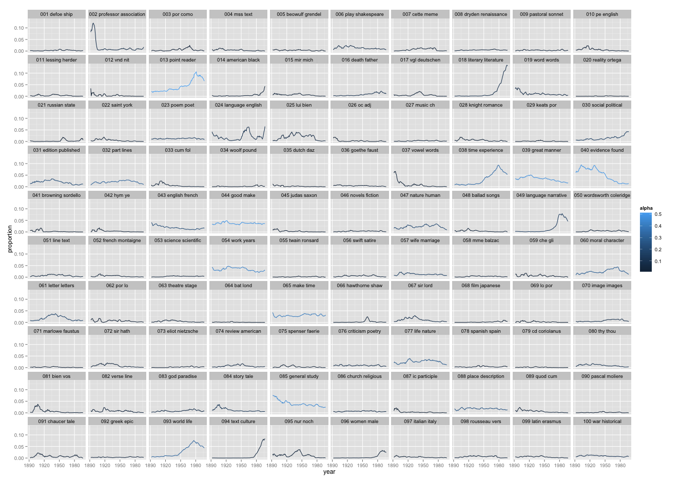
This is a picture of 5940 articles from PMLA, showing the changing presence of each of 100 "topics" in PMLA over time. (Click through to enlarge; a longer list of topic keywords is here.) For example, the most probable words in the topic arbitrarily numbered 59 in the model visualized above are, in descending order:

che gli piu nel lo suo sua sono io delle perche questo quando ogni mio quella loro cosi dei

This is not a “topic” in the sense of a theme or a rhetorical convention. What these words have in common is simply that they’re basic Italian words, which appear together whenever an extended Italian text occurs. And this is the point: a “topic” is neither more nor less than a pattern of co-occurring words.

Nonetheless, a topic like topic 59 does tell us about the history of PMLA. The articles where this topic achieved its highest proportion were:

Antonio Illiano, “Momenti e problemi di critica pirandelliana: L’umorismo, Pirandello e Croce, Pirandello e Tilgher,” PMLA 83 no. 1 (1968): pp. 135-143
Domenico Vittorini, “I Dialogi ad Petrum Histrum di Leonardo Bruni Aretino (Per la Storia del Gusto Nell’Italia del Secolo XV),” PMLA 55 no. 3 (1940): pp. 714-720
Vincent Luciani, “Il Guicciardini E La Spagna,” PMLA 56 no. 4 (1941): pp. 992-1006

And here’s a plot of the changing proportions of this topic over time, showing moving 1-year and 5-year averages:

topic59line
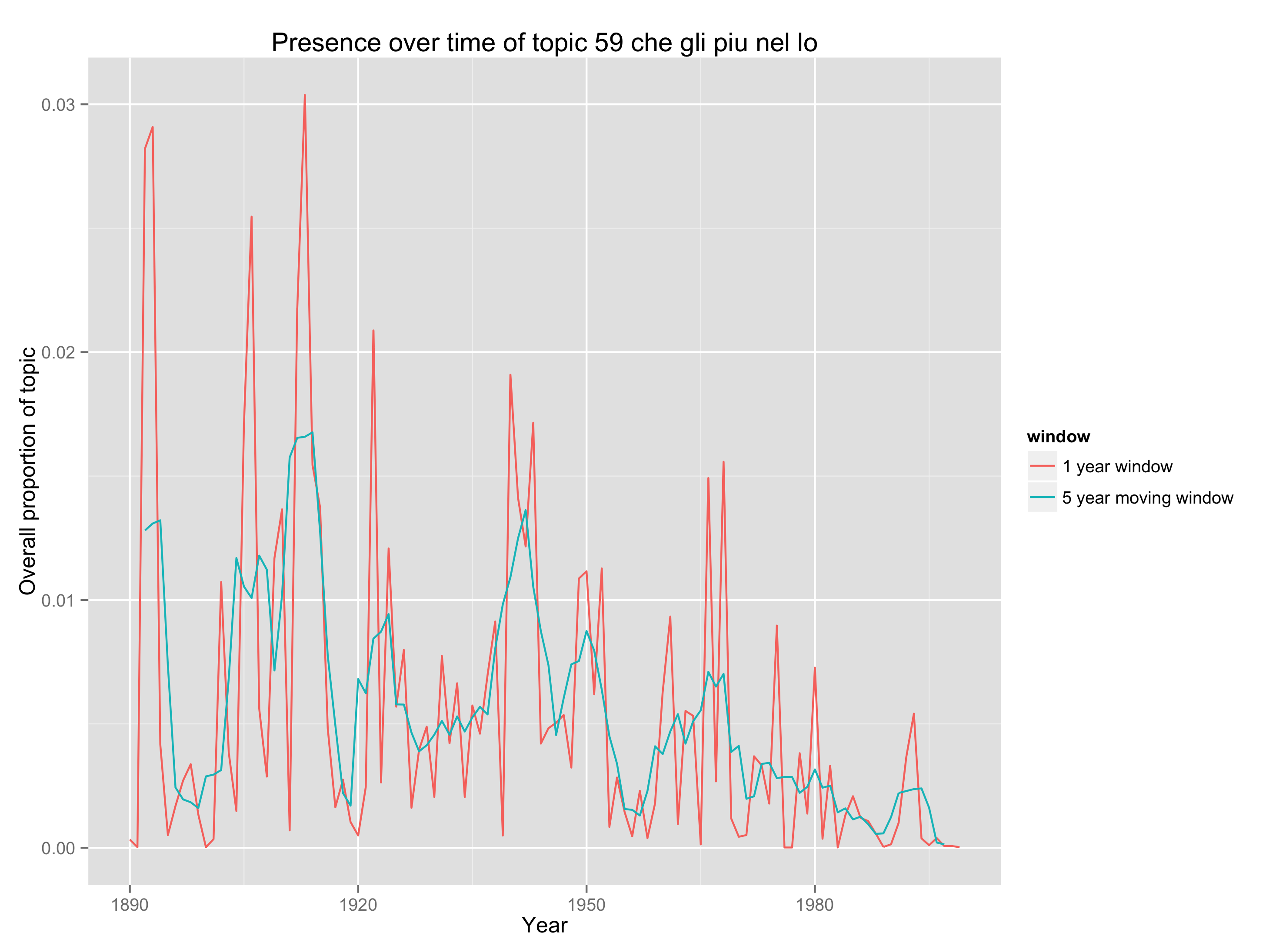
We see something about PMLA that is worth remembering for the history of criticism, namely, that it has embedded Italian less and less frequently in its language since midcentury. (The model shows that the same thing is true of French and German.)

What can topics tell us about the history of theory?
Of course a topic can also be a subject category—modeling PMLA, we have found topics that are primarily “about Beowulf” or “about music.” Or a topic can be a group of words that tend to co-occur because they’re associated with a particular critical approach.

Here, for instance, we have a topic from Underwood’s 150-topic model associated with discussions of pattern and structure in literature. We can characterize it by listing words that occur more commonly in the topic than elsewhere, or by graphing the frequency of the topic over time, or by listing a few articles where it’s especially salient.

Topic 109 from Underwood's model of 150 topics.
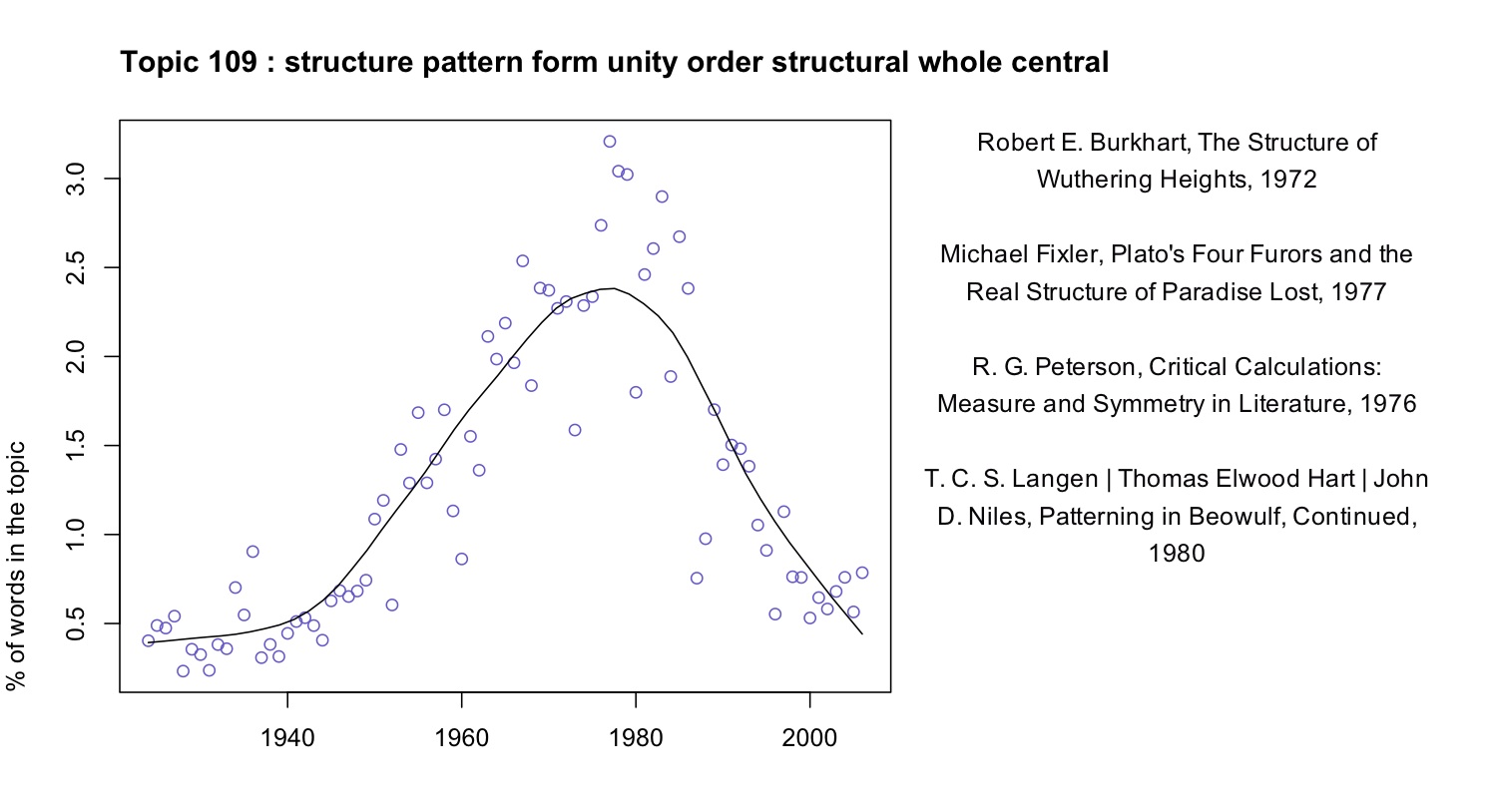
At first glance this topic might seem to fit neatly into a familiar story about critical history. We know that there was a mid-twentieth-century critical movement called “structuralism,” and the prominence of “structure” here might suggest that we’re looking at the rise and fall of that movement. In part, perhaps, we are. But the articles where this topic is most prominent are not specifically “structuralist.” In the top four articles, Ferdinand de Saussure, Claude Lévi-Strauss, and Northrop Frye are nowhere in evidence. Instead these articles appeal to general notions of symmetry, or connect literary patterns to Neoplatonism and Renaissance numerology.

By forcing us to attend to concrete linguistic practice, topic modeling gives us a chance to bracket our received assumptions about the connections between concepts. While there is a distinct mid-century vogue for structure, it does not seem strongly associated with the concepts that are supposed to have motivated it (myth, kinship, language, archetype). And it begins in the 1940s, a decade or more before “structuralism” is supposed to have become widespread in literary studies. We might be tempted to characterize the earlier part of this trend as “New Critical interest in formal unity” and the latter part of it as “structuralism.” But the dividing line between those rationales for emphasizing pattern is not evident in critical vocabulary (at least not at this scale of analysis).

This evidence doesn’t necessarily disprove theses about the history of structuralism. Topic modeling might not reveal varying “rationales” for using a word even if those rationales did vary. The strictly linguistic character of this technique is a limitation as well as a strength: it’s not designed to reveal motivation or conflict. But since our histories of criticism are already very intellectual and agonistic, foregrounding the conscious beliefs of contending critical “schools,” topic modeling may offer a useful corrective. This technique can reveal shifts of emphasis that are more gradual and less conscious than the ones we tend to celebrate.

It may even reveal shifts of emphasis of which we were entirely unaware. “Structure” is a familiar critical theme, but what are we to make of this?

Topic 79 from Underwood's 150-topic model.
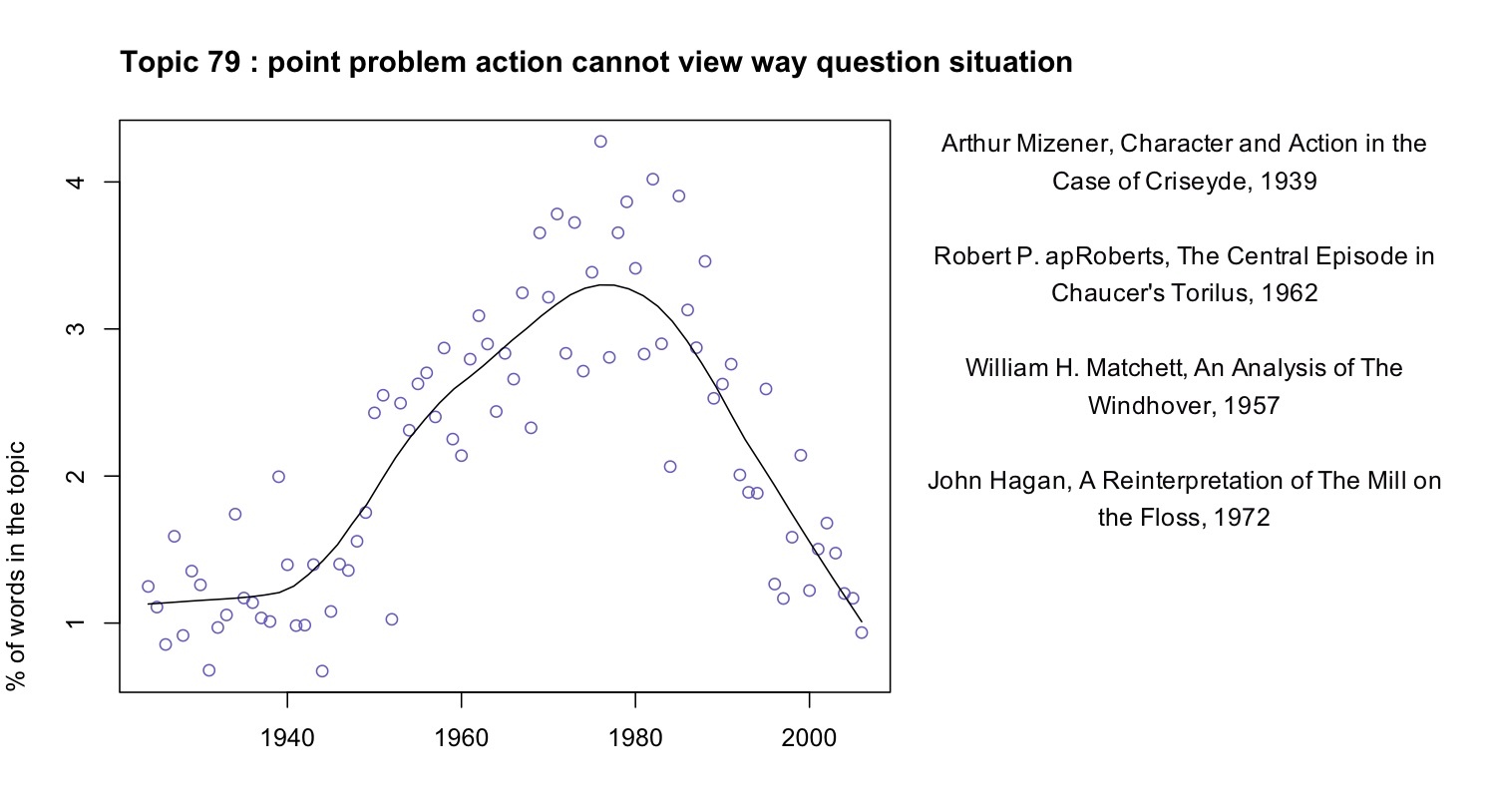
A fuller list of terms included in this topic would include “character”, “fact,” “choice,” “effect,” and “conflict.” Reading some of the articles where the topic is prominent, it appears that in this topic “point” is rarely the sort of point one makes in an argument. Instead it’s a moment in a literary work (e.g., “at the point where the rain occurs,” in Robert apRoberts 379). Apparently, critics in the 1960s developed a habit of describing literature in terms of problems, questions, and significant moments of action or choice; the habit intensified through the early 1980s and then declined. This habit may not have a name; it may not line up neatly with any recognizable school of thought. But it’s a fact about critical history worth knowing.

Note that this concern with problem-situations is embodied in common words like “way” and “cannot” as well as more legible, abstract terms. Since common words are often difficult to interpret, it can be tempting to exclude them from the modeling process. It’s true that a word like “the” isn’t likely to reveal much. But subtle, interesting rhetorical habits can be encoded in common words. (E.g. “itself” is especially common in late-20c theoretical topics.)

We don’t imagine that this brief blog post has significantly contributed to the history of criticism. But we do want to suggest that topic modeling could be a useful resource for that project. It has the potential to reveal shifts in critical vocabulary that aren’t well described, and that don’t fit our received assumptions about the history of the discipline.

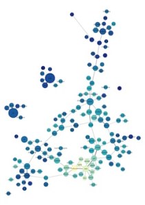
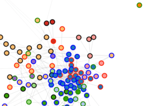
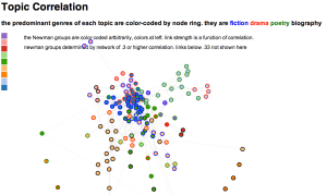
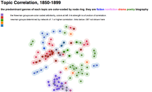
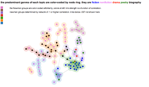
Why browse topics as a network?
The fact that a word is prominent in topic A doesn’t prevent it from also being prominent in topic B. So certain generalizations we might make about an individual topic (for instance, that Italian words decline in frequency after midcentury) will be true only if there’s not some other “Italian” topic out there, picking up where the first one left off.

For that reason, interpreters really need to survey a topic model as a whole, instead of considering single topics in isolation. But how can you browse a whole topic model? We’ve chosen relatively small numbers of topics, but it would not be unreasonable to divide literary scholarship into, say, 500 topics. Information overload becomes a problem.

A browsable image map of 150 topics from PMLA. After you click through you can mouseover (or click) individual topics for more information.
We’ve found network graphs useful here. Click on the image of the network on the right to browse Underwood’s 150-topic model. The size of each node (roughly) indicates the number of words in the topic; color indicates the average date of words. (Blue topics are older; yellow topics are more recent.) Topics are linked to each other if they tend to appear in the same articles. Topics have been labeled with their most salient word—unless that word was already taken for another topic, or seemed misleading. Mousing over a topic reveals a list of words associated with it; with most topics it’s also possible to click through for more information.

The structure of the network makes a loose kind of sense. Topics in French and German form separate networks floating free of the main English structure. Recent topics tend to cluster at the bottom of the page. And at the bottom, historical and pedagogical topics tend to be on the left, while formal, phenomenological, and aesthetic categories tend to be on the right.

But while it’s a little eerie to see patterns like this emerge automatically, we don’t advise readers to take the network structure too seriously. A topic model isn’t a network, and mapping one onto a network can be misleading. For instance, topics that are physically distant from each other in this visualization are not necessarily unrelated. Connections below a certain threshold go unrepresented.

Goldstone's 100-topic model of PMLA; click through to enlarge.
Goldstone’s 100-topic model of PMLA; click through to enlarge.
Moreover, as you can see by comparing illustrations in this post, a little fiddling with dials can turn the same data into networks with rather different shapes. It’s probably best to view network visualization as a convenience. It may help readers browse a model by loosely organizing topics—but there can be other equally valid ways to organize the same material.

How did our models differ?
The two models we’ve examined so far in this post differ in several ways at once. They’re based on different spans of PMLA‘s print run (1890–1999 and 1924–2006). They were produced with different software. Perhaps most importantly, we chose different numbers of topics (100 and 150).

But the models we’re presenting are only samples. Goldstone and Underwood each produced several models of PMLA, changing one variable at a time, and we have made some closer apples-to-apples comparisons.

Broadly, the conclusion we’ve reached is that there’s both a great deal of fluidity and a great deal of consistency in this process. The algorithm has to estimate parameters that are impossible to calculate exactly. So the results you get will be slightly different every time. If you run the algorithm on the same corpus with the same number of topics, the changes tend to be fairly minor. But if you change the number of topics, you can get results that look substantially different.

On the other hand, to say that two models “look substantially different” isn’t to say that they’re incompatible. A jigsaw puzzle cut into 100 pieces looks different from one with 150 pieces. If you examine them piece by piece, no two pieces are the same—but once you put them together you’re looking at the same picture. In practice, there was a lot of overlap between our models; on the older end of the spectrum you often see a topic like “evidence fact,” while the newer end includes topics that foreground narrative, rhetoric, and gender. Some of the more surprising details turned out to be consistent as well. For instance, you might expect the topic “literary literature” to skew toward the older end of the print run. But in fact this is a relatively recent topic in both of our models, associated with discussion of canonicity. (Perhaps the owl of Minerva flies only at dusk?)

Contrasting models: a short example
While some topics look roughly the same in all of our models, it’s not always possible to identify close correlates of that sort. As you vary the overall number of topics, some topics seem to simply disappear. Where do they go? For example, there is no exact counterpart in Goldstone’s model to that “structure” topic in Underwood’s model. Does that mean it is a figment? Underwood isolated the following article as the most prominent exemplar:

Robert E. Burkhart, The Structure of Wuthering Heights, Letter to the Editor, PMLA 87 no. 1 (1972): 104–5. (Incidentally, jstor has miscategorized this as a “full-length article.”)

Goldstone’s model puts more than half of Burkhart’s comment in three topics:

0.24 topic 38 time experience reality work sense form present point world human process structure concept individual reader meaning order real relationship

0.13 topic 46 novels fiction poe gothic cooper characters richardson romance narrator story novelist reader plot novelists character reade hero heroine drf

0.12 topic 13 point reader question interpretation meaning make reading view sense argument words word problem makes evidence read clear text readers

The other prominent documents in Underwood’s 109 are connected to similar topics in Goldstone’s model. The keywords for Goldstone’s topic 38, the top topic here, immediately suggest an affinity with Underwood’s topic 109. Now compare the time course of Goldstone’s 38 with Underwood’s 109 (the latter is above):

It is reasonable to infer that some portion of the words in Underwood’s “structure” topic are absorbed in Goldstone’s “time experience” topic. But “time experience reality work sense” looks less like vocabulary for describing form (although “form” and “structure” are included in it, further down the list; cf. the top words for all 100 topics), and more like vocabulary for talking about experience in generalized ways—as is also suggested by the titles of some articles in which that topic is substantially present:

“The Vanishing Subject: Empirical Psychology and the Modern Novel”
“Metacommentary”
“Toward a Modern Humanism”
“Wordsworth’s Inscrutable Workmanship and the Emblems of Reality”

This version of the topic is no less “right” or “wrong” than the one in Underwood’s model. They both reveal the same underlying evidence of word use, segmented in different but overlapping ways. Instead of focusing our vision on affinities between “form” and “structure”, Goldstone’s 100-topic model shows a broader connection between the critical vocabulary of form and structure and the keywords of “humanistic” reflection on experience.

The most striking contrast to these postwar themes is provided by a topic which dominates in the prewar period, then gives way before “time experience” takes hold. Here are box plots by ten-year intervals of the proportions of another topic, Goldstone’s topic 40, in PMLA articles:

Underwood’s model shows a similar cluster of topics centering on questions of evidence and textual documentation, which similarly decrease in frequency. The language of PMLA has shown a consistently declining interest in “evidence found fact” in the era of the postwar research university.

So any given topic model of a corpus is not definitive. Each variation in the modeling parameters can produce a new model. But although topic models vary, models of the same corpus remain fundamentally consistent with each other.

Using LDA as evidence
It’s true that a “topic model” is simply a model of how often words occur together in a corpus. But information of that kind has a deeper significance than we might at first assume. A topic model doesn’t just show you what people are writing about (a list of “topics” in our ordinary sense of the word). It can also show you how they’re writing. And that “how” seems to us a strong clue to social affinities—perhaps especially for scholars, who often identify with a methodology or critical vocabulary. To put this another way, topic modeling can identify discourses as well as subject categories and embedded languages. Naturally we also need other kinds of evidence to produce a history of the discipline, including social and institutional evidence that may not be fully manifest in discourse. But the evidence of topic modeling should be taken seriously.

As you change the number of topics (and other parameters), models provide different pictures of the same underlying collection. But this doesn’t mean that topic modeling is an indeterminate process, unreliable as evidence. All of those pictures will be valid. They are taken (so to speak) at different distances, and with different levels of granularity. But they’re all pictures of the same evidence and are by definition compatible. Different models may support different interpretations of the evidence, but not interpretations that absolutely conflict. Instead the multiplicity of models presents us with a familiar choice between “lumping” or “splitting” cultural phenomena—a choice where we have long known that multiple levels of analysis can coexist. This multiplicity of perspective should be understood as a strength rather than a limitation of the technique; it is part of the reason why an analysis using topic modeling can afford a richly detailed picture of an archive like PMLA.

Appendix: How did we actually do this?
The PMLA data obtained from JSTOR was independently processed by Goldstone and Underwood for their different LDA tools. This created some quantitative subtleties that we’ve saved for this appendix to keep this post accessible to a broad audience. If you read closely, you’ll notice that we sometimes talk about the “probability” of a term in a topic, and sometimes about its “salience.” Goldstone used MALLET for topic modeling, whereas Underwood used his own Java implementation of LDA. As a result, we also used slightly different formulas for ranking words within a topic. MALLET reports the raw probability of terms in each topic, whereas Underwood’s code uses a slightly more complex formula for term salience drawn from Blei & Lafferty (2009). In practice, this did not make a huge difference.

MALLET also has a “hyperparameter optimization” option which Goldstone’s 100-topic model above made use of. Before you run screaming, “hyperparameters” are just dials that control how much fuzziness is allowed in a topic’s distribution across words (beta) or across documents (alpha). Allowing alpha to vary allows greater differentiation between the sizes of large topics (often with common words), and smaller (often more specialized) topics. (See “Why Priors Matter,” Wallach, Mimno, and McCallum, 2009.) In any event, Goldstone’s 100-topic model used hyperparameter optimization; Underwood’s 150-topic model did not. A comparison with several other models suggests that the difference between symmetric and asymmetric (optimized) alpha parameters explains much of the difference between their structures when visualized as networks.

Goldstone’s processing scripts are online in a github repository. The same repository includes R code for making the plots from Goldstone’s model. Goldstone would also like to thank Bob Gerdes of Rutgers’s Office of Instructional and Research Technology for support for running mallet on the university’s apps.rutgers.edu server, Ben Schmidt for helpful comments at a THATCamp Theory session, and Jon Goodwin for discussion and his excellent blog posts on topic-modeling jstor data.

Underwood’s network graphs were produced by measuring Pearson correlations between topic distributions (across documents) and then selecting the strongest correlations as network edges using an algorithm Underwood has described previously. That data structure was sent to Gephi. Underwood’s Java implementation of LDA, as well as his PMLA model, and code for translating a model into a network, are on github, although at this point he can’t promise a plug-and-play workflow. Underwood would like to thank Matt Jockers for convincing him to try topic modeling (see Matt’s impressive, detailed model of the nineteenth-century novel) and Michael Simeone for convincing him to try force-directed network graphs. David Mimno kindly answered some questions about the innards of MALLET.

[Cross-posted: andrewgoldstone.com, Arcade (to appear).]

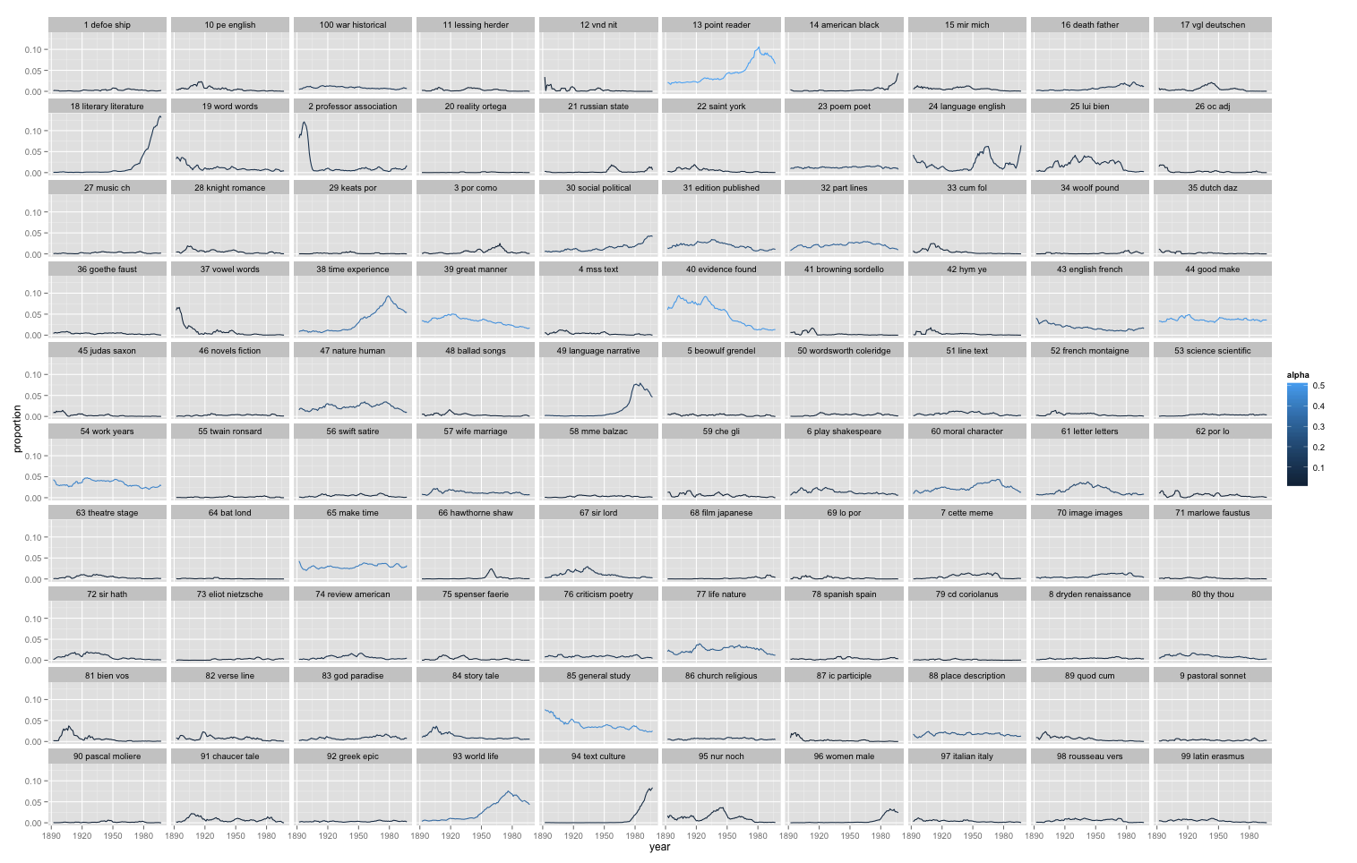
[Edit (AG) 12/12/16: 10×10 grid image now with topics in numerical order. Original version still available: overview.png.]

Categories
19c topic modeling visualization

Visualizing Topic Models with Force-Directed Graphs

headlineForce-directed graphs are tricky.  At their best, the perspective they offer can be very helpful; data points cluster into formations that feel intuitive and look approachable. At their worst, though, they can be too cluttered, and the algorithms that make everything fall into place can deceive as much as they clarify.

But there’s still a good chance that, despite the problems that come along with making a network model of anything (and the problems introduced by making network models of texts), they can still be helpful for interpreting topic models.  Visualizations aren’t exactly analysis, so what I share below is meant to raise more questions than answers.  We also tried to represent as many aspects of the data as possible without breaking (or breaking only a little) the readability of the visualizations.  There were some very unsuccessful tries before we arrived at what is below.

A Few Remarks on Method

As part of our work together, Ted has run some topic models on his 19th century literature dataset and computed the correlation of each topic to other topics.  We decided to try this out to see topic distribution among genres, and to get a feel for how topics clustered with one another.  Which documents belong to what topic aren’t important for now, although in time I’d like to have the nodes link to the text of the documents.  Ted has also calculated the predominant genre to which each topic belongs. And, after building a network model where topic correlation equals edge value, I’ve run the Girvan-Newman algorithm to assess how the topics would cluster by their associations with other topics (I like this approach to grouping better than others for examinations of overall graph structure like this one, as we’re not as interested in  individual cliques or clusters).  What we get then, is two different ways to categorize the topic: on the one hand we have the genre the topic appears in most (with the genres being assigned to individual documents by a human expert), and on the other we see groupings based on co-occurence with other topics.

The visualizations shown here are all built using d3.js, the excellent open source javascript library created by Mike Bostock.  Each of the graphs are force-directed: all nodes possess a negative charge and repel from one another.  All links bond to these nodes and hold them together.  Many force-directed models set their links to behave like springs and contract to the shortest possible distance between nodes, but these graphs below don’t exactly use Hooke’s law to calculate bond length. Instead, they aim for a specific bond length (in this case, 20 pixels) and draw a link as close as possible to that length given the charges acting on it.

I wanted physical proximity of nodes to one another to means something, so the graphs below have variable bond strengths, which means that depending on the value of the bond (which in these graphs is a function of the correlation of a topic with the topic to which it is linked), it will resist or cooperate with being “stretched” (or really, drawn at a longer distance as other stronger bonds take precedence in being drawn closer to the ideal length of 20px).  This has implications for how to interpret distance between nodes in these images.  The X and Y axes have no set value, so distance does not equal correlation. This is more of a Newtonian than Euclidean space,  which means that a short link can indicate a strong bond between nodes, but strong bonds can also be stretched by opposing forces (like other bonds) exerted on nodes at either end of the bond. So distance between nodes can be significant, but only once considered in context of the whole model and its constitutive metaphor of a physical system. Click on the image below for a sample of what we’re talking about:

Main TM

D3 allows this is to be an interactive visual, and mousing over an individual node will reveal the first ten words of the topic it represents.  Also, clicking on a node allows for pulling and rearranging the graph.  Doing this a few times helps reinforce the idea that distance between nodes is the result of a set of simulated physical properties.  The colors assigned to the Newman groups are arbitrary, but there’s a key on the left to help distinguish among similar colors.

Comparing Two Graphs

Network graphs are more useful when you can compare them to other network graphs.  We split the dataset into two halves, and Ted generated 100 topics for each half of the century.  We used slightly different genre labels, but we calculated Newman groups again to produce the two graphs below (again, click through to interact with the graph):

cellplot49cellplot99

Like the first graph, Newman color assignments are arbitrary; what’s purple in the first 50 years of topics has nothing to do with what’s purple in the next 50 years of topics.  I’ve modified these graphs in two key ways to help with reading them.  Firstly, bond thickness now variable, and it is a function of bond strength (bond strength derived from correlation).  This helps assess if a bond is longer because it’s being stretched or because it’s weak, or both.  Secondly, I’ve added node “halos” to emphasize the degree to which the nodes cluster, as well as highlight the Newman groups.

Here’s an alternative graph that colors the nodes by genre instead of Newman group, leaving only the halo to represent group affiliation:

cellalt49

I won’t pretend that any of these are easy to read immediately, but one of our experiments in this was to try to represent as many dimensions as possible to create an exploratory framework for a topic model.  Halo and node diameter are set, but the two elements on the visualization are independent and could represent topic size, degree of genre predominance in a topic, etc.

My hope is that these visualizations can be insightful and might help us work through the benefits and disadvantages of force-directed layouts for visualizing topic models.

As for interpretation and analysis, here is the part where I punt to domain experts in 19th century literature and history…

Categories
19c Bayesian topic modeling topic modeling visualization

Visualizing topic models.

I’ve been collaborating with Michael Simeone of I-CHASS on strategies for visualizing topic models. Michael is using d3.js to build interactive visualizations that are much nicer than what I show below, but since this problem is probably too big for one blog post I thought I might give a quick preview.

Basically the problem is this: How do you visualize a whole topic model? It’s easy to pull out a single topic and visualize it — as a word cloud, or as a frequency distribution over time. But it’s also risky to focus on a single topic, because in LDA, the boundaries between topics are ontologically sketchy.

After all, LDA will create as many topics as you ask it to. If you reduce that number, topics that were separate have to fuse; if you increase it, topics have to undergo fission. So it can be misleading to make a fuss about the fact that two discourses are or aren’t “included in the same topic.” (Ben Schmidt has blogged a nice example showing where this goes astray.) Instead we need to ask whether discourses are relatively near each other in the larger model.

But visualizing the larger model is tricky. The go-to strategy for something like this in digital humanities is usually a network graph. I have some questions about that strategy, but since examples are more fun than abstract skepticism, I should start by providing an illustration. The underlying topic model here was produced by LDA on the top 10k words in 872 volume-length documents. Then I produced a correlation matrix of topics against topics. Finally I created a network in Gephi by connecting topics that correlated strongly with each other (see the notes at the end for the exact algorithm). Topics were labeled with their single most salient word, except in three cases where I changed the label manually. The size of each node is roughly log-proportional to the number of tokens in the topic; nodes are colored to reflect the genre most prominent in each topic. (Since every genre is actually represented in every topic, this is only a rough and relative characterization.) Click through for a larger version.

Since single-word labels are usually misleading, a graph like this would be more useful if you could mouseover a topic and get more information. E.g., the topic labeled “cases” (connecting the dark cluster at top to the rest of the graph) is actually “cases death dream case heard saw mother room time night impression.” (Added Nov 20: If you click through, I’ve now edited the underlying illustration as an image map so you get that information when you mouseover individual topics.)

A network graph does usefully dramatize several important things about the model. It reveals, for instance, that “literary” topics tend to be more strongly connected with each other than nonfiction topics (probably because topics dominated by nonfiction also tend to have a relatively specialized vocabulary).

On the other hand, I think a graph like this could easily be over-interpreted. Graphs are good models for structures that are really networks: i.e., structures with discrete nodes that may or may not be related to each other. But a topic model is not really a network. For one thing, as I was pointing out above, the boundaries between topics are at bottom arbitrary, so these nodes aren’t in reality very discrete. Also, in reality every topic is connected to every other. But as Scott Weingart has been pointing out, you usually have to cut edges to produce a network, and this means that you’re always losing some of the data. Every correlation below some threshold of significance will be lost.

That’s a nontrivial loss, because it’s not safe to assume that negative correlations between topics don’t matter. If two topics absolutely never occur together, that’s a meaningful relation! For instance, if language about the slave trade absolutely never occurred in books of poetry, that would tell us something about both discourses.

So I think we’ll also want to consider visualizing topic models through a strategy like PCA (Principal Component Analysis). Instead of simplifying the model by cutting selected edges, PCA basically “compresses” the whole model into two dimensions. That way you can include all of the data (even the evidence provided by negative correlations). When I perform PCA on the same 1850-99 model, I get this illustration. I’m afraid it’s difficult to read unless you click through and click again to magnify:

I think that’s a more accurate visualization of the relationship between topics, both because it rests on a sounder basis mathematically, and because I observe that in practice it does a good job of discriminating genres. But it’s not as fun as a network visually. Also, since specialized discourses are hard to differentiate in only two dimensions, specialized scientific topics (“temperature,” “anterior”) tend to clump in an unreadable electron cloud. But I’m hoping that Michael and I can find some technical fixes for that problem.

Technical notes: To turn a topic model into a correlation matrix, I simply use Pearson correlation to compare topic distributions over documents. I’ve tried other strategies: comparing distributions over the lexicon, for instance, or using cosine similarity instead of correlation.

The network illustration above was produced with Gephi. I selected edges with an ad-hoc algorithm: 1) take the strongest correlation for each topic 2) if the second-strongest correlation is stronger than .2, include that one too. 3) include additional edges if the correlation is stronger than .38. This algorithm is mathematically indefensible, but it produces pretty topic maps.

I find that it works best to perform PCA on the correlation matrix rather than the underlying word counts. Maybe in the future I’ll be able to explain why, but for now I’ll simply commend these lines of R code to readers who want to try it at home:
pca <- princomp(correlationmatrix)
x <- predict(pca)[,1]
y <- predict(pca)[,2]

Categories
18c 19c collection-building Romantic-era writing visualization

Where to start with text mining.

[Edit June 8, 2015: This blog post has been rewritten and updated. See Seven Ways Humanists are Using Computers to Understand Text.]

This post is an outline of discussion topics I’m proposing for a workshop at NASSR2012 (a conference of Romanticists). I’m putting it on the blog since some of the links might be useful for a broader audience.

In the morning I’ll give a few examples of concrete literary results produced by text mining. I’ll start the afternoon workshop by opening two questions for discussion: first, what are the obstacles confronting a literary scholar who might want to experiment with quantitative methods? Second, how do those methods actually work, and what are their limits?

I’ll also invite participants to play around with a collection of 818 works between 1780 and 1859, using an R program I’ve provided for the occasion. Links for these materials are at the end of this post.

I. HOW DIFFICULT IS IT TO GET STARTED?
There are two kinds of obstacles: getting the data you need, and getting the digital skills you need.

1. Is it really necessary to have a large collection of texts?
This is up for debate. But I tend to think the answer is “yes.”

Not because bigger is better, or because “distant reading” is the new hotness. It’s still true that a single passage, perceptively interpreted, may tell us more than a thousand volumes.

But if you want to interpret a single passage, you fortunately already have a wrinkled protein sponge that will do a better job than any computer. Quantitative analysis starts to make things easier only when we start working on a scale where it’s impossible for a human reader to hold everything in memory. Your mileage may vary, but I’d say, more than ten books?

And actually, you need a larger collection than that, because quantitative analysis tends to require context before it becomes meaningful. It doesn’t mean much to say that the word “motion” is common in Wordsworth, for instance, until we know whether “motion” is more common in his works than in other nineteenth-century poets. So yes, text-mining can provide clues that lead to real insights about a single author or text. But it’s likely that you’ll need a collection of several hundred volumes, for comparison, before those clues become legible.

Words that are consistently more common in works by William Wordsworth than in other poets from 1780 to 1850. I’ve used Wordle’s graphics, but the words have been selected by a Mann-Whitney test, which measures overrepresentation relative to a context — not by Wordle’s own (context-free) method. See the R script at the end of this post.

This isn’t to deny that there are interesting things that can be done digitally with a single text: digital editing, building timelines and maps, and so on. I just doubt that quantitative analysis adds much value at that scale. (And to give credit where it’s due: Mark Olsen was saying all this back in the 90s — see References.)

2. So, where do I get all those texts?
That’s what I was asking myself 18 months ago. A lot of excitement about digital humanities is premised on the notion that we already have large collections of digitized sources waiting to be used. But it’s not true, because page images are not the same thing as clean, machine-readable text.

If you’re interested in twentieth-century secondary sources, the JSTOR Data for Research API can probably get you what you need. Primary sources are a harder problem. In our own (Romantic) era, optical character recognition (OCR) is unreliable. The ratio of words transcribed accurately ranges from around 80% to around 98%, depending on print quality and typographical quirks like the notorious “long s.” For a lot of text-mining purposes, 95% might be fine, if the errors were randomly distributed. But they’re not random: errors cluster in certain words and periods.

What you see in a page image.

The problem can be addressed in several different ways. There are a few collections (like ECCO-TCP and the Brown Women Writers Project) that transcribe text manually. That’s an ideal solution, but coverage of that kind is stronger in the eighteenth than the nineteenth century.

What you may see as OCR.

So Jordan Sellers and I have supplemented those collections by automatically correcting 19c OCR that we got from the Internet Archive. Our strategy involved statistically cautious, period-specific spellchecking, combined with enough reasoning about context to realize that “mortal fin” is probably “mortal sin,” even though “fin” is a correctly spelled word. It’s not a perfect solution, but in our period it works well enough for text-mining purposes. We have corrected about 2,000 volumes this way, and are happy to share our texts and metadata, as well as the spellchecker itself (once I get it packaged well enough to distribute). I can give you either a zip file containing the 19c texts themselves, or a tab-separated file containing docIDs, words, and word counts for the whole collection. In either scheme, the docIDs are keyed to this metadata file.

Of course, selecting titles for a collection like this raises intractable questions about representativeness. We tried to maximize diversity while also selecting volumes that seemed to have reached a significant audience. But other scholars may have other priorities. I don’t think it would be useful to seek a single right answer about representativeness; instead, I’d like to see multiple scholars building different kinds of collections, making them all public, and building on each other’s work. Then we would be able to test a hypothesis against multiple collections, and see whether the obvious caveats about representativeness actually make a difference in any given instance.

3. Is it necessary to learn how to program?
I’m not going to try to answer that question, because it’s complex and better addressed through discussion.

I will tell a brief story. I went into this gig thinking that I wouldn’t have to do my own programming, since there were already public toolsets for text-mining (Voyant, MONK, MALLET, TAPoR, SEASR) and for visualization (Gephi). I figured I would just use those.

But I rapidly learned otherwise. Tools like MONK and Voyant taught me what was possible, but they weren’t well adapted for managing a very large collection of texts, and didn’t permit me to make my own methodological innovations. When you start trying to do either of those things, you rapidly need “nonstandard parts,” which means that someone in the team has to be able to program.

That doesn’t have to be a daunting prospect, because the programming involved is of a relatively forgiving sort. It’s not easy, but it’s also not professional software development. So if you want to do it yourself, that’s a plausible aspiration. Alternately, if you want to collaborate with someone, you don’t necessarily need to find “a computer scientist.” A graduate student or fellow humanist who can program will do just fine.

If you do want to learn to program, I would recommend starting with either Python or R. Of the two languages, Python is certainly easier. It’s intuitive, and well-documented, and great for working with text. If you expect to use existing tools (like MALLET), and just need some “glue” to connect them to each other, Python is probably the way to go. R is a more specialized and less intuitive language. But it happens to be specialized in some ways that are useful for text mining. In particular, it has built-in statistical functions, and a built-in plotting/graphing capacity. I’ve used it for the sample exercise that accompanies this post. But if you’re learning to program for the first time, Python might be a better all-around choice, and you could in principle extend it to do everything R does. [Later addition: You could do worse than start with The Programming Historian.]

II. WHAT CAN WE ACTUALLY DO WITH QUANTITATIVE METHODS?
What follows is just a list of elements. Interesting research projects tend to combine several of these elementary operations in ad-hoc ways suited to a particular question. The list of elements runs a little long, so let me cut to the chase: the overall theme I’m trying to convey is that you can build complex arguments on a very simple foundation. Yes, at bottom, text mining is often about counting words. But a) words matter and b) they hang together in interesting ways, like individual dabs of paint that together start to form a picture.

So, to return to the original question: what can we do?

1) Categorize documents. You can “categorize” in several different senses.

    a) Information retrieval: retrieve documents that match a query. This is what you do every time you use a search engine.

b) (Supervised) classification: a program can learn to correctly distinguish texts by a given author, or learn (with a bit more difficulty) to distinguish poetry from prose, tragedies from history plays, or “gothic novels” from “sensation novels.” (See “Quantitative Formalism,” Pamphlet 1 from the Stanford Literary Lab.) The researcher has to provide examples of different categories, but doesn’t have to specify how to make the distinction: algorithms can learn to recognize a combination of features that is the “fingerprint” of a given category.

An example of clustering from “Quantitative Formalism,” Allison, Heuser, Jockers, Moretti, and Witmore, Stanford Literary Lab.

c) (Unsupervised) clustering: a program can subdivide a group of documents using general measures of similarity instead of predetermined categories. This may reveal patterns you don’t expect.

All three of these techniques can achieve amazing results armed with what seems like very crude information about the documents they’re categorizing. We know, intuitively, that merely counting words is not enough to distinguish a tragedy from a history play. But our intuitions are simply wrong — see the lit lab pamphlet I cited above. It turns out that there’s an enormous amount of information contained in relative word frequencies, even if you know nothing about sequence or syntax. As you consider other aspects of text mining, it’s useful to keep this intuitive misfire in mind. Relatively simple statistical techniques often characterize discourse a good deal better than our intuitions would predict.

2) Contrast the vocabulary of different corpora. In a way, this reverses the logic of classifying documents (1b). Instead of using features to sort documents into categories, you start with two categories of documents and contrast them to identify distinctive features.

For instance, you can discover which words (or phrases) are overrepresented in one author or genre (relative to, say, the rest of nineteenth-century literature). It can admittedly be a challenge to interpret the results: this is a kind of evidence we aren’t accustomed to yet. But lists of overrepresented words can be a fruitful source of critical leads to pursue in more traditional ways.

Beyond identifying distinctive words and phrases, corpora can be compared using metrics chosen for some more specific reason. It’s difficult to give an exhaustive list – but, for instance, the argument I’ve been making about generic differentiation is based on a kind of corpus comparison. As a general think-piece on the topic, I recommend Ben Schmidt’s blog post arguing that comparison is an underused and underrated tool; Schmidt’s taxonomy of text-mining techniques in that post was a strong influence on the taxonomy I’m offering here.

3) Trace the history of particular features (words or phrases) over time. This could be viewed as a special category of corpus comparison, where you’re comparing corpora segmented on the time axis.

The best-known example here would be Google’s ngram viewer. Digital humanists love to criticize the ngram viewer, partly for valid reasons (there’s no way to know what texts are being used). But it has probably been the single most influential application of text mining, so clearly people are finding this simple kind of diachronic visualization useful. A couple of other projects have built on the same dataset, slicing it in different ways. Mark Davies of BYU built an interface that lets you survey the history of collocations. Our team at Illinois built an interface that mines 18-19c correlations in the ngram dataset; it turns out that correlated words have a high likelihood of being related in other ways as well, and these can be intriguing leads: see what words correlate with “delicacy” in our period, for instance. Harvard has built Bookworm, which can be understood as a smaller but more flexible and better-documented version of the ngram viewer (built on the Open Library instead of Google Books).

Words whose frequencies correlate strongly over time are often related in other ways as well. Ngram viewer by Auvil, Capitanu, Heuser and Underwood, based on corrected Google dataset.

Of special interest to Romanticists: a project that isn’t built on the ngram dataset but that does use diachronic correlation-mining as a central methodology. In Stanford Lit Lab Pamphlet 4, Ryan Heuser and Long Le-Khac have traced some very interesting, strongly correlated changes in novelistic diction over the course of the 19th century.

Finally, anyone who wants to make a diachronic argument about diction should read Ben Schmidt’s simple, elegant experiment peeling apart two different components of change: generational succession and historical change within the diction of a single age-cohort.

4) Cluster features that tend to be associated in a given corpus of documents (aka topic modeling). In a way, this reverses the logic of clustering documents (1c). Instead of grouping documents that tend to share the same words, you group words that tend to appear in the same documents, or parts of documents. This produces something that looks like a semantic map of the period or corpus you’re studying. (It would be more accurate to call it a discursive map, because topics don’t actually have to be unified semantically. They are more analogous to “discourses.”)

There are a lot of ways to cluster features, ranging from older approaches (Latent Semantic Analysis), to the new, hip approach — “Bayesian topic modeling,” which has the advantage that it clusters individual occurrences of words (tokens) instead of word types. As a result, it can distinguish different senses of a word. (Scott Weingart has written a clear and comprehensive introduction to topic modeling for humanists.)

Topic modeling has become justifiably popular for several reasons. First and foremost, a “discursive map” can be a nice thing to have; it lends itself easily to interpretation. Also, frankly, this approach doesn’t require a whole lot of improvisation. You just pour text files into a tool like MALLET, and out come a list of topics, looking meaningful and authoritative. It’s important to remember that topic-modeling is in fact an imprecise process. Slightly different inputs (for instance, a different stopword list) can produce very different outputs.

5) Entity extraction. If you’re mainly interested in proper nouns (personal names or place names, or dates and prices) there are tools like OpenNLP that can extract these from text, using syntactic patterns as clues.

6) Visualization. Perhaps this isn’t technically a form of analysis, but in practice it’s important enough that it deserves to be treated as a separate analytical step. It’s impractical to list all possible forms of visualization here, but for instance, results can be visualized:

    • a) Geographically — to reflect, for instance, density of references to different parts of the world. (See

a quick example of Matt Wilkens’ excellent work

    • in this mode — and

a more complete argument available through this conference program.

    )

b) As a network graph — to reflect strength of affinity between different entities (characters, or topics, or what have you).

c) Through “Principal Component Analysis,” if you have multidimensional data that need to be flattened to two dimensions for ease of comprehension.

Putting things together.
There’s no limit to the number of ways you can combine these different operations. Matt Wilkens has extracted references to named entities from fiction, and then visualized their density geographically. Robert K. Nelson has performed topic modeling on the print run of a Civil-War-era newspaper, and then graphed the frequency of each topic over time. You could go a step further and look for correlations between topics (either over time, or in terms of their distribution over documents). Then you could visualize the relationships between topics as a network.

What’s the goal uniting all this experimentation? I suspect there are two different but equally valid goals. In some cases, we’re going to find patterns that actually function as evidence to support literary-historical arguments. (In a number of the examples cited above, I think that’s starting to happen.) In other cases, text mining may work mainly as an exploratory technique, revealing clues that need to be fleshed out and written up using more traditional critical methods. The boundary between those two applications will be hotly debated for years, so I won’t attempt to define it here.

III. SAMPLE DATA AND SCRIPT FOR EXPLORATION.
I don’t know whether we’ll really have time for this, but I ought to at least offer you a chance to do hands-on stuff. So here’s a medium-sized project.

I’ve created a pre-packaged set of 818 volumes of poetry and fiction between 1780 and 1859, including 243 authors. I can give you first, a metadata file that includes the authors, titles, dates, and so on for each volume, and second, a data file that includes word counts for each volume. (To keep from frying your laptop, I’ve only included the top 9,000 words in the collection. But actually that’s a lot.)

Finally, I’ve provided an R script that will let you define different chunks of the collection and compare them against each other, to identify words that are significantly overrepresented in a given author, genre, or period. The script will try two different measures of “overrepresentation”: the first, “log-likelihood,” is based on the aggregate frequency of words in the corpus you selected, adding all the volumes in the corpus together. The second, “Mann-Whitney rho,” tries to locate words that are consistently more common in corpus X by paying attention to individual volumes. For more on how that works, see this blog post.

Of course, the R script won’t work until you download R and open it from within R. Please understand that this is a very rough, ad-hoc piece of work for this one occasion, not a polished piece of software that I expect people to use for the long term.

Postscript about the word “mining.”
I know it has an industrial sound; I know humanists like “analysis” more. But I’m sticking with the mining metaphor on the principle of truth in advertising. I think that word accurately conveys the scale of this enterprise, and the fact that it’s often more exploratory than probative. Besides, “mining” is vivid, and that has its own sort of humanistic value.

References (that aren’t already implicit in links)
Mark Olsen, “Signs, Symbols, and Discourses: A New Direction for Computer-Aided Literature Studies” Computers and the Humanities 27 (1993): 309-314.

Categories
18c 19c visualization

The history of an association, part two.

Here’s another attempt to animate the history of a cluster of associated words — this time as a force-directed graph that folds and unfolds itself as the window of time moves forward, and changing strengths of association create different tensions in the graph.

I had a lot of fun making this clip, but I don’t want to make exaggerated claims for it. These images might not mean very much to me if I hadn’t also read some of the books on which they’re based. The visualization only took a day to build, though, and I think it might turn out to be a useful brainstorming tool. In this instance the clip got me thinking about the different ways time is imagined in the “terror gothic” and in the “horror gothic.”


Association between words is measured here using a vector space model and a collection of more than five hundred works of British fiction. I realize it may seem strange that associations can form and disappear while an eighty-year search window moves forward only sixty years — at the end of this clip the cluster is disappearing while the window still overlaps with the period where the cluster started to emerge. It’s worth recalling that the model isn’t counting words, but measuring the association between them. An early-eighteenth-century work that didn’t use sentimental language at all would do nothing to dilute the association between sentimental terms. But a group of nineteenth-century works that used the same language differently could rapidly obscure earlier patterns.

In short, I suspect that the language of temporal immediacy (“moment,” “suddenly,” “immediately,” and so on) is strongly associated with feeling in the 18c in part because gothic novels, and novels of sensibility, just get to it first. In the nineteenth century other kinds of fiction may take up the same temporal language, diluting its specific connection to tremulous feeling. I can’t prove it yet, but the clues I’m seeing do point in that general direction.

Categories
18c 19c visualization

The history of an association.

[Update May 6th, 2011: The problem I describe here is solved a bit more effectively in a more recent post.] It’s fairly easy to visualize a cluster of associated words. But I’d also like to understand how these associations change, and visualizing that is trickier. For one thing, it’s not easy to define what it means to trace “the same” cluster across time; we need an approach that remains open to the possibility that a particular set of associations could simply weaken or dissolve. The video I’ve embedded below is a first, tentative stab at the problem. Move your mouse pointer away after clicking “play” to see the image without cropping.


I’m trying to understand a late-eighteenth-century convergence between the language of temporality and of feeling. Two words that seemed particularly strongly connected were “moment” and “felt.” So what I’ve done is to proceed five years at a time through a 200-year-long corpus, looking at 80-year-long windows from the corpus. In each “snapshot,” I select the twelve words that associate most strongly in vector space with a vector that’s composed of both “moment” and “felt.” In order to graph them on a coordinate plane, I also measure their association with each term separately. The y axis is association with “moment,” and the x axis is association with “felt.” The reference terms themselves are also plotted. This gives me a way to visualize strength of association in the whole cluster — basically, as everything gets closer to the upper-right-hand corner, the strength of association is getting stronger. At the same time we can get a general sense of the semantic character of the cluster.

I’m working with a relatively small collection here — 538 works of British fiction stretched out between 1700 and 1900. I have a larger 18th-century collection, but in this case I needed continuity over a longer span of time, and in order to achieve that I had to limit the collection to fiction, which reduced its size. It also means that the selection of words you’ll see here is different from the selection of words you saw in previous posts about the “felt-moment” convergence, which were based on a generically diverse collection.

Some of the things that are awkward about this video are consequences of the small collection size. For instance, given the small collection size, I have to choose a pretty long window (80 years out of an overall 200-year-long collection). The window is a bit shorter than that at the beginning of the video — for purely dramatic reasons, so that we don’t reach the “climax” of the clip too rapidly.

Also, of course, the stop-motion animation is rather jerky. With a larger collection, I think it might actually be possible to watch these terms move across the coordinate plane in a smooth and connected fashion. But given the small collection size, smooth motion would be illusory; the data don’t really support that level of precision.

However, even with all those caveats, I feel I’m learning something from the exercise. I think we are glimpsing the transformation of an associative cluster, and looking at the way it changes across time makes me more than ever suspect that — at the moment when it’s strongest — it has something to do with the way late-eighteenth-century fiction imagines suspense. “Anxiety” and “agitation” are durable presences, often in the upper-right-hand corner of the cluster. This interpretation is also, of course, based on reading some of the relevant works, and I think the next stage in exploring the question will be to go back and read them again. As always, I’m inclined to present text-mining more as an exploratory tool or brainstorming technique than as definitive evidence.

It is also a bit interesting to watch the language of gothic agitation turn into language of middle-class striving as we get into the nineteenth century. The intersection between “moment” and “felt” is increasingly occupied not by trembling but by terms like “energy,” “effort,” and “struggle.” I’m not quite sure what to make of that trajectory. Perhaps it helps explain the dissolution of the earlier cluster.

Another way of visualizing clusters like this might be to group terms in a force-directed graph and animate the evolution of the graph across time.