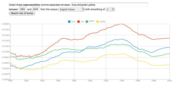
In my last post, I argued that groups of related terms that express basic sensory oppositions (wet/dry, hot/cold, red/green/blue/yellow) have a tendency to correlate strongly with each other in the Google dataset. When “wet” goes up in frequency, “dry” tends to go up as well, as if the whole sensory category were somehow becoming more prominent in writing. Primary colors rise and fall as a group as well.

In that post I focused on a group of categories (temperature, color, and wetness) that all seem to become more prominent from 1820 to 1940, and then start to decline. The pattern was so consistent that you might start to wonder whether it’s an artefact of some flaw in the data. Does every adjective go up from 1820 to 1940? Not at all. A lot of them (say, “melancholy”) peak roughly where the ones I’ve been graphing hit a minimum. And it’s possible to find many paired oppositions that correlate like hot/cold or wet/dry, but peak at a different point.

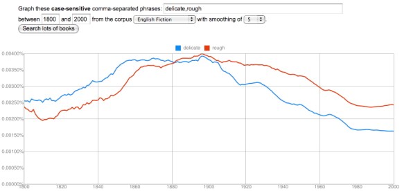
“Delicate” and “rough” correlate loosely (with an interesting lag), but peak much earlier than words for temperature or color, somewhere between 1880 and 1900. Now, it’s fair to question whether “delicate” and “rough” are actually antonyms. Perhaps the opposite of “rough” is actually “smooth”? As we get away from the simplest sensory categories there’s going to be more ambiguity than there was with “wet” and “dry,” and the neat structural parallels I traced in my previous post are going to be harder to find. I think it’s possible, however, that we’ll be able to discover some interesting patterns simply by paying attention to the things that do in practice correlate with each other at different times. The history of diction seems to be characterized by a sequence of long “waves” where different conceptual categories gradually rise to prominence, and then decline.
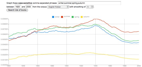
I should credit mmwm at the blog Beyond Rivalry for the clue that led to my next observation, which is that it’s not just certain sensory adjectives (like hot/cold/cool/warm) that rise to prominence from 1820 to 1940, but also a few nouns loosely related to temperature, like the seasons.

I’ve started this graph at 1820 rather than 2000, because the long s/f substitution otherwise creates noise at the very beginning. And I’ve chosen “autumn” rather than “fall” to avoid interference from the verb. But the pattern here is very similar to the pattern I described in my last post — there’s a low around 1820 and a high around 1940. (Looking at the data for fummer and fpring, I suspect that the frequency of all four seasons does increase as you go back before 1820.)
As I factor in some of this evidence, I’m no longer sure it’s adequate to characterize this trend generally as an increase in “concreteness” or “sensory vividness” — although that might be how Ernest Hemingway and D. H. Lawrence themselves would have imagined it. Instead, it may be necessary to describe particular categories that became more prominent in the early 20c (maybe temperature? color?) while others (perhaps delicacy/roughness?) began to decline. Needless to say, this is all extremely tentative; I don’t specialize in modernism, so I’m not going to try to explain what actually happened in the early 20c. We need more context to be confident that these patterns have significance, and I’ll leave the task of explaining their significance to people who know the literature more intimately. I’m just drawing attention to a few interesting patterns, which I hope might provoke speculation.
Finally, I should note that all of the changes I’ve graphed here, and in the last post, were based on the English fiction dataset. Some of these correlations are a little less striking in the main English dataset (although some are also more striking). I’m restricting myself to fiction right now to avoid cherry-picking the prettiest graphs.
Categories

2 replies on “More reflections on the apparent “structuralism” in the Google dataset”
I suspect there something funky at the heart of the Google Books data set. How would you explain the tight correlation and rather sharp up/down movements of names of the month, for example?
http://ngrams.googlelabs.com/graph?content=January%2CFebruary%2CMarch%2CApril%2CMay%2CJune%2CJuly%2CAugust%2CSeptember%2COctober%2CNovember%2CDecember&year_start=1800&year_end=2008&corpus=0&smoothing=1
Explain it? I love it. The tight correlation seems to me to confirm what I’m finding over and over again in this dataset, which is that related terms simply *do* correlate really closely. You see the same thing with the names of the seasons (summer, winter,spring, autumn). You see the same thing with colors.
As for the up/down movements, that depends on how you set smoothing. You’ve set the smoothing to the minimum on that example, so it looks a little jagged. I’m not surprised that certain months might be mentioned more at certain times; for instance, you do see a spike in “September” around 2002-03, for obvious reasons. I bet the main reason why all months go up and down together from year to year is a slight shift in the portion of the dataset that consists of periodicals. They say this is all “books,” but I bet some collections of magazine articles do appear in it, where the parts (or even, say the running heads at the top of the page) are labeled by month. And I’m not surprised that the proportion of those might vary slightly from year to year. But even with no smoothing, what’s striking to me is the regularity of the overall pattern.
What I can’t explain at all is why all months gradually and steadily increase till the 1980s and then decline. But that’s a good kind of “can’t explain,” the kind that makes me want to look for an answer.