Recently, historians have been trying to understand cultural change by measuring the “distances” that separate texts, songs, or other cultural artifacts. Where distances are large, they infer that change has been rapid. There are many ways to define distance, but one common strategy begins by topic modeling the evidence. Each novel (or song, or political speech) can be represented as a distribution across topics in the model. Then researchers estimate the pace of change by measuring distances between topic distributions.
I don’t think topic modeling causes problems in either of the papers I just mentioned. But these methods are so useful that they’re likely to be widely imitated, and I do want to warn interested people about a couple of pitfalls I’ve encountered along the road.
One reason for skepticism will immediately occur to humanists: are human perceptions about difference even roughly proportional to the “distances” between topic distributions? In one case study I examined, the answer turned out to be “yes,” but there are caveats attached. Read the paper if you’re curious.
In this blog post, I’ll explore a simpler and weirder problem. Unless we’re careful about the way we measure “distance,” topic models can warp time. Time may seem to pass more slowly toward the edges of a long topic model, and more rapidly toward its center.
For instance, suppose we want to understand the pace of change in fiction between 1885 and 1984. To make sure that there is exactly the same amount of evidence in each decade, we might randomly select 750 works in each decade, and reduce each work to 10,000 randomly sampled words. We topic-model this corpus. Now, suppose we measure change across every year in the timeline by calculating the average cosine distance between the two previous years and the next two years. So, for instance, we measure change across the year 1911 by taking each work published in 1909 or 1910, and comparing its topic proportions (individually) to every work published in 1912 or 1913. Then we’ll calculate the average of all those distances. The (real) results of this experiment are shown below.
Perhaps we’re excited to discover that the pace of change in fiction peaks around 1930, and declines later in the twentieth century. It fits a theory we have about modernism! Wanting to discover whether the decline continues all the way to the present, we add 25 years more evidence, and create a new topic model covering the century from 1910 to 2009. Then we measure change, once again, by measuring distances between topic distributions. Now we can plot the pace of change measured in two different models. Where they overlap, the two models are covering exactly the same works of fiction. The only difference is that one covers a century (1885-1984) centered at 1935, and the other a century (1910-2009) centered at 1960.
But the two models provide significantly different pictures of the period where they overlap. 1978, which was a period of relatively slow change in the first model, is now a peak of rapid change. On the other hand, 1920, which was a point of relatively rapid change, is now a trough of sluggishness.
Puzzled by this sort of evidence, I discussed this problem with Laure Thompson and David Mimno at Cornell, who suggested that I should run a whole series of models using a moving window on the same underlying evidence. So I slid a 100-year window across the two centuries from 1810 to 2009 in five 25-year steps. The results are shown below; I’ve smoothed the curves a little to make the pattern easier to perceive.
The models don’t agree with each other well at all. You may also notice that all these curves are loosely n-shaped; they peak at the middle and decline toward the edges (although sometimes to an uneven extent). That’s why 1920 showed rapid change in a model centered at 1935, but became a trough of sloth in one centered at 1960. To make the pattern clearer we can directly superimpose all five models and plot them on an x-axis using date relative to the model’s timeline (instead of absolute date).
The pattern is clear: if you measure the pace of change by comparing documents individually, time is going to seem to move faster near the center of the model. I don’t entirely understand why this happens, but I suspect the problem is that topic diversity tends to be higher toward the center of a long timeline. When the modeling process is dividing topics, phenomena at the edges of the timeline may fall just below the threshold to form a distinct topic, because they’re more sparsely represented in the corpus (just by virtue of being near an edge). So phenomena at the center will tend to be described with finer resolution, and distances between pairs of documents will tend to be greater there. (In our conversation about the problem, David Mimno ran a generative simulation that produced loosely similar behavior.)
To confirm that this is the problem, I’ve also measured the average cosine distance, and Kullback-Leibler divergence, between pairs of documents in the same year. You get the same n-shaped pattern seen above. In other words, the problem has nothing to do with rates of change as such; it’s just that all distances tend to be larger toward the center of a topic model than at its edges. The pattern is less clearly n-shaped with KL divergence than with cosine distance, but I’ve seen some evidence that it distorts KL divergence as well.
But don’t panic. First, I doubt this is a problem with topic models that cover less than a decade or two. On a sufficiently short timeline, there may be no systematic difference between topics represented at the center and at the edges. Also, this pitfall is easy to avoid if we’re cautious about the way we measure distance. For instance, in the example above I measured cosine distance between individual pairs of documents across a 5-year period, and then averaged all the distances to create an “average pace of change.” Mathematically, that way of averaging things is slighly sketchy, for reasons Xanda Schofield explained on Twitter:
The mathematics of cosine distance tend to work better if you average the documents first, and then measure the cosine between the averages (or “centroids”). If you take that approach—producing yearly centroids and comparing the centroids—the five overlapping models actually agree with each other very well.
Calculating centroids factors out the n-shaped pattern governing average distances between individual books, and focuses on the (smaller) component of distance that is actually year-to-year change. Lines produced this way agree very closely, even about individual years where change seems to accelerate. As substantive literary history, I would take this evidence with a grain of salt: the corpus I’m using is small enough that the apparent peaks could well be produced by accidents of sampling. But the math itself is working.
I’m slightly more confident about the overall decline in the pace of change from the nineteenth century to the twenty-first. Although it doesn’t look huge on this graph, that pattern is statistically quite strong. But I would want to look harder before venturing a literary interpretation. For instance, is this pattern specific to fiction, or does it reflect a broadly shared deceleration in underlying rates of linguistic change? As I argued in a recent paper, supervised models may be better than raw distance measures at answering that culturally-specific question.
But I’m wandering from the topic of this post. The key observation I wanted to share is just that topic models produce a kind of curved space when applied to long timelines; if you’re measuring distances between individual topic distributions, it may not be safe to assume that your yardstick means the same thing at every point in time. This is not a reason for despair: there are lots of good ways to address the distortion. But it’s the kind of thing researchers will want to be aware of.
Of all our literary-historical narratives it is the history of criticism itself that seems most wedded to a stodgy history-of-ideas approach—narrating change through a succession of stars or contending schools. While scholars like John Guillory and Gerald Graff have produced subtler models of disciplinary history, we could still do more to complicate the narratives that organize our discipline’s understanding of itself.
A browsable network based on Underwood's model of PMLA. Click through, then mouse over or click on individual topics.The archive of scholarship is also, unlike many twentieth-century archives, digitized and available for “distant reading.” Much of what we need is available through JSTOR’s Data for Research API. So last summer it occurred to a group of us that topic modeling PMLA might provide a new perspective on the history of literary studies. Although Goldstone and Underwood are writing this post, the impetus for the project also came from Natalia Cecire, Brian Croxall, and Roger Whitson, who may do deeper dives into specific aspects of this archive in the near future.
Topic modeling is a technique that automatically identifies groups of words that tend to occur together in a large collection of documents. It was developed about a decade ago by David Blei among others. Underwood has a blog post explaining topic modeling, and you can find a practical introduction to the technique at the Programming Historian. Jonathan Goodwin has explained how it can be applied to the word-frequency data you get from JSTOR.
Obviously, PMLA is not an adequate synecdoche for literary studies. But, as a generalist journal with a long history, it makes a useful test case to assess the value of topic modeling for a history of the discipline.
Goldstone and Underwood each independently produced several different models of PMLA, using different software, stopword lists, and numbers of topics. Our results overlapped in places and diverged in places. But we’ve reached a shared sense that topic modeling can enrich the history of literary scholarship by revealing trends that are presently invisible.
What is a topic?
A “topic model” assigns every word in every document to one of a given number of topics. Every document is modeled as a mixture of topics in different proportions. A topic, in turn, is a distribution of words—a model of how likely given words are to co-occur in a document. The algorithm (called LDA) knows nothing “meta” about the articles (when they were published, say), and it knows nothing about the order of words in a given document.
This is a picture of 5940 articles from PMLA, showing the changing presence of each of 100 "topics" in PMLA over time. (Click through to enlarge; a longer list of topic keywords is here.) For example, the most probable words in the topic arbitrarily numbered 59 in the model visualized above are, in descending order:
che gli piu nel lo suo sua sono io delle perche questo quando ogni mio quella loro cosi dei
This is not a “topic” in the sense of a theme or a rhetorical convention. What these words have in common is simply that they’re basic Italian words, which appear together whenever an extended Italian text occurs. And this is the point: a “topic” is neither more nor less than a pattern of co-occurring words.
Nonetheless, a topic like topic 59 does tell us about the history of PMLA. The articles where this topic achieved its highest proportion were:
Antonio Illiano, “Momenti e problemi di critica pirandelliana: L’umorismo, Pirandello e Croce, Pirandello e Tilgher,” PMLA 83 no. 1 (1968): pp. 135-143
Domenico Vittorini, “I Dialogi ad Petrum Histrum di Leonardo Bruni Aretino (Per la Storia del Gusto Nell’Italia del Secolo XV),” PMLA 55 no. 3 (1940): pp. 714-720
Vincent Luciani, “Il Guicciardini E La Spagna,” PMLA 56 no. 4 (1941): pp. 992-1006
And here’s a plot of the changing proportions of this topic over time, showing moving 1-year and 5-year averages:
We see something about PMLA that is worth remembering for the history of criticism, namely, that it has embedded Italian less and less frequently in its language since midcentury. (The model shows that the same thing is true of French and German.)
What can topics tell us about the history of theory?
Of course a topic can also be a subject category—modeling PMLA, we have found topics that are primarily “about Beowulf” or “about music.” Or a topic can be a group of words that tend to co-occur because they’re associated with a particular critical approach.
Here, for instance, we have a topic from Underwood’s 150-topic model associated with discussions of pattern and structure in literature. We can characterize it by listing words that occur more commonly in the topic than elsewhere, or by graphing the frequency of the topic over time, or by listing a few articles where it’s especially salient.
At first glance this topic might seem to fit neatly into a familiar story about critical history. We know that there was a mid-twentieth-century critical movement called “structuralism,” and the prominence of “structure” here might suggest that we’re looking at the rise and fall of that movement. In part, perhaps, we are. But the articles where this topic is most prominent are not specifically “structuralist.” In the top four articles, Ferdinand de Saussure, Claude Lévi-Strauss, and Northrop Frye are nowhere in evidence. Instead these articles appeal to general notions of symmetry, or connect literary patterns to Neoplatonism and Renaissance numerology.
By forcing us to attend to concrete linguistic practice, topic modeling gives us a chance to bracket our received assumptions about the connections between concepts. While there is a distinct mid-century vogue for structure, it does not seem strongly associated with the concepts that are supposed to have motivated it (myth, kinship, language, archetype). And it begins in the 1940s, a decade or more before “structuralism” is supposed to have become widespread in literary studies. We might be tempted to characterize the earlier part of this trend as “New Critical interest in formal unity” and the latter part of it as “structuralism.” But the dividing line between those rationales for emphasizing pattern is not evident in critical vocabulary (at least not at this scale of analysis).
This evidence doesn’t necessarily disprove theses about the history of structuralism. Topic modeling might not reveal varying “rationales” for using a word even if those rationales did vary. The strictly linguistic character of this technique is a limitation as well as a strength: it’s not designed to reveal motivation or conflict. But since our histories of criticism are already very intellectual and agonistic, foregrounding the conscious beliefs of contending critical “schools,” topic modeling may offer a useful corrective. This technique can reveal shifts of emphasis that are more gradual and less conscious than the ones we tend to celebrate.
It may even reveal shifts of emphasis of which we were entirely unaware. “Structure” is a familiar critical theme, but what are we to make of this?
A fuller list of terms included in this topic would include “character”, “fact,” “choice,” “effect,” and “conflict.” Reading some of the articles where the topic is prominent, it appears that in this topic “point” is rarely the sort of point one makes in an argument. Instead it’s a moment in a literary work (e.g., “at the point where the rain occurs,” in Robert apRoberts 379). Apparently, critics in the 1960s developed a habit of describing literature in terms of problems, questions, and significant moments of action or choice; the habit intensified through the early 1980s and then declined. This habit may not have a name; it may not line up neatly with any recognizable school of thought. But it’s a fact about critical history worth knowing.
Note that this concern with problem-situations is embodied in common words like “way” and “cannot” as well as more legible, abstract terms. Since common words are often difficult to interpret, it can be tempting to exclude them from the modeling process. It’s true that a word like “the” isn’t likely to reveal much. But subtle, interesting rhetorical habits can be encoded in common words. (E.g. “itself” is especially common in late-20c theoretical topics.)
We don’t imagine that this brief blog post has significantly contributed to the history of criticism. But we do want to suggest that topic modeling could be a useful resource for that project. It has the potential to reveal shifts in critical vocabulary that aren’t well described, and that don’t fit our received assumptions about the history of the discipline.
Why browse topics as a network?
The fact that a word is prominent in topic A doesn’t prevent it from also being prominent in topic B. So certain generalizations we might make about an individual topic (for instance, that Italian words decline in frequency after midcentury) will be true only if there’s not some other “Italian” topic out there, picking up where the first one left off.
For that reason, interpreters really need to survey a topic model as a whole, instead of considering single topics in isolation. But how can you browse a whole topic model? We’ve chosen relatively small numbers of topics, but it would not be unreasonable to divide literary scholarship into, say, 500 topics. Information overload becomes a problem.
A browsable image map of 150 topics from PMLA. After you click through you can mouseover (or click) individual topics for more information.We’ve found network graphs useful here. Click on the image of the network on the right to browse Underwood’s 150-topic model. The size of each node (roughly) indicates the number of words in the topic; color indicates the average date of words. (Blue topics are older; yellow topics are more recent.) Topics are linked to each other if they tend to appear in the same articles. Topics have been labeled with their most salient word—unless that word was already taken for another topic, or seemed misleading. Mousing over a topic reveals a list of words associated with it; with most topics it’s also possible to click through for more information.
The structure of the network makes a loose kind of sense. Topics in French and German form separate networks floating free of the main English structure. Recent topics tend to cluster at the bottom of the page. And at the bottom, historical and pedagogical topics tend to be on the left, while formal, phenomenological, and aesthetic categories tend to be on the right.
But while it’s a little eerie to see patterns like this emerge automatically, we don’t advise readers to take the network structure too seriously. A topic model isn’t a network, and mapping one onto a network can be misleading. For instance, topics that are physically distant from each other in this visualization are not necessarily unrelated. Connections below a certain threshold go unrepresented.
Goldstone’s 100-topic model of PMLA; click through to enlarge.Moreover, as you can see by comparing illustrations in this post, a little fiddling with dials can turn the same data into networks with rather different shapes. It’s probably best to view network visualization as a convenience. It may help readers browse a model by loosely organizing topics—but there can be other equally valid ways to organize the same material.
How did our models differ?
The two models we’ve examined so far in this post differ in several ways at once. They’re based on different spans of PMLA‘s print run (1890–1999 and 1924–2006). They were produced with different software. Perhaps most importantly, we chose different numbers of topics (100 and 150).
But the models we’re presenting are only samples. Goldstone and Underwood each produced several models of PMLA, changing one variable at a time, and we have made some closer apples-to-apples comparisons.
Broadly, the conclusion we’ve reached is that there’s both a great deal of fluidity and a great deal of consistency in this process. The algorithm has to estimate parameters that are impossible to calculate exactly. So the results you get will be slightly different every time. If you run the algorithm on the same corpus with the same number of topics, the changes tend to be fairly minor. But if you change the number of topics, you can get results that look substantially different.
On the other hand, to say that two models “look substantially different” isn’t to say that they’re incompatible. A jigsaw puzzle cut into 100 pieces looks different from one with 150 pieces. If you examine them piece by piece, no two pieces are the same—but once you put them together you’re looking at the same picture. In practice, there was a lot of overlap between our models; on the older end of the spectrum you often see a topic like “evidence fact,” while the newer end includes topics that foreground narrative, rhetoric, and gender. Some of the more surprising details turned out to be consistent as well. For instance, you might expect the topic “literary literature” to skew toward the older end of the print run. But in fact this is a relatively recent topic in both of our models, associated with discussion of canonicity. (Perhaps the owl of Minerva flies only at dusk?)
Contrasting models: a short example
While some topics look roughly the same in all of our models, it’s not always possible to identify close correlates of that sort. As you vary the overall number of topics, some topics seem to simply disappear. Where do they go? For example, there is no exact counterpart in Goldstone’s model to that “structure” topic in Underwood’s model. Does that mean it is a figment? Underwood isolated the following article as the most prominent exemplar:
Robert E. Burkhart, The Structure of Wuthering Heights, Letter to the Editor, PMLA 87 no. 1 (1972): 104–5. (Incidentally, jstor has miscategorized this as a “full-length article.”)
Goldstone’s model puts more than half of Burkhart’s comment in three topics:
0.24 topic 38 time experience reality work sense form present point world human process structure concept individual reader meaning order real relationship
0.13 topic 46 novels fiction poe gothic cooper characters richardson romance narrator story novelist reader plot novelists character reade hero heroine drf
0.12 topic 13 point reader question interpretation meaning make reading view sense argument words word problem makes evidence read clear text readers
The other prominent documents in Underwood’s 109 are connected to similar topics in Goldstone’s model. The keywords for Goldstone’s topic 38, the top topic here, immediately suggest an affinity with Underwood’s topic 109. Now compare the time course of Goldstone’s 38 with Underwood’s 109 (the latter is above):
It is reasonable to infer that some portion of the words in Underwood’s “structure” topic are absorbed in Goldstone’s “time experience” topic. But “time experience reality work sense” looks less like vocabulary for describing form (although “form” and “structure” are included in it, further down the list; cf. the top words for all 100 topics), and more like vocabulary for talking about experience in generalized ways—as is also suggested by the titles of some articles in which that topic is substantially present:
“The Vanishing Subject: Empirical Psychology and the Modern Novel”
“Metacommentary”
“Toward a Modern Humanism”
“Wordsworth’s Inscrutable Workmanship and the Emblems of Reality”
This version of the topic is no less “right” or “wrong” than the one in Underwood’s model. They both reveal the same underlying evidence of word use, segmented in different but overlapping ways. Instead of focusing our vision on affinities between “form” and “structure”, Goldstone’s 100-topic model shows a broader connection between the critical vocabulary of form and structure and the keywords of “humanistic” reflection on experience.
The most striking contrast to these postwar themes is provided by a topic which dominates in the prewar period, then gives way before “time experience” takes hold. Here are box plots by ten-year intervals of the proportions of another topic, Goldstone’s topic 40, in PMLA articles:
Underwood’s model shows a similar cluster of topics centering on questions of evidence and textual documentation, which similarly decrease in frequency. The language of PMLA has shown a consistently declining interest in “evidence found fact” in the era of the postwar research university.
So any given topic model of a corpus is not definitive. Each variation in the modeling parameters can produce a new model. But although topic models vary, models of the same corpus remain fundamentally consistent with each other.
Using LDA as evidence
It’s true that a “topic model” is simply a model of how often words occur together in a corpus. But information of that kind has a deeper significance than we might at first assume. A topic model doesn’t just show you what people are writing about (a list of “topics” in our ordinary sense of the word). It can also show you how they’re writing. And that “how” seems to us a strong clue to social affinities—perhaps especially for scholars, who often identify with a methodology or critical vocabulary. To put this another way, topic modeling can identify discourses as well as subject categories and embedded languages. Naturally we also need other kinds of evidence to produce a history of the discipline, including social and institutional evidence that may not be fully manifest in discourse. But the evidence of topic modeling should be taken seriously.
As you change the number of topics (and other parameters), models provide different pictures of the same underlying collection. But this doesn’t mean that topic modeling is an indeterminate process, unreliable as evidence. All of those pictures will be valid. They are taken (so to speak) at different distances, and with different levels of granularity. But they’re all pictures of the same evidence and are by definition compatible. Different models may support different interpretations of the evidence, but not interpretations that absolutely conflict. Instead the multiplicity of models presents us with a familiar choice between “lumping” or “splitting” cultural phenomena—a choice where we have long known that multiple levels of analysis can coexist. This multiplicity of perspective should be understood as a strength rather than a limitation of the technique; it is part of the reason why an analysis using topic modeling can afford a richly detailed picture of an archive like PMLA.
Appendix: How did we actually do this?
The PMLA data obtained from JSTOR was independently processed by Goldstone and Underwood for their different LDA tools. This created some quantitative subtleties that we’ve saved for this appendix to keep this post accessible to a broad audience. If you read closely, you’ll notice that we sometimes talk about the “probability” of a term in a topic, and sometimes about its “salience.” Goldstone used MALLET for topic modeling, whereas Underwood used his own Java implementation of LDA. As a result, we also used slightly different formulas for ranking words within a topic. MALLET reports the raw probability of terms in each topic, whereas Underwood’s code uses a slightly more complex formula for term salience drawn from Blei & Lafferty (2009). In practice, this did not make a huge difference.
MALLET also has a “hyperparameter optimization” option which Goldstone’s 100-topic model above made use of. Before you run screaming, “hyperparameters” are just dials that control how much fuzziness is allowed in a topic’s distribution across words (beta) or across documents (alpha). Allowing alpha to vary allows greater differentiation between the sizes of large topics (often with common words), and smaller (often more specialized) topics. (See “Why Priors Matter,” Wallach, Mimno, and McCallum, 2009.) In any event, Goldstone’s 100-topic model used hyperparameter optimization; Underwood’s 150-topic model did not. A comparison with several other models suggests that the difference between symmetric and asymmetric (optimized) alpha parameters explains much of the difference between their structures when visualized as networks.
Goldstone’s processing scripts are online in a github repository. The same repository includes R code for making the plots from Goldstone’s model. Goldstone would also like to thank Bob Gerdes of Rutgers’s Office of Instructional and Research Technology for support for running mallet on the university’s apps.rutgers.edu server, Ben Schmidt for helpful comments at a THATCamp Theory session, and Jon Goodwin for discussion and his excellent blog posts on topic-modeling jstor data.
Force-directed graphs are tricky. At their best, the perspective they offer can be very helpful; data points cluster into formations that feel intuitive and look approachable. At their worst, though, they can be too cluttered, and the algorithms that make everything fall into place can deceive as much as they clarify.
But there’s still a good chance that, despite the problems that come along with making a network model of anything (and the problems introduced by making network models of texts), they can still be helpful for interpreting topic models. Visualizations aren’t exactly analysis, so what I share below is meant to raise more questions than answers. We also tried to represent as many aspects of the data as possible without breaking (or breaking only a little) the readability of the visualizations. There were some very unsuccessful tries before we arrived at what is below.
A Few Remarks on Method
As part of our work together, Ted has run some topic models on his 19th century literature dataset and computed the correlation of each topic to other topics. We decided to try this out to see topic distribution among genres, and to get a feel for how topics clustered with one another. Which documents belong to what topic aren’t important for now, although in time I’d like to have the nodes link to the text of the documents. Ted has also calculated the predominant genre to which each topic belongs. And, after building a network model where topic correlation equals edge value, I’ve run the Girvan-Newman algorithm to assess how the topics would cluster by their associations with other topics (I like this approach to grouping better than others for examinations of overall graph structure like this one, as we’re not as interested in individual cliques or clusters). What we get then, is two different ways to categorize the topic: on the one hand we have the genre the topic appears in most (with the genres being assigned to individual documents by a human expert), and on the other we see groupings based on co-occurence with other topics.
The visualizations shown here are all built using d3.js, the excellent open source javascript library created by Mike Bostock. Each of the graphs are force-directed: all nodes possess a negative charge and repel from one another. All links bond to these nodes and hold them together. Many force-directed models set their links to behave like springs and contract to the shortest possible distance between nodes, but these graphs below don’t exactly use Hooke’s law to calculate bond length. Instead, they aim for a specific bond length (in this case, 20 pixels) and draw a link as close as possible to that length given the charges acting on it.
I wanted physical proximity of nodes to one another to means something, so the graphs below have variable bond strengths, which means that depending on the value of the bond (which in these graphs is a function of the correlation of a topic with the topic to which it is linked), it will resist or cooperate with being “stretched” (or really, drawn at a longer distance as other stronger bonds take precedence in being drawn closer to the ideal length of 20px). This has implications for how to interpret distance between nodes in these images. The X and Y axes have no set value, so distance does not equal correlation. This is more of a Newtonian than Euclidean space, which means that a short link can indicate a strong bond between nodes, but strong bonds can also be stretched by opposing forces (like other bonds) exerted on nodes at either end of the bond. So distance between nodes can be significant, but only once considered in context of the whole model and its constitutive metaphor of a physical system. Click on the image below for a sample of what we’re talking about:
D3 allows this is to be an interactive visual, and mousing over an individual node will reveal the first ten words of the topic it represents. Also, clicking on a node allows for pulling and rearranging the graph. Doing this a few times helps reinforce the idea that distance between nodes is the result of a set of simulated physical properties. The colors assigned to the Newman groups are arbitrary, but there’s a key on the left to help distinguish among similar colors.
Comparing Two Graphs
Network graphs are more useful when you can compare them to other network graphs. We split the dataset into two halves, and Ted generated 100 topics for each half of the century. We used slightly different genre labels, but we calculated Newman groups again to produce the two graphs below (again, click through to interact with the graph):
Like the first graph, Newman color assignments are arbitrary; what’s purple in the first 50 years of topics has nothing to do with what’s purple in the next 50 years of topics. I’ve modified these graphs in two key ways to help with reading them. Firstly, bond thickness now variable, and it is a function of bond strength (bond strength derived from correlation). This helps assess if a bond is longer because it’s being stretched or because it’s weak, or both. Secondly, I’ve added node “halos” to emphasize the degree to which the nodes cluster, as well as highlight the Newman groups.
Here’s an alternative graph that colors the nodes by genre instead of Newman group, leaving only the halo to represent group affiliation:
I won’t pretend that any of these are easy to read immediately, but one of our experiments in this was to try to represent as many dimensions as possible to create an exploratory framework for a topic model. Halo and node diameter are set, but the two elements on the visualization are independent and could represent topic size, degree of genre predominance in a topic, etc.
My hope is that these visualizations can be insightful and might help us work through the benefits and disadvantages of force-directed layouts for visualizing topic models.
As for interpretation and analysis, here is the part where I punt to domain experts in 19th century literature and history…
I’ve been collaborating with Michael Simeone of I-CHASS on strategies for visualizing topic models. Michael is using d3.js to build interactive visualizations that are much nicer than what I show below, but since this problem is probably too big for one blog post I thought I might give a quick preview.
Basically the problem is this: How do you visualize a whole topic model? It’s easy to pull out a single topic and visualize it — as a word cloud, or as a frequency distribution over time. But it’s also risky to focus on a single topic, because in LDA, the boundaries between topics are ontologically sketchy.
After all, LDA will create as many topics as you ask it to. If you reduce that number, topics that were separate have to fuse; if you increase it, topics have to undergo fission. So it can be misleading to make a fuss about the fact that two discourses are or aren’t “included in the same topic.” (Ben Schmidt has blogged a nice example showing where this goes astray.) Instead we need to ask whether discourses are relatively near each other in the larger model.
But visualizing the larger model is tricky. The go-to strategy for something like this in digital humanities is usually a network graph. I have some questions about that strategy, but since examples are more fun than abstract skepticism, I should start by providing an illustration. The underlying topic model here was produced by LDA on the top 10k words in 872 volume-length documents. Then I produced a correlation matrix of topics against topics. Finally I created a network in Gephi by connecting topics that correlated strongly with each other (see the notes at the end for the exact algorithm). Topics were labeled with their single most salient word, except in three cases where I changed the label manually. The size of each node is roughly log-proportional to the number of tokens in the topic; nodes are colored to reflect the genre most prominent in each topic. (Since every genre is actually represented in every topic, this is only a rough and relative characterization.) Click through for a larger version.
Since single-word labels are usually misleading, a graph like this would be more useful if you could mouseover a topic and get more information. E.g., the topic labeled “cases” (connecting the dark cluster at top to the rest of the graph) is actually “cases death dream case heard saw mother room time night impression.” (Added Nov 20: If you click through, I’ve now edited the underlying illustration as an image map so you get that information when you mouseover individual topics.)
A network graph does usefully dramatize several important things about the model. It reveals, for instance, that “literary” topics tend to be more strongly connected with each other than nonfiction topics (probably because topics dominated by nonfiction also tend to have a relatively specialized vocabulary).
On the other hand, I think a graph like this could easily be over-interpreted. Graphs are good models for structures that are really networks: i.e., structures with discrete nodes that may or may not be related to each other. But a topic model is not really a network. For one thing, as I was pointing out above, the boundaries between topics are at bottom arbitrary, so these nodes aren’t in reality very discrete. Also, in reality every topic is connected to every other. But as Scott Weingart has been pointing out, you usually have to cut edges to produce a network, and this means that you’re always losing some of the data. Every correlation below some threshold of significance will be lost.
That’s a nontrivial loss, because it’s not safe to assume that negative correlations between topics don’t matter. If two topics absolutely never occur together, that’s a meaningful relation! For instance, if language about the slave trade absolutely never occurred in books of poetry, that would tell us something about both discourses.
So I think we’ll also want to consider visualizing topic models through a strategy like PCA (Principal Component Analysis). Instead of simplifying the model by cutting selected edges, PCA basically “compresses” the whole model into two dimensions. That way you can include all of the data (even the evidence provided by negative correlations). When I perform PCA on the same 1850-99 model, I get this illustration. I’m afraid it’s difficult to read unless you click through and click again to magnify:
I think that’s a more accurate visualization of the relationship between topics, both because it rests on a sounder basis mathematically, and because I observe that in practice it does a good job of discriminating genres. But it’s not as fun as a network visually. Also, since specialized discourses are hard to differentiate in only two dimensions, specialized scientific topics (“temperature,” “anterior”) tend to clump in an unreadable electron cloud. But I’m hoping that Michael and I can find some technical fixes for that problem.
Technical notes: To turn a topic model into a correlation matrix, I simply use Pearson correlation to compare topic distributions over documents. I’ve tried other strategies: comparing distributions over the lexicon, for instance, or using cosine similarity instead of correlation.
The network illustration above was produced with Gephi. I selected edges with an ad-hoc algorithm: 1) take the strongest correlation for each topic 2) if the second-strongest correlation is stronger than .2, include that one too. 3) include additional edges if the correlation is stronger than .38. This algorithm is mathematically indefensible, but it produces pretty topic maps.
I find that it works best to perform PCA on the correlation matrix rather than the underlying word counts. Maybe in the future I’ll be able to explain why, but for now I’ll simply commend these lines of R code to readers who want to try it at home:
pca <- princomp(correlationmatrix)
x <- predict(pca)[,1]
y <- predict(pca)[,2]
Right now, humanists often have to take topic modeling on faith. There are several good posts out there that introduce the principle of the thing (by Matt Jockers, for instance, and Scott Weingart). But it’s a long step up from those posts to the computer-science articles that explain “Latent Dirichlet Allocation” mathematically. My goal in this post is to provide a bridge between those two levels of difficulty.
Computer scientists make LDA seem complicated because they care about proving that their algorithms work. And the proof is indeed brain-squashingly hard. But the practice of topic modeling makes good sense on its own, without proof, and does not require you to spend even a second thinking about “Dirichlet distributions.” When the math is approached in a practical way, I think humanists will find it easy, intuitive, and empowering. This post focuses on LDA as shorthand for a broader family of “probabilistic” techniques. I’m going to ask how they work, what they’re for, and what their limits are.
How does it work? Say we’ve got a collection of documents, and we want to identify underlying “topics” that organize the collection. Assume that each document contains a mixture of different topics. Let’s also assume that a “topic” can be understood as a collection of words that have different probabilities of appearance in passages discussing the topic. One topic might contain many occurrences of “organize,” “committee,” “direct,” and “lead.” Another might contain a lot of “mercury” and “arsenic,” with a few occurrences of “lead.” (Most of the occurrences of “lead” in this second topic, incidentally, are nouns instead of verbs; part of the value of LDA will be that it implicitly sorts out the different contexts/meanings of a written symbol.)
Of course, we can’t directly observe topics; in reality all we have are documents. Topic modeling is a way of extrapolating backward from a collection of documents to infer the discourses (“topics”) that could have generated them. (The notion that documents are produced by discourses rather than authors is alien to common sense, but not alien to literary theory.) Unfortunately, there is no way to infer the topics exactly: there are too many unknowns. But pretend for a moment that we had the problem mostly solved. Suppose we knew which topic produced every word in the collection, except for this one word in document D. The word happens to be “lead,” which we’ll call word type W. How are we going to decide whether this occurrence of W belongs to topic Z?
We can’t know for sure. But one way to guess is to consider two questions. A) How often does “lead” appear in topic Z elsewhere? If “lead” often occurs in discussions of Z, then this instance of “lead” might belong to Z as well. But a word can be common in more than one topic. And we don’t want to assign “lead” to a topic about leadership if this document is mostly about heavy metal contamination. So we also need to consider B) How common is topic Z in the rest of this document?
Here’s what we’ll do. For each possible topic Z, we’ll multiply the frequency of this word type W in Z by the number of other words in document D that already belong to Z. The result will represent the probability that this word came from Z. Here’s the actual formula:
Simple enough. Okay, yes, there are a few Greek letters scattered in there, but they aren’t terribly important. They’re called “hyperparameters” — stop right there! I see you reaching to close that browser tab! — but you can also think of them simply as fudge factors. There’s some chance that this word belongs to topic Z even if it is nowhere else associated with Z; the fudge factors keep that possibility open. The overall emphasis on probability in this technique, of course, is why it’s called probabilistic topic modeling.
Now, suppose that instead of having the problem mostly solved, we had only a wild guess which word belonged to which topic. We could still use the strategy outlined above to improve our guess, by making it more internally consistent. We could go through the collection, word by word, and reassign each word to a topic, guided by the formula above. As we do that, a) words will gradually become more common in topics where they are already common. And also, b) topics will become more common in documents where they are already common. Thus our model will gradually become more consistent as topics focus on specific words and documents. But it can’t ever become perfectly consistent, because words and documents don’t line up in one-to-one fashion. So the tendency for topics to concentrate on particular words and documents will eventually be limited by the actual, messy distribution of words across documents.
That’s how topic modeling works in practice. You assign words to topics randomly and then just keep improving the model, to make your guess more internally consistent, until the model reaches an equilibrium that is as consistent as the collection allows.
What is it for? Topic modeling gives us a way to infer the latent structure behind a collection of documents. In principle, it could work at any scale, but I tend to think human beings are already pretty good at inferring the latent structure in (say) a single writer’s oeuvre. I suspect this technique becomes more useful as we move toward a scale that is too large to fit into human memory.
So far, most of the humanists who have explored topic modeling have been historians, and I suspect that historians and literary scholars will use this technique differently. Generally, historians have tried to assign a single label to each topic. So in mining the Richmond Daily Dispatch, Robert K. Nelson looks at a topic with words like “hundred,” “cotton,” “year,” “dollars,” and “money,” and identifies it as TRADE — plausibly enough. Then he can graph the frequency of the topic as it varies over the print run of the newspaper.
As a literary scholar, I find that I learn more from ambiguous topics than I do from straightforwardly semantic ones. When I run into a topic like “sea,” “ship,” “boat,” “shore,” “vessel,” “water,” I shrug. Yes, some books discuss sea travel more than others do. But I’m more interested in topics like this:
You can tell by looking at the list of words that this is poetry, and plotting the volumes where the topic is prominent confirms the guess.
This topic is prominent in volumes of poetry from 1815 to 1835, especially in poetry by women, including Felicia Hemans, Letitia Landon, and Caroline Norton. Lord Byron is also well represented. It’s not really a “topic,” of course, because these words aren’t linked by a single referent. Rather it’s a discourse or a kind of poetic rhetoric. In part it seems predictably Romantic (“deep bright wild eye”), but less colorful function words like “where” and “when” may reveal just as much about the rhetoric that binds this topic together.
A topic like this one is hard to interpret. But for a literary scholar, that’s a plus. I want this technique to point me toward something I don’t yet understand, and I almost never find that the results are too ambiguous to be useful. The problematic topics are the intuitive ones — the ones that are clearly about war, or seafaring, or trade. I can’t do much with those.
Now, I have to admit that there’s a bit of fine-tuning required up front, before I start getting “meaningfully ambiguous” results. In particular, a standard list of stopwords is rarely adequate. For instance, in topic-modeling fiction I find it useful to get rid of at least the most common personal pronouns, because otherwise the difference between 1st and 3rd person point-of-view becomes a dominant signal that crowds out other interesting phenomena. Personal names also need to be weeded out; otherwise you discover strong, boring connections between every book with a character named “Richard.” This sort of thing is very much a critical judgment call; it’s not a science.
I should also admit that, when you’re modeling fiction, the “author” signal can be very strong. I frequently discover topics that are dominated by a single author, and clearly reflect her unique idiom. This could be a feature or a bug, depending on your interests; I tend to view it as a bug, but I find that the author signal does diffuse more or less automatically as the collection expands.
What are the limits of probabilistic topic modeling?I spent a long time resisting the allure of LDA, because it seemed like a fragile and unnecessarily complicated technique. But I have convinced myself that it’s both effective and less complex than I thought. (Matt Jockers, Travis Brown, Neil Fraistat, and Scott Weingart also deserve credit for convincing me to try it.)
This isn’t to say that we need to use probabilistic techniques for everything we do. LDA and its relatives are valuable exploratory methods, but I’m not sure how much value they will have as evidence. For one thing, they require you to make a series of judgment calls that deeply shape the results you get (from choosing stopwords, to the number of topics produced, to the scope of the collection). The resulting model ends up being tailored in difficult-to-explain ways by a researcher’s preferences. Simpler techniques, like corpus comparison, can answer a question more transparently and persuasively, if the question is already well-formed. (In this sense, I think Ben Schmidt is right to feel that topic modeling wouldn’t be particularly useful for the kinds of comparative questions he likes to pose.)
Moreover, probabilistic techniques have an unholy thirst for memory and processing time. You have to create several different variables for every single word in the corpus. The models I’ve been running, with roughly 2,000 volumes, are getting near the edge of what can be done on an average desktop machine, and commonly take a day. To go any further with this, I’m going to have to beg for computing time. That’s not a problem for me here at Urbana-Champaign (you may recall that we invented HAL), but it will become a problem for humanists at other kinds of institutions.
Probabilistic methods are also less robust than, say, vector-space methods. When I started running LDA, I immediately discovered noise in my collection that had not previously been a problem. Running headers at the tops of pages, in particular, left traces: until I took out those headers, topics were suspiciously sensitive to the titles of volumes. But LDA is sensitive to noise, after all, because it is sensitive to everything else! On the whole, if you’re just fishing for interesting patterns in a large collection of documents, I think probabilistic techniques are the way to go.
Where to go next
The standard implementation of LDA is the one in MALLET. I haven’t used it yet, because I wanted to build my own version, to make sure I understood everything clearly. But MALLET is better. If you want a few examples of complete topic models on collections of 18/19c volumes, I’ve put some models, with R scripts to load them, in my github folder.
If you want to understand the technique more deeply, the first thing to do is to read up on Bayesian statistics. In this post, I gloss over the Bayesian underpinnings of LDA because I think the implementation (using a strategy called Gibbs sampling, which is actually what I described above!) is intuitive enough without them. And this might be all you need! I doubt most humanists will need to go further. But if you do want to tinker with the algorithm, you’ll need to understand Bayesian probability.
David Blei invented LDA, and writes well, so if you want to understand why this technique has “Dirichlet” in its name, his works are the next things to read. I recommend his Introduction to Probabilistic Topic Models. It recently came out in Communications of the ACM, but I think you get a more readable version by going to his publication page (link above) and clicking the pdf link at the top of the page.
Probably the next place to go is “Rethinking LDA: Why Priors Matter,” a really thoughtful article by Hanna Wallach, David Mimno, and Andrew McCallum that explains the “hyperparameters” I glossed over in a more principled way.
Then there are a whole family of techniques related to LDA — Topics Over Time, Dynamic Topic Modeling, Hierarchical LDA, Pachinko Allocation — that one can explore rapidly enough by searching the web. In general, it’s a good idea to approach these skeptically. They all promise to do more than LDA does, but they also add additional assumptions to the model, and humanists are going to need to reflect carefully about which assumptions we actually want to make. I do think humanists will want to modify the LDA algorithm, but it’s probably something we’re going to have to do for ourselves; I’m not convinced that computer scientists understand our problems well enough to do this kind of fine-tuning.
I’ve been doing topic modeling on collections of eighteenth- and nineteenth-century volumes, using volumes themselves as the “documents” being modeled. Lisa has been pursuing topic modeling on a collection of poems, using individual poems as the documents being modeled.
The math we’re using is probably similar. I believe Lisa is using MALLET. I’m using a version of Latent Dirichlet Allocation that I wrote in Java so I could tinker with it.
But the interesting question we’re exploring is this: How does the meaning of LDA change when it’s applied to writing at different scales of granularity? Lisa’s documents (poems) are a typical size for LDA: this technique is often applied to identify topics in newspaper articles, for instance. This is a scale that seems roughly in keeping with the meaning of the word “topic.” We often assume that the topic of written discourse changes from paragraph to paragraph, “topic sentence” to “topic sentence.”
By contrast, I’m using documents (volumes) that are much larger than a paragraph, so how is it possible to produce topics as narrowly defined as this one?
This is based on a generically diverse collection of 1,782 19c volumes, not all of which are plotted here (only the volumes where the topic is most prominent are plotted; the gray line represents an aggregate frequency including unplotted volumes). The most prominent words in this topic are “mother, little, child, children, old, father, poor, boy, young, family.” It’s clearly a topic about familial relationships, and more specifically about parent-child relationships. But there aren’t a whole lot of books in my collection specifically about parent-child relationships! True, the most prominent books in the topic are A. F. Chamberlain’s The Child and Childhood in Folk Thought (1896) and Alice Earl Morse’s Child Life in Colonial Days (1899), but most of the rest of the prominent volumes are novels — by, for instance, Catharine Sedgwick, William Thackeray, Louisa May Alcott, and so on. Since few novels are exclusively about parent-child relations, how can the differences between novels help LDA identify this topic?
The answer is that the LDA algorithm doesn’t demand anything remotely like a one-to-one relationship between documents and topics. LDA uses the differences between documents to distinguish topics — but not by establishing a one-to-one mapping. On the contrary, every document contains a bit of every topic, although it contains them in different proportions. The numerical variation of topic proportions between documents provides a kind of mathematical leverage that distinguishes topics from each other.
The implication of this is that your documents can be considerably larger than the kind of granularity you’re trying to model. As long as the documents are small enough that the proportions between topics vary significantly from one document to the next, you’ll get the leverage you need to discriminate those topics. Thus you can model a collection of volumes and get topics that are not mere “subject classifications” for volumes.
Now, in the comments to an earlier post I also said that I thought “topic” was not always the right word to use for the categories that are produced by topic modeling. I suggested that “discourse” might be better, because topics are not always unified semantically. This is a place where Lisa starts to question my methodology a little, and I don’t blame her for doing so; I’m making a claim that runs against the grain of a lot of existing discussion about “topic modeling.” The computer scientists who invented this technique certainly thought they were designing it to identify semantically coherent “topics.” If I’m not doing that, then, frankly, am I using it right? Let’s consider this example:
This is based on the same generically diverse 19c collection. The most prominent words are “love, life, soul, world, god, death, things, heart, men, man, us, earth.” Now, I would not call that a semantically coherent topic. There is some religious language in there, but it’s not about religion as such. “Love” and “heart” are mixed in there; so are “men” and “man,” “world” and “earth.” It’s clearly a kind of poetic diction (as you can tell from the color of the little circles), and one that increases in prominence as the nineteenth century goes on. But you would be hard pressed to identify this topic with a single concept.
Does that mean topic modeling isn’t working well here? Does it mean that I should fix the system so that it would produce topics that are easier to label with a single concept? Or does it mean that LDA is telling me something interesting about Victorian poetry — something that might be roughly outlined as an emergent discourse of “spiritual earnestness” and “self-conscious simplicity”? It’s an open question, but I lean toward the latter alternative. (By the way, the writers most prominently involved here include Christina Rossetti, Algernon Swinburne, and both Brownings.)
In an earlier comment I implied that the choice between “semantic” topics and “discourses” might be aligned with topic modeling at different scales, but I’m not really sure that’s true. I’m sure that the document size we choose does affect the level of granularity we’re modeling, but I’m not sure how radically it affects it. (I believe Matt Jockers has done some systematic work on that question, but I’ll also be interested to see the results Lisa gets when she models differences between poems.)
I actually suspect that the topics identified by LDA probably always have the character of “discourses.” They are, technically, “kinds of language that tend to occur in the same discursive contexts.” But a “kind of language” may or may not really be a “topic.” I suspect you’re always going to get things like “art hath thy thou,” which are better called a “register” or a “sociolect” than they are a “topic.” For me, this is not a problem to be fixed. After all, if I really want to identify topics, I can open a thesaurus. The great thing about topic modeling is that it maps the actual discursive contours of a collection, which may or may not line up with “concepts” any writer ever consciously held in mind.
Computer scientists don’t understand the technique that way.* But on this point, I think we literary scholars have something to teach them.
*[UPDATE April 3, 2012: Allen Riddell rightly points out in the comments below that Blei’s original LDA article is elegantly agnostic about the significance of the “topics” — which are at bottom just “latent variables.” The word “topic” may be misleading, but computer scientists themselves are often quite careful about interpretation.]
Documentation / open data:
I’ve put the topic model I used to produce these visualizations on github. It’s in the subfolder 19th150topics under folder BrowseLDA. Each folder contains an R script that you run; it then prompts you to load the data files included in the same folder, and allows you to browse around in the topic model, visualizing each topic as you go.
I have also pushed my Java code for LDA up to github. But really, most people are better off with MALLET, which is infinitely faster and has hyperparameter optimization that I haven’t added yet. I wrote this just so that I would be able to see all the moving parts and understand how they worked.
I’m getting ahead of myself with this post, because I don’t have time to explain everything I did to produce this. But it was just too striking not to share.
Basically, I’m experimenting with Latent Dirichlet Allocation, and I’m impressed. So first of all, thanks to Matt Jockers, Travis Brown, Neil Fraistat, and everyone else who tried to convince me that Bayesian methods are better. I’ve got to admit it. They are.
But anyway, in a class I’m teaching we’re using LDA on a generically diverse collection of 1,853 volumes between 1751 and 1903. The collection includes fiction, poetry, drama, and a limited amount of nonfiction (just biography). We’re stumbling on a lot of fascinating things, but this was slightly moving. Here’s the graph for one particular topic.
The circles and X’s are individual volumes. Blue is fiction, green is drama, pinkish purple is poetry, black biography. Only the volumes where this topic turned out to be prominent are plotted, because if you plot all 1,853 it’s just a blurry line at the bottom of the image. The gray line is an aggregate frequency curve, which is not related in any very intelligible way to the y-axis. (Work in progress …) As you can see. this topic is mostly prominent in fiction around the year 1800. Here are the top 50 words in the topic:
But here’s what I find slightly moving. The x’s at the top of the graph are the 10 works in the collection where the topic was most prominent. They include, in order, Mary Wollstonecraft Shelley, Frankenstein, Mary Wollstonecraft, Mary, William Godwin, St. Leon, Mary Wollstonecraft Shelley, Lodore, William Godwin, Fleetwood, William Godwin, Mandeville, and Mary Wollstonecraft Shelley, Falkner.
In short, this topic is exemplified by a family! Mary Hays does intrude into the family circle with Memoirs of Emma Courtney, but otherwise, it’s Mary Wollstonecraft, William Godwin, and their daughter.
Other critics have of course noticed that M. W. Shelley writes “Godwinian novels.” And if you go further down the list of works, the picture becomes less familial (Helen Maria Williams and Thomas Holcroft butt in, as well as P. B. Shelley). Plus, there’s another topic in the model (“myself these should situation”) that links William Godwin more closely to Charles Brockden Brown than it does to his wife or daughter. And LDA isn’t graven on stone; every time you run topic modeling you’re going to get something slightly different. But still, this is kind of a cool one. “Mind feelings heart felt” indeed.
Right now Latent Semantic Analysis is the analytical tool I’m finding most useful. By measuring the strength of association between words or groups of words, LSA allows a literary historian to map themes, discourses, and varieties of diction in a given period.
This approach, more than any other I’ve tried, turns up leads that are useful for me as a literary scholar. But when I talk to other people in digital humanities, I rarely hear enthusiasm for it. Why doesn’t LSA get more love? I see three reasons:
But for a literary historian, the value of this technique does not depend on its claim to identify synonyms and antonyms. We may actually be more interested in contingent associations (e.g., “sensibility” — “rousseau” in the list on the left) than we are in the core “meaning” of a word.
I’ll return in a moment to this point. It has important implications, because it means that we want LSA to do something slightly different than linguists and information scientists have designed it to do. The “flaws” they have tried to iron out of the technique may not always be flaws for our purposes.
2. People who do topic-modeling may feel that they should use more-recently-developed Bayesian methods, which are supposed to be superior on theoretical grounds. I’m acknowledging this point just to set it aside; I’ve mused out loud about it once already, and I don’t want to do more musing until I have rigorously compared the two methods. I will say that from the perspective of someone just getting started, LSA is easier to implement than Bayesian topic modeling: it runs faster and scales up more easily.
3. The LSA algorithm provided by an off-the-shelf package is not necessarily the best algorithm for a literary historian. At bottom, that’s why I’m writing this post: humanists who want to use LSA are going to need guidance from people in their own discipline. Computer scientists do acknowledge that LSA requires “tuning, which is viewed as a kind of art.” [2] But they also offer advice about “best practices,” and some of those best practices are defined by disciplinary goals that humanists don’t share.
For instance, the power of LSA is often said to come from “reducing the dimensionality of the matrix.” The matrix in question is a term-document matrix — documents are listed along one side of the matrix, and terms along the other, and each cell of the matrix (tfi,j) records the number of times term i appears in document j, modified by a weighting algorithm described at the end of this post. A (very small) term-document matrix.
That term-document matrix in and of itself can tell you a lot about the associations between words; all you have to do is measure the similarity between the vectors (columns of numbers) associated with each term. But associations of this kind won’t always reveal synonyms. For instance, “gas” and “petrol” might seem unrelated, because they substitute for each other in different sociolects and are rarely found together. To address that problem, you can condense the matrix by factorizing it with a technique called singular value decomposition (SVD). I’m not going to get into the math here, but the key is that condensing the matrix partially fuses related rows and columns — and as a result, the compressed matrix is able to measure transitive kinds of association. The words “gas” and “petrol” may rarely appear together. But they both appear with the same kinds of other words. So when dimensionality reduction “merges” the rows representing similar documents, “gas” and “petrol” will end up being strongly represented in the same merged rows. A compressed matrix is better at identifying synonyms, and for that reason at information retrieval. So there is a lot of consensus among linguists and information scientists that reducing the number of dimensions in the matrix is a good idea.
But literary historians approach this technique with a different set of goals. We care a lot about differences of sociolect and register, and may even be more interested in those sources of “noise” than we are in purely semantic relations. “Towering,” for instance, is semantically related to “high.” But I could look that up in a dictionary; I don’t need a computer program to tell me that! I might be more interested to discover that “towering” belongs to a particular subset of poetic diction in the eighteenth century. And that is precisely the kind of accident of distribution that dimensionality-reduction is designed to filter out. For that reason, I don’t think literary applications of LSA are always going to profit from the dimensionality-reduction step that other disciplines recommend.
For about eight months now, I’ve been using a version of LSA without dimensionality reduction. It mines associations simply by comparing the cosine-similarity of term vectors in a term-document matrix (weighted in a special way to address differences of document size). But I wanted to get a bit more clarity about the stakes of that choice, so recently I’ve been comparing it to a version of LSA that does use SVD to compress the matrix. Comparing 18c associations for "delicacy" generated by two different algorithms.
Here’s a quick look at the results. (I’m using 2,193 18c volumes, mostly produced by TCP-ECCO; volumes that run longer than 100,000 words get broken into chunks that can range from 50k-100k words.) In many cases, the differences between LSA with and without compression are not very great. In the case of “delicacy,” for instance, both algorithms indicate that “delicate” has the strongest association. “Politeness” and “tenderness” are also very high on both lists. But compare the second row. The algorithm with compression produces “sensibility” — a close synonym. On the left-hand side, we have “woman.” This is not a synonym for “delicacy,” and if a linguist or computer scientist were evaluating these algorithms, it would probably be rejected as a mistake. But from a literary-historical point of view, it’s no mistake: the association between “delicacy” and femininity is possibly the most interesting fact about the word. The 18c associations of "high" and "towering," in an uncompressed term-document matrix.
In short, compressing the matrix with SVD highlights semantic relationships at the cost of slightly blurring other kinds of association. In the case of “delicacy,” the effect is fairly subtle, but in other cases the difference between the two approaches is substantial. For instance, if you measure the similarity of term vectors in a matrix without compression, “high” and “towering” look entirely different. The main thing you discover about “high” is that it’s used for physical descriptions of landscape (“lies,” “hills”), and the main thing you discover about “towering” is that it’s used in poetic contexts (“flowery,” “glittering”). The 18c. associations of "high" and "towering," as measured in a term-document matrix that has undergone SVD compression.
In a matrix that has undergone dimensionality reduction with SVD, associations have a much more semantic character, although they are still colored by other dimensions of context. Which of these two algorithms is more useful for humanistic purposes? I think the answer is going to depend on the goals being pursued in a given research project — if you’re interested in “topics” that are strictly semantic, you might want to use an algorithm that reduces dimensionality with SVD. If you’re interested in discourses, sociolects, genres, or types of diction, you might use LSA without dimensionality reduction.
My purpose here isn’t to choose between those approaches; it’s just to remind humanists that the algorithms we borrow from other disciplines are often going to need to be customized for our own disciplinary purposes. Information scientists have designed topic-modeling algorithms that produce semantically unified topics, because semantic categorization is important for them. But in literary history, we also care about other dimensions of language, and we don’t have to judge topic-modeling algorithms by strictly semantic criteria. How should we judge them? It will probably take decades for us to answer that question fully, but the short answer is just — by how well, in practice, they help us locate critically and historically interesting patterns.
A couple of technical notes: A fine point of LSA that can matter a great deal is how you weight the individual cells in the term-document matrix. For the normal LSA algorithm that uses dimensionality reduction, the consensus is that “log-entropy weighting” works well. You take the log of each frequency, and multiply the whole term vector by the entropy of the vector. I have found that this also works well for humanistic purposes.
For LSA without dimensionality reduction, I would recommend weighting cells by subtracting the expected frequency from the observed frequency. This formula “evens the playing field” between common and uncommon words — and it does so, vitally, in a way that gives a word’s absence from a long document more weight than its absence from a short one. (Much of LSA’s power actually comes from learning where a given word tends not to appear. [3]) I have tried various ways of applying log-entropy weighting without compressing the matrix, and I do not recommend it. Those two techniques belong together.
For reasons that remain somewhat mysterious (although the phenomenon itself is widely discussed), dimensionality reduction seems to work best when the number of dimensions retained is in the range of 250-350. Intuitively, it would seem possible to strike a sort of compromise between LSA methods that do and don’t compress the matrix by reducing dimensionality less drastically (perhaps only, say, cutting it by half). But in practice I find that doesn’t work very well; I suspect compression has to reach a certain threshold before the noise inherent in the process starts to cancel itself out and give way to a new sort of order.
[1] Thomas K. Landauer, Peter W. Foltz, and Darrell Latham, An Introduction to Latent Semantic Analysis, Discourse Processes 25 (1998): 259-84. Web reprint, p. 22.
[2] Preslav Nakov, Elena Valchanova, and Galia Angelova, “Towards Deeper Understanding of Latent Sematic Analysis Performance,” Recent Advances in Natural Language Processing, ed. Nicolas Nicolov (Samokov, Bulgaria: John Benjamins, 2004), 299.
[3] Landauer, Foltz, and Latham, p. 24.
While I’m fascinated by cases where the frequencies of two, or ten, or twenty words closely parallel each other, my conscience has also been haunted by a problem with trend-mining — which is that it always works. There are so many words in the English language that you’re guaranteed to find groups of them that correlate, just as you’re guaranteed to find constellations in the night sky. Statisticians call this the problem of “multiple comparisons”; it rests on a fallacy that’s nicely elucidated in this classic xkcd comic about jelly beans.
Simply put: it feels great to find two conceptually related words that correlate over time. But we don’t know whether this is a significant find, unless we also know how many potentially related words don’t correlate.
One way to address this problem is to separate the process of forming hypotheses from the process of testing them. For instance, we could use topic modeling to divide the lexicon up into groups of terms that occur in the same contexts, and then predict that those terms will also correlate with each other over time. In making that prediction, we turn an undefined universe of possible comparisons into a finite set.
Once you create a set of topics, plotting their frequencies is simple enough. But plotting the aggregate frequency of a group of words isn’t the same thing as “discovering a trend,” unless the individual words in the group actually correlate with each other over time. And it’s not self-evident that they will. The top 15 words in topic #91, "Silence/Listened," and their cosine similarity to the centroid.
So I decided to test the hypothesis that they would. I used semi-fuzzy clustering to divide one 18c collection (TCP-ECCO) into 200 groups of words that tend to appear in the same volumes, and then tested the coherence of those topics over time in a different 18c collection (a much-cleaned-up version of the Google ngrams dataset I produced in collaboration with Loretta Auvil and Boris Capitanu at the NCSA). Testing hypotheses in a different dataset than the one that generated them is a way of ensuring that we aren’t simply rediscovering the same statistical accidents a second time.
To make a long story short, it turns out that topics have a statistically significant tendency to be trends (at least when you’re working with a century-sized domain). Pairs of words selected from the same topic correlated significantly with each other even after factoring out other sources of correlation*; the Fisher weighted mean r for all possible pairs was 0.223, which measured over a century (n = 100) is significant at p < .05.
In practice, the coherence of different topics varied widely. And of course, any time you test a bunch of hypotheses in a row you're going to get some false positives. So the better way to assess significance is to control for the "false discovery rate." When I did that (using the Benjamini-Hochberg method) I found that 77 out of the 200 topics cohered significantly as trends.
There are a lot of technical details, but I'll defer them to a footnote at the end of this post. What I want to emphasize first is the practical significance of the result for two different kinds of researchers. If you're interested in mining diachronic trends, then it may be useful to know that topic-modeling is a reliable way of discovering trends that have real statistical significance and aren’t just xkcd’s “green jelly beans.” The top 15 terms in topic #89, "Enemy/Attacked," and their cosine similarity to the centroid.
Conversely, if you're interested in topic modeling, it may be useful to know that the topics you generate will often be bound together by correlation over time as well. (In fact, as I’ll suggest in a moment, topics are likely to cohere as trends beyond the temporal boundaries of your collection!)
Finally, I think this result may help explain a phenomenon that Ryan Heuser, Long Le-Khac, and I have all independently noticed: which is that groups of words that correlate over time in a given collection also tend to be semantically related. I've shown above that topic modeling tends to produce diachronically coherent trends. I suspect that the converse proposition is also true: clusters of words linked by correlation over time will turn out to have a statistically significant tendency to appear in the same contexts.
Why are topics and trends so closely related? Well, of course, when you’re topic-modeling a century-long collection, co-occurrence has a diachronic dimension to start with. So the boundaries between topics may already be shaped by change over time. It would be interesting to factor time out of the topic-modeling process, in order to see whether rigorously synchronic topics would still generate diachronic trends.
I haven’t tested that yet, but I have tried another kind of test, to rule out the possibility that we’re simply rediscovering the same trends that generated the topics in the first place. Since the Google dataset is very large, you can also test whether 18c topics continue to cohere as trends in the nineteenth century. As it turns out, they do — and in fact, they cohere slightly more strongly! (In the 19c, 88 out of 200 18c topics cohered significantly as trends.) The improvement is probably a clue that Google’s dataset gets better in the nineteenth century (which god knows, it does) — but even if that’s true, the 19c result would be significant enough on its own to show that topic modeling has considerable predictive power.
Practically, it’s also important to remember that “trends” can play out on a whole range of different temporal scales.
For instance, here’s the trend curve for topic #91, “Silence / Listened,” which is linked to the literature of suspense, and increases rather gradually and steadily from 1700 to the middle of the nineteenth century.
By contrast, here’s the trend curve for topic #89, “Enemy/Attacked,” which is largely used in describing warfare. It doesn’t change frequency markedly from beginning to end; instead it bounces around from decade to decade with a lot of wild outliers. But it is in practice a very tightly-knit trend: a pair of words selected from this topic will have on average 31% of their variance in common. The peaks and outliers are not random noise: they’re echoes of specific armed conflicts.
* Technical details: Instead of using Latent Dirichlet Allocation for topic modeling, I used semi-fuzzy c-means clustering on term vectors, where term vectors are defined in the way I describe in this technical note. I know LDA is the standard technique, and it seems possible that it would perform even better than my clustering algorithm does. But in a sufficiently large collection of documents, I find that a clustering algorithm produces, in practice, very coherent topics, and it has some other advantages that appeal to me. The “semi-fuzzy” character of the algorithm allows terms to belong to more than one cluster, and I use cosine similarity to the centroid to define each term’s “degree of membership” in a topic.
I only topic-modeled the top 5000 words in the TCP-ECCO collection. So in measuring pairwise correlations of terms drawn from the same topic, I had to calculate it as a partial correlation, controlling for the fact that terms drawn from the top 5k of the lexicon are all going to have, on average, a slight correlation with each other simply by virtue of being drawn from that larger group.
I’ve developed a text-mining strategy that identifies what I call “trending topics” — with apologies to Twitter, where the term is used a little differently. These are diachronic patterns that I find practically useful as a literary historian, although they don’t fit very neatly into existing text-mining categories.
A “topic,” as the term is used in text-mining, is a group of words that occur together in a way that defines a thematic focus. Cameron Blevin’s analysis of Martha Ballard’s diary is often cited as an example: Blevin identifies groups of words that seem to be associated, for instance, with “midwifery,” “death,” or “gardening,” and tracks these topics over the course of the diary.
“Trends” haven’t received as much attention as topics, but we need some way to describe the pattern that Google’s ngram viewer has made so visible, where groups of related words rise and fall together across long periods of time. I suspect “trend” is as a good a name for this phenomenon as we’ll get. blue, red, green, yellow, in the English corpus 1750-2000
From 1750 to 1920, the prominence of color vocabulary increases by a factor of three, for instance: and when it does, the names of different colors track each other very closely. I would call this a trend. Moreover, it’s possible to extend the principle that conceptually related words rise and fall together beyond cases like the colors and seasons where we’re dealing with an obvious physical category.
Google data graphed with my own viewer; if you compare this to Google's viewer, remember that I'm merging capitalized and uncapitalized forms, as well as ardor/ardour.
“Animated,” “attentive,” and “ardour” track each other almost as closely as the names of primary colors (the correlation coefficients are around 0.8), and they characterize conduct in ways that are similar enough to suggest that we’re looking at the waxing and waning not just of a few random words, but of a conceptual category — say, a particular sort of interest in states of heightened receptiveness or expressivity.
I think we could learn a lot by thoughtfully considering “trends” of this sort, but it’s also a kind of evidence that’s not easy to interpret, and that could easily be abused. A lot of other words correlate almost as closely with “attentive,” including “propriety,” “elegance,” “sentiments,” “manners,” “flattering,” and “conduct.” Now, I don’t think that’s exactly a random list (these terms could all be characterized loosely as a discourse of manners), but it does cover more conceptual ground than I initially indicated by focusing on words like “animated” and “ardour.” And how do we know that any of these terms actually belonged to the same “discourse”? Perhaps the books that talked about “conduct” were careful not to talk about “ardour”! Isn’t it possible that we have several distinct discourses here that just happened to be rising and falling at the same time?
In order to answer these questions, I’ve been developing a technique that mines “trends” that are at the same time “topics.” In other words, I look for groups of terms that hold together both in the sense that they rise and fall together (correlation across time), and in the sense that they tend to be common in the same documents (co-occurrence). My way of achieving this right now is a two-stage process: first I mine loosely defined trends from the Google ngrams dataset (long lists of, say, one hundred closely correlated words), and then I send those trends to a smaller, generically diverse collection (including everything from sermons to plays) where I can break the list into clusters of terms that tend to occur in the same kinds of documents.
I do this with the same vector space model and hierarchical clustering technique I’ve been using to map eighteenth-century diction on a larger scale. It turns the list of correlated words into a large, branching tree. When you look at a single branch of that tree you’re looking at what I would call a “trending topic” — a topic that represents, not a stable, more-or-less-familiar conceptual category, but a dynamically-linked set of concepts that became prominent at the same time, and in connection with each other.
one branch of a tree created by finding words that correlate with "manners," and then clustering them based on co-occurrence in 18c books
Here, for instance, is a branch of a larger tree that I produced by clustering words that correlate with “manners” in the eighteenth century. It may not immediately look thematically coherent. We might have expected “manners” to be associated with words like “propriety” or “conduct” (which do in fact correlate with it over time), but when we look at terms that change in correlated ways and occur in the same volumes, we get a list of words that are largely about wealth and rank (“luxury,” “opulence,” “magnificence”), as well as the puzzling “enervated.” To understand a phenomenon like this, you can simply reverse the process that generated it, by using the list as a search query in the eighteenth-century collection it’s based on. What turned up in this case were, pre-eminently, a set of mid-eighteenth-century works debating whether modern commercial opulence, and refinements in the arts, have had an enervating effect on British manners and civic virtue. Typical examples are John Brown’s Estimate of the Manners and Principles of the Times (1757) and John Trusler’s Luxury no Political Evil but Demonstratively Proved to be Necessary to the Preservation and Prosperity of States (1781). I was dimly aware of this debate, but didn’t grasp how central it became to debate about manners, and certainly wasn’t familiar with the works by Brown and Trusler.
I feel like this technique is doing what I want it to do, practically, as a literary historian. It makes the ngram viewer something more than a provocative curiosity. If I see an interesting peak in a particular word, I can can map the broader trend of which it’s a part, and then break that trend up into intersecting discourses, or individual works and authors.
Admittedly, there’s something inelegant about the two-stage process I’m using, where I first generate a list of terms and then use a smaller collection to break the list into clusters. When I discussed the process with Ben Schmidt and Miles Efron, they both, independently, suggested that there ought to be some simpler way of distinguishing “trends” from “topics” in a single collection, perhaps by using Principal Component Analysis. I agree about that, and PCA is an intriguing suggestion. On the other hand, the two-stage process is adapted to the two kinds of collections I actually have available at the moment: on the one hand, the Google dataset, which is very large and very good at mapping trends with precision, but devoid of metadata, on the other hand smaller, richer collections that are good at modeling topics, but not large enough to produce smooth trend lines. I’m going to experiment with Principal Component Analysis and see what it can do for me, but in the meantime — speaking as a literary historian rather than a computational linguist — I’m pretty happy with this rough-and-ready way of identifying trending topics. It’s not an analytical tool: it’s just a souped-up search technology that mines trends and identifies groups of works that could help me understand them. But as a humanist, that’s exactly what I want text mining to provide.


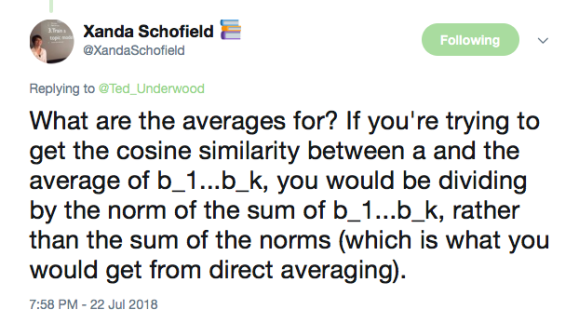
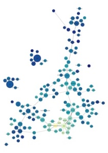


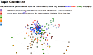

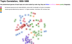


