It’s only in the last few months that I’ve come to understand how complex search engines actually are. Part of the logic of their success has been to hide the underlying complexity from users. We don’t have to understand how a search engine assigns different statistical weights to different terms; we just keep adding terms until we find what we want. The differences between algorithms (which range widely in complexity, and are based on different assumptions about the relationship between words and documents) never cross our minds.
I’m pretty sure search engines have transformed literary scholarship. There was a time (I can dimly recall) when it was difficult to find new primary sources. You had to browse through a lot of bibliographies looking for an occasional lead. I can also recall the thrill I felt, at some point in the 90s, when I realized that full-text searches in a Chadwyck-Healey database could rapidly produce a much larger number of leads — things relevant to my topic, that no one else seemed to have read. Of course, I wasn’t the only one realizing this. I suspect the wave of challenges to canonical “Romanticism” in the 90s had a lot to do with the fact that Romanticists all realized, around the same time, that we had been looking at the tip of an iceberg.
One could debate whether search engines have exerted, on balance, a positive or negative influence on scholarship. If the old paucity of sources tempted critics to endlessly chew over a small and unrepresentative group of authors, the new abundance may tempt us to treat all works as more or less equivalent — when perhaps they don’t all provide the same kinds of evidence. But no one blames search engines themselves for this, because search isn’t an evidentiary process. It doesn’t claim to prove a thesis. It’s just a heuristic: a technique that helps you find a lead, or get a better grip on a problem, and thus abbreviates the quest for a thesis.
The lesson I would take away from this story is that it’s much easier to transform a discipline when you present a new technique as a heuristic than when you present it as evidence. Of course, common sense tells us that the reverse is true. Heuristics tend to be unimpressive. They’re often quite simple. In fact, that’s the whole point: heuristics abbreviate. They also “don’t really prove anything.” I’m reminded of the chorus of complaints that greeted the Google ngram viewer when it first came out, to the effect that “no one knows what these graphs are supposed to prove.” Perhaps they don’t prove anything. But I find that in practice they’re already guiding my research, by doing a kind of temporal orienteering for me. I might have guessed that “man of fashion” was a buzzword in the late eighteenth century, but I didn’t know that “diction” and “excite” were as well.
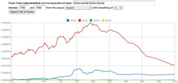
What does a miscellaneous collection of facts about different buzzwords prove? Nothing. But my point is that if you actually want to transform a discipline, sometimes it’s a good idea to prove nothing. Give people a new heuristic, and let them decide what to prove. The discipline will be transformed, and it’s quite possible that no one will even realize how it happened.
POSTSCRIPT, May 1, 2011: For a slightly different perspective on this issue, see Ben Schmidt’s distinction between “assisted reading” and “text mining.” My own thinking about this issue was originally shaped by Schmidt’s observations, but on re-reading his post I realize that we’re putting the emphasis in slightly different places. He suggests that digital tools will be most appealing to humanists if they resemble, or facilitate, familiar kinds of textual encounter. While I don’t disagree, I would like to imagine that humanists will turn out in the end to be a little more flexible: I’m emphasizing the “heuristic” nature of both search engines and the ngram viewer in order to suggest that the key to the success of both lies in the way they empower the user. But — as the word “tricked” in the title is meant to imply — empowerment isn’t the same thing as self-determination. To achieve that, we need to reflect self-consciously on the heuristics we use. Which means that we need to realize we’re already doing text mining, and consider building more appropriate tools.
This post was originally titled “Why Search Was the Killer App in Text-Mining.”
Author: tedunderwood
Ted Underwood is Professor of Information Sciences and English at the University of Illinois, Urbana-Champaign. On Twitter he is @Ted_Underwood.
Seriously geeking out.
The pace of posts here has slowed, and it may stay pretty slow until I get some new data-slicing tools set up.
I spent the weekend trying to understand when I might want to use a vector space model to compare documents or terms, and when ordinary Pearson’s correlation would be better. Also, I now understand how Ward’s method of hierarchical agglomerative clustering is different from all the other methods.
Aside from the sheer fun of geekery, what I’ve learned is that the digital humanities have become *much* easier to enter than they were in the 90s. I attempted a bit of data-mining in the early 90s, and published an article containing a few graphs in Studies in Romanticism, but didn’t pursue the approach much further because I found it nearly impossible to produce the kind of results I wanted on the necessary scale. (You have to remember that my interests lean toward the large end of the scale continuum in DH.)
I told myself that I would get back in the game when the kinds of collections I needed began to become available, and in the last couple of years it became clear to me that they were, if not available, at least possible to construct. But I actually had no idea how transparent and accessible things have become. So much information is freely available on the web, and with tools like Zotero and SEASR the web is also becoming a medium in which one can do the work itself. Everything’s frickin interoperable. It’s so different from the 90s when you had to build things more or less from scratch yourself.
Over the next several years, I predict that we’re going to hear a lot of arguments about what the digital humanities can’t do. They can’t help us distinguish insightful and innovative works from merely typical productions of the press. They can’t help us make aesthetic judgments. They can’t help students develop a sense of what really matters about their individual lives, or about history.
Personally, I’m going to be thrilled. First of all, because Blake was right about many things, but above all about the humanities, when he wrote “Opposition is true Friendship.” The best way to get people to pay attention to the humanities is for us to have a big, lively argument about things that matter — indeed, I would go so far as to say that no humanistic project matters much until it gets attacked.
And critics of the digital humanities will be pointing to things that really do matter. We ought to be evaluating authors and works, and challenging students to make similar kinds of judgments. We ought to be insisting that students connect the humanities to their own lives, and develop a broader feeling for the comic and tragic dimensions of human history.
Of course, it’s not as though we’re doing much of that now. But if humanists’ resistance to the digitization of our profession causes us to take old bromides about the humanities more seriously, and give them real weight in the way we evaluate our work — then I’m all for it. I’ll sign up, in full seriousness, as a fan of the coming reaction against the digital humanities, which might even turn out to be more important than digital humanism itself.
I wouldn’t, after all, want every humanist to become a “digital humanist.” I believe there’s a lot we can learn from new modes of analysis, networking, and visualization, but I don’t believe the potential is infinite, or that new approaches ineluctably supplant old ones. The New York Times may have described data-intensive methods as an alternative to “theory,” but surely we’ve been trained to recognize a false dichotomy? “Theory” used to think it was an alternative to “humanism,” and that was wrong too.
I also predict that the furor will subside, in a decade or so, when scholars start to understand how new modes of analysis help them do things they presently want to do, but can’t. I’ve been thinking a lot about Benjamin Schmidt’s point that search engines are already a statistically sophisticated technology for assisted reading. Of course humanists use search engines to mine data every day, without needing to define a tf-idf score, and without getting so annoyed that they exclaim “Search engines will never help us properly appreciate an individual author’s sensibility!”
That’s the future I anticipate for the digital humanities. I don’t think we’re going to be making a lot of arguments that explicitly foreground a quantitative methodology. We’ll make a few. But more often text mining, or visualization, will function as heuristics that help us find and recognize significant patterns, which we explore in traditional humanistic ways. Once a heuristic like that is freely available and its uses are widely understood, you don’t need to make a big show of using it, any more than we now make a point of saying “I found these obscure sources by performing a clever keyword search on ECCO.” But it may still be true that the heuristic is permitting us to pursue different kinds of arguments, just as search engines are now probably permitting us to practice a different sort of historicism.
But once this becomes clear, we’ll start to agree with each other. Things will become boring again, and The New York Times will stop paying attention to us. So I plan to enjoy the argument while it lasts.
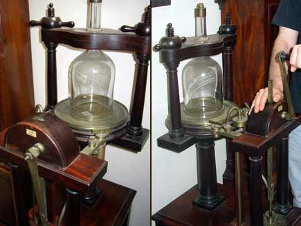
In a few years, some enterprising historian of science is going to write a history of the “culturomics” controversy, and it’s going to be fun to read. In some ways, the episode is a classic model of the social processes underlying the production of knowledge. Whenever someone creates a new method or tool (say, an air pump), and claims to produce knowledge with it, they run head-on into the problem that knowledge is social. If the tool is really new, their experience with it is by definition anomalous, and anomalous experiences — no matter how striking — never count as knowledge. They get dismissed as amusing curiosities.
The team that published in Science has attempted to address this social problem, as scientists usually do, by making their data public and carefully describing the conditions of their experiment. In this case, however, one runs into the special problem that the underlying texts are the private property of Google, and have been released only in a highly compressed form that strips out metadata. As Matt Jockers may have been the first to note, we don’t yet even have a bibliography of the contents of each corpus. Yesterday, in a new FAQ posted on culturomics.org (see section III.5), researchers acknowledged that they want to release such a bibliography, but haven’t yet received permission from Google to do it.
This is going to produce a very interesting deadlock. I’ve argued in many other posts that the Google dataset is invaluable, because its sheer scale allows us to grasp diachronic patterns that wouldn’t otherwise be visible. But without a list of titles, it’s going to be difficult to cite it as evidence. What I suspect may happen is that humanists will start relying on it in private to discover patterns, but then write those patterns up as if they had just been doing, you know, a bit of browsing in 500,000 books — much as we now use search engines quietly and without acknowledgment, although they in fact entail significant methodological choices. As Benjamin Schmidt has recently been arguing, search technology is based on statistical presuppositions more complex and specific than most people realize, presuppositions that humanists already “use all the time to, essentially, do a form of reading for them.”
A different solution, and the one I’ll try, is to use the Google dataset openly, but in conjunction with other smaller and more transparent collections. I’ll use the scope of the Google dataset to sketch broad contours of change, and then switch to a smaller archive in order to reach firmer and more detailed conclusions. But I still hope that Google can somehow be convinced to release a bibliography — at least of the works that are out of copyright — and I would urge humanists to keep lobbying them.
If some of the dilemmas surrounding this tool are classic history-of-science problems, others are specific to a culture clash between the humanities and the sciences. For instance, I’ve argued in the past that humanists need to develop a quantitative conception of error. We’re very talented at making the perfect the enemy of the good, but that simply isn’t how statistical knowledge works. As the newly-released FAQ points out, there’s a comparably high rate of error in fields like genomics.
On other topics, though, it may be necessary for scientists to learn a bit more about the way humanists think. For instance, one of the corpora included in the ngram viewer is labeled “English fiction.” Matt Jockers was the first to point out that this is potentially ambiguous. I assumed that it contained mostly novels and short stories, since that’s how we use the word in the humanities, but prompted by Matt’s skepticism, I wrote the culturomics team to inquire. Yesterday in the FAQ they answered my question, and it turns out that Matt’s skepticism was well founded.
Crucially, it’s not just actual works of fiction! The English fiction corpus contains some fiction and lots of fiction-associated work, like commentary and criticism. We created the fiction corpus as an experiment meant to explore the notion of creating a subject-specific corpus. We don’t actually use it in the main text of our paper because the experiment isn’t very far along. Even so, a thoughtful data analyst can do interesting things with this corpus, for instance by comparing it to the results for English as a whole.
Humanists are going to find that an eye-opening paragraph. This conception of fiction is radically different from the way we usually understand fiction — as a genre. Instead, the culturomics team has constructed a corpus based on fiction as a subject category; or perhaps it would be better to say that they have combined the two conceptions. I can say pretty confidently that no humanist will want to rely on the corpus of “English fiction” to make claims about fiction; it represents something new and anomalous.
On the other hand, I have to say that I’m personally grateful that the culturomics team made this corpus available — not because it tells me much about fiction, but because it tells me something about what happens when you try to hold “subject designations” constant across time instead of allowing the relative proportions of books in different subjects to fluctuate as they actually did in publishing history. I think they’re right that this is a useful point of comparison, although at the moment the corpus is labeled in a potentially misleading way.
In general, though, I’m going to use the main English corpus, which is easier to interpret. The lack of metadata is still a problem here, but this corpus seems to represent university library collections more fully than any other dataset I have access to. While sheer scale is a crude criterion of representativeness, for some questions it’s the useful one.
The long and short of it all is that the next few years are going to be a wild ride. I’m convinced that advances in digital humanities are reaching the point where they’re going to start allowing us to describe some large, fascinating, and until now largely invisible patterns. But at the moment, the biggest dataset — prominent in public imagination, but also genuinely useful — is curated by scientists, and by a private corporation that has not yet released full information about it. The stage is set for a conflict of considerable intensity and complexity.
Benjamin Schmidt has been posting some fascinating reflections on different ways of analyzing texts digitally and characterizing the affinities between them.
I’m tempted to briefly comment on a technique of his that I find very promising. This is something that I don’t yet have the tools to put into practice myself, and perhaps I shouldn’t comment until I do. But I’m just finding the technique too intriguing to resist speculating about what might be done with it.
Basically, Schmidt describes a way of mapping the relationships between terms in a particular archive. He starts with a word like “evolution,” identifies texts in his archive that use the word, and then uses tf-idf weighting to identify the other words that, statistically, do most to characterize those texts.
After iterating this process a few times, he has a list of something like 100 terms that are related to “evolution” in the sense that this whole group of terms tends, not just to occur in the same kinds of books, but to be statistically prominent in them. He then uses a range of different clustering algorithms to break this list into subsets. There is, for instance, one group of terms that’s clearly related to social applications of evolution, another that seems to be drawn from anatomy, and so on. Schmidt characterizes this as a process that maps different “discourses.” I’m particularly interested in his decision not to attempt topic modeling in the strict sense, because it echoes my own hesitation about that technique:
In the language of text analysis, of course, I’m drifting towards not discourses, but a simple form of topic modeling. But I’m trying to only submerge myself slowly into that pool, because I don’t know how well fully machine-categorized topics will help researchers who already know their fields. Generally, we’re interested in heavily supervised models on locally chosen groups of texts.
This makes a lot of sense to me. I’m not sure that I would want a tool that performed pure “topic modeling” from the ground up — because in a sense, the better that tool performed, the more it might replicate the implicit processing and clustering of a human reader, and I already have one of those.
Schmidt’s technique is interesting to me because the initial seed word gives it what you might call a bias, as well as a focus. The clusters he produces aren’t necessarily the same clusters that would emerge if you tried to map the latent topics of his whole archive from the ground up. Instead, he’s producing a map of the semantic space surrounding “evolution,” as seen from the perspective of that term. He offers this less as a finished product than as an example of a heuristic that humanists might use for any keyword that interested them, much in the way we’re now accustomed to using simple search strategies. Presumably it would also be possible to move from the semantic clusters he generates to a list of the documents they characterize.
I think this is a great idea, and I would add only that it could be adapted for a number of other purposes. Instead of starting with a particular seed word, you might start with a list of terms that happen to be prominent in a particular period or genre, and then use Schmidt’s technique of clustering based on tf-idf correlations to analyze the list. “Prominence” can be defined in a lot of different ways, but I’m particularly interested in words that display a similar profile of change across time.
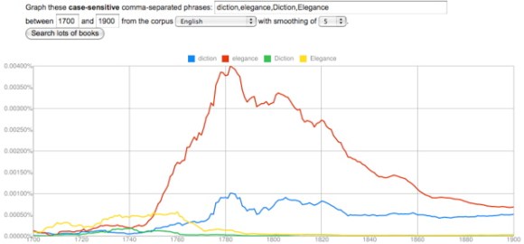
For instance, I think it’s potentially rather illuminating that “diction” and “elegance” change in closely correlated ways in the late eighteenth and early nineteenth century. It’s interesting that they peak at the same time, and I might even be willing to say that the dip they both display, in the radical decade of the 1790s, suggests that they had a similar kind of social significance. But of course there will be dozens of other terms (and perhaps thousands of phrases) that also correlate with this profile of change, and the Google dataset won’t do anything to tell us whether they actually occurred in the same sorts of books. This could be a case of unrelated genres that happened to have emerged at the same time.
But I think a list of chronologically correlated terms could tell you a lot if you then took it to an archive with metadata, where Schmidt’s technique of tf-idf clustering could be used to break the list apart into subsets of terms that actually did occur in the same groups of works. In effect this would be a kind of topic modeling, but it would be topic modeling combined with a filter that selects for a particular kind of historical “topicality” or timeliness. I think this might tell me a lot, for instance, about the social factors shaping the late-eighteenth-century vogue for characterizing writing based on its “diction” — a vogue that, incidentally, has a loose relationship to data mining itself.
I’m not sure whether other humanists would accept this kind of technique as evidence. Schmidt has some shrewd comments on the difference between data mining and assisted reading, and he’s right that humanists are usually going to prefer the latter. Plus, the same “bias” that makes a technique like this useful dispels any illusion that it is a purely objective or self-generating pattern. It’s clearly a tool used to slice an archive from a particular angle, for particular reasons.
But whether I could use it as evidence or not, a technique like this would be heuristically priceless: it would give me a way of identifying topics that peculiarly characterize a period — or perhaps even, as the dip in the 1790s hints, a particular impulse in that period — and I think it would often turn up patterns that are entirely unexpected. It might generate these patterns by looking for correlations between words, but it would then be fairly easy to turn lists of correlated words into lists of works, and investigate those in more traditionally humanistic ways.
For instance, I had no idea that “diction” would correlate with “elegance” until I stumbled on the connection, but having played around with the terms a bit in MONK, I’m already getting a sense that the terms are related not just through literary criticism (as you might expect), but also through historical discourse and (oddly) discourse about the physiology of sensation. I don’t have a tool yet that can really perform Schmidt’s sort of tf-idf clustering, but just to leave you with a sense of the interesting patterns I’m glimpsing, here’s a word cloud I generated in MONK by contrasting eighteenth-century works that contain “elegance” to the larger reference set of all eighteenth-century works. The cloud is based on Dunning’s log likelihood, and limited to adjectives, frankly, just because they’re easier to interpret at first glance.

There’s a pretty clear contrast here between aesthetic and moral discourse, which is interesting to begin with. But it’s also a bit interesting that the emphasis on aesthetics extends into physiological terms like “sensorial,” “irritative,” and “numb,” and historical terms like “Greek” and “Latin.” Moreover, many of the same terms reoccur if you pursue the same strategy with “diction.”
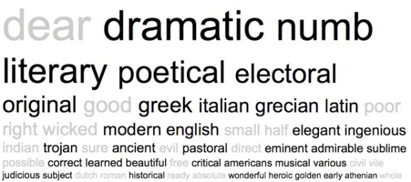
A lot of words here are predictably literary, but again you see sensory terms like “numb,” and historical ones like “Greek,” “Latin,” and “historical” itself. Once again, moreover, moral discourse is interestingly underrepresented. This is actually just one piece of the larger pattern you might generate if you pursued Schmidt’s clustering strategy — plus, Dunning’s is not the same thing as tf-idf clustering, and the MONK corpus of 1000 eighteenth-century works is smaller than one would wish — but the patterns I’m glimpsing are interesting enough to suggest to me that this general kind of approach could tell me a lot of things I don’t yet know about a period.
I started blogging about the Google dataset because it revealed stylistic trends so intriguing that I couldn’t wait to write them up. But these reflections are also ending up in a blog because they can’t yet go in an article. The ngram viewer, as fascinating as it is, is not yet very useful as evidence in a humanistic argument.
As I’ve explained at more length elsewhere, the problems that most humanists have initially pointed to don’t seem to me especially troubling. It’s true that the data contains noise — but so does all data. Researchers in other fields don’t wait for noiseless instruments before they draw any conclusions; they assess the signal/noise ratio and try to frame questions that are answerable within those limits.
It’s also true that the history of diction doesn’t provide transparent answers to social and literary questions. This kind of evidence will require context and careful interpretation. In which respect, it resembles every other kind of evidence humanists currently grapple with.
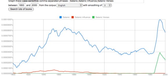
The problem that seems more significant to me is one that Matt Jockers has raised. We simply don’t yet know what’s in these corpora. We do know how they were constructed: that’s explained, in a fairly detailed way, in the background material supporting the original article in Science. But we don’t yet have access to a list of titles for each corpus.
Here differences between disciplines become amusing. For a humanist, it’s a little shocking that a journal like Science would publish results without what we would call simply “a bibliography” — a list of the primary texts that provide evidence for the assertion. The list contains millions of titles in this case, and would be heavy in print. But it seems easy enough for Google, or the culturomics research team, to make these lists available on the web. In fact, I assume they’re forthcoming; the datasets themselves aren’t fully uploaded yet, so apparently more information is on the way. I’ve written Google Labs asking whether they plan to release lists of titles, and I’ll update this post when they do.
Until they do, it will be difficult for humanists to use the ngram viewer as scholarly evidence. The background material to the Science article does suggest that these datasets have been constructed thoughtfully, with an awareness of publishing history, and on an impressive scale. But humanists and scientists understand evidence differently. I can’t convince other humanists by telling them “Look, here’s how I did the experiment.” I have to actually show them the stuff I experimented on — that is, a bibliography.
Ideally, one might ask even more from Google. They could make the original texts themselves available (at least those out of copyright), so that we could construct our own archives. With the ability to ask questions about genre and context of occurrence, we could connect quantitative trends to a more conventional kind of literary history. Instead of simply observing that a lot of physical adjectives peak around 1940,  we could figure out how much of that is due to modernism (“The sunlight was hot and hard”), to Time magazine, or to some other source — and perhaps even figure out why the trend reversed itself.
Google seems unlikely to release all their digitized texts; it may not be in their corporate interest to do so. But fortunately, there are workarounds. HathiTrust, and other online archives, are making large electronic collections freely available, and these will eventually be used to construct more flexible tools. Even now, it’s possible to have the best of both worlds by pairing the scope of Google’s dataset with the analytic flexibility of a tool like MONK (constructed by a team of researchers funded by the Andrew W. Mellon Foundation, including several here at Illinois). When I discover an interesting 18c. or 19c. trend in the ngram viewer, I take it to MONK, which can identify genres, authors, works, or parts of works where a particular pattern of word choice was most prominent.
So, to make the ngram viewer useful, Google needs to release lists of titles, and humanists need to pair the scope of the Google dataset with the analytic power of a tool like MONK, which can ask more precise, and literarily useful, questions on a smaller scale. And then, finally, we have to read some books and say smart things about them. That part hasn’t changed.
But the ngram viewer itself could also be improved. It could, for instance
1) Give researchers the option to get rid of case sensitivity and (at least partly) undo the f/s substitution, which together make it very hard to see any patterns in the 18c.
2) Provide actual numbers as output, not just pretty graphs, so that we can assess correlation and statistical significance.
3) Offer better search strategies. Instead of plugging in words one by one to identify a pattern, I would like to be able to enter a seed word, and ask for a list of words that correlate with it across a given period, sorted by degree of positive (or inverse) correlation.
It would be even more interesting to do the same thing for ngrams. One might want the option to exclude phrases that contain only the original seed word(s) and stop words (“of,” “the,” and so on). But I suspect a tool like this could rapidly produce some extremely interesting results.
4) Offer other ways to mine the list of 2,3,4, and 5-grams, where a lot of conceptually interesting material is hiding. For instance, “what were the most common phrases containing ‘feminine’ between 1950 and 1970?” Or, “which phrases containing ‘male’ increased most in frequency between 1940 and 1960?”
Of course, since the dataset is public, none of these improvements actually have to be made by Google itself.
I’ve asserted several times that flaws in optical character recognition (OCR) are not a crippling problem for the English part of the Google dataset, after 1820. Readers may wonder where I get that confidence, since it’s easy to generate a graph like this for almost any short, random string of letters:
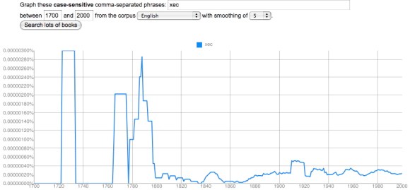
It’s true that the OCR process is imperfect, especially with older typography, and produces some garbage strings of letters. You see a lot of these if you browse Google Books in earlier periods. The researchers who created the ngram viewer did filter out the volumes with the worst OCR. So the quality of OCR here is higher than you’ll see in Google Books at large — but not perfect.
I tried to create “xec” as a nonsense string, but there are surprisingly few strings of complete nonsense. It turns out that “xec” occurs for all kinds of legitimate reasons: it appears in math, as a model number, and as a middle name in India. But the occurrences before 1850 that look like the Chicago skyline are mostly OCR noise. Now, the largest of these is three millionths of a percent (10-6). By contrast, a moderately uncommon word like “apprehend” ranges from a frequency of two thousandths of a percent (10-3) in 1700 to about two ten-thousandths of a percent today (10-4). So we’re looking at a spike that’s about 1% of the minimum frequency of a moderately uncommon word.
In the aggregate, OCR failures like this are going to reduce the frequency of all words in the corpus significantly. So one shouldn’t use the Google dataset to make strong claims about the absolute frequency of any word. But “xec” occurs randomly enough that it’s not going to pose a real problem for relative comparisons between words and periods. Here’s a somewhat more worrying problem:
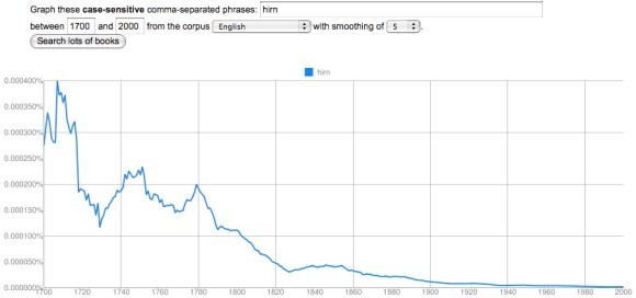
English unfortunately has a lot of letters that look like little bumps, so “hirn” is a very common OCR error for “him.” Two problems leap out here. First, the scale of the error is larger. At its peak, it’s four ten-thousandths of a percent (10-4), which is comparable to the frequency of an uncommon word. Second, and more importantly, the error is distributed very unequally; it increases as one goes back in time (because print quality is poorer), which might potentially skew the results of a diachronic graph by reducing the frequency of “him” in the early 18c. But as you can see, this doesn’t happen to any significant degree:
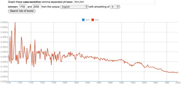
“Hirn” is a very common error because “him” is a very common word, averaging around a quarter of a percent in 1750. The error in this case is about one thousandth the size of the word itself, which is why “hirn” totally disappears on this graph. So even if we postulate that there are twenty equally common ways of getting “him” wrong in the OCR (which I doubt), this is not going to be a crippling problem. It’s a much less significant obstacle than the random year-to-year variability of sampling in the early eighteenth century, caused by a small dataset, which becomes visible here because I’ve set the smoothing to “0” instead of using my usual setting of “5.”
The take-away here is that one needs to be cautious before 1820 for a number of reasons. Bad OCR is the most visible of those reasons, and the one most likely to scandalize people, but (except for the predictable f/s substitution before 1820), it’s actually not as significant a problem as the small size of the dataset itself. Which is why I think the relatively large size of the Google dataset outweighs its imperfections.
By the way, the mean frequency of all words in the lexicon does decline over time, as the size of the lexicon grows, but that subtle shift is probably not the primary explanation for the downward slope of “him.” “Her” increases in frequency from 1700 to the present; “the” remains largely stable. The expansion of the lexicon, and proliferation of nonfiction genres, does however give us a good reason not to over-read slight declines in frequency. A word doesn’t have to be displaced by anything in particular; it can be displaced by everything in the aggregate.
An even better reason not to over-read changes of 5-10% is just that — frankly — no one is going to care about them. The connection between word frequency and discourse content is still very fuzzy; we’re not in a position to assume that all changes are significant. If the ngram viewer were mostly revealing this sort of subtle variation I might be one of the people who dismiss it as trivial bean-counting. In fact, it’s revealing shifts on a much larger scale, that amount to qualitative change: the space allotted to words for color seems to have grown more than threefold between 1700 and 1940, and possibly more than tenfold in fiction.
This is the fundamental reason why I’m not scandalized by OCR errors. We’re looking at a domain where the minimum threshhold for significance is very high from the start, because humanists basically aren’t yet convinced that changes in frequency matter at all. It’s unlikely that we’re going to spend much time arguing about phenomena subtle enough for OCR errors to make a difference.
This isn’t to deny that one has to be cautious. There are real pitfalls in this tool. In the 18c, its case sensitivity and tendency to substitute f for s become huge problems. It also doesn’t know anything about spelling variants (antient/ancient,changed/changd) or morphology (run/ran). And once in a great while you run into something like this:
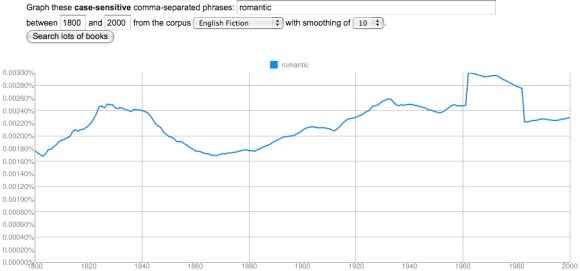
“Hmm,” I thought. “That’s odd. One doesn’t normally see straight-sided plateaus outside the 18c, where the sample size is small enough to generate spikes. Let’s have a bit of a closer look and turn off smoothing.”
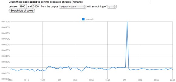
Yep, that’s odd. My initial thought was the overwhelming power of the movie Love Story, but that came out 1970, not 1972.
I’m actually not certain what kind of error this is — if it’s an error at all. (Some crazy-looking early 18c spikes in the names of colors turn out to be Isaac Newton’s Opticks.) But this only appears in the fiction corpus and in the general English corpus; it disappears in American English and British English (which were constructed separately and are not simply subsets of English). Perhaps a short-lived series of romance novels with “romantic” in the running header at the top of every page? But I’ve browsed Google Books for 1972 and haven’t found the culprit yet. Maybe this is an ill-advised Easter egg left by someone who got engaged then.
Now, I have to say that I’ve looked at hundreds and hundreds of ngrams, and this is the only case where I’ve stumbled on something flatly inexplicable. Clearly you have to have your wits about you when you’re working with this dataset; it’s still a construction site. It helps to write “case-sensitive” on the back of your hand, to keep smoothing set relatively low, to check different corpora against each other, to browse examples — and it’s wise to cross-check the whole Google dataset against another archive where possible. But this is the sort of routine skepticism we should always be applying to scholarly hypotheses, whether they’re based on three texts or on three million.
I’ve written several posts now on the way related terms (especially simple physical adjectives) tend to parallel each other in the Google dataset. The names of primary colors rise and fall together. So do “hot” and “cold,” “wet” and “dry,” “thin” and “thick,” “clean” and “dirty,” and the names of the seasons.
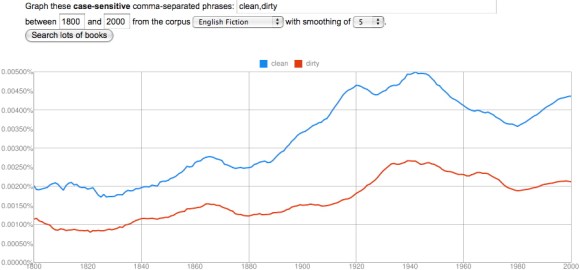
These correlations tend to be strongest in the fiction corpus, but most of them hold in other corpora as well. Moreover, all the terms I just mentioned seem to have a minimum value in the early nineteenth century (around 1820) and a maximum around 1940.
Since I’ve listed a lot of binary oppositions, and playfully channeled Lévi-Strauss at the end of an earlier post, it may be time for me to offer a few disclaimers.
The title of the article published in Science was “Quantitative Analysis of Culture Using Millions of Digitized Books.” But I’m afraid I agree with Matthew Jockers, among others, that in this context the word “culture” is unhelpful. To be fair to the “culturomics” team, it’s an unhelpfully vague word in most other contexts too. Writers often invoke “culture” when they need to connect phenomena without an evident causal connection. The New York Times wedding pages may seem to have nothing to do with Facebook. But all I have to do is characterize them as coordinate expressions of a single “culture of narcissism” and — ta da!
Some of the blame for this habit of argument may rest with structural anthropologists who mapped different kinds of behavior onto each other (kinship relations, language, myth), and characterized them as expressions of the same underlying cultural oppositions. So when I start enumerating oppositions, I should stress that I don’t think the Google dataset proves a structuralist theory of culture, or that we have to assume one in order to use it.
I want to suggest that changes in diction are meaningful phenomena in their own right, and that the task of interpreting them is essentially descriptive. We don’t have to read diction as a symptom of something more abstract like culture. Of course, to say that this is a descriptive task is not to deny that it involves interpretation. Patterns don’t foreground themselves.
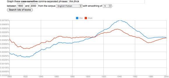
There’s interpretation involved in pairing “thick” and “thin,” just as there is whenever we highlight a pattern in a literary work. But we’re describing a pattern perceptible in the history of diction, not speculating about a hidden cultural agency.
To explain these patterns causally, they may need to be broken into smaller pieces. It’s possible, for instance, that the commonest concrete adjectives became less frequent in the early nineteenth century because they got partly displaced by Latinate near-synonyms, but became infrequent in the late twentieth century for a completely different reason — say, because adjectives in general became less common in prose. (I’m just speculating here.) Genres will also need to be distinguished. It seems likely that concrete adjectives peak around 1940 partly because modernist novels explore the hot, wet phenomenology of life, and partly because pulpy sci-fi stories describe the hot, wet jungles of Venus.
The relative contributions of different genres will need to be disentangled before we really understand what happened, and Google unfortunately is not going to do much to help us there.
All this is to say that I’m not offering an explanation when I mention structuralism. I certainly don’t mean to invoke “culture” as an explanation for these patterns. It will be far more interesting to understand them, eventually, as consequences of specific generic and stylistic shifts.
I mention structuralism only as a (very loose!) metaphor for one way of extracting literary significance from the history of diction. Right now a lot of humanists have the impression that this sort of interpretation would have to rely on sympathetic magic: the fact that the word “sentimental” peaked around 1930 would only interest us if we could assume that this somehow made the Thirties the most sentimental decade of all time. (Kirstin Wilcox pointed me to the history of “sentimental,” btw.)
Focusing on sets of antonyms has the advantage of ruling out this sort of sympathetic magic. The world can’t have become at once thinner and thicker, wetter and drier, in the early 20th century. When both parts of an opposition change in correlated ways, the explanation required is clearly stylistic. To put this another way, wet/dry and thin/thick are connected not by a mysterious black box called “culture” but by the patterns of selection writers had to learn in order to reproduce a historically specific style.
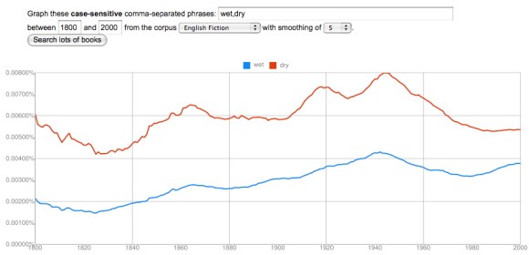
In my last post, I argued that groups of related terms that express basic sensory oppositions (wet/dry, hot/cold, red/green/blue/yellow) have a tendency to correlate strongly with each other in the Google dataset. When “wet” goes up in frequency, “dry” tends to go up as well, as if the whole sensory category were somehow becoming more prominent in writing. Primary colors rise and fall as a group as well.
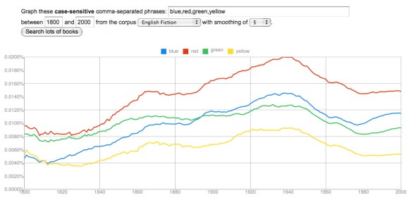
In that post I focused on a group of categories (temperature, color, and wetness) that all seem to become more prominent from 1820 to 1940, and then start to decline. The pattern was so consistent that you might start to wonder whether it’s an artefact of some flaw in the data. Does every adjective go up from 1820 to 1940? Not at all. A lot of them (say, “melancholy”) peak roughly where the ones I’ve been graphing hit a minimum. And it’s possible to find many paired oppositions that correlate like hot/cold or wet/dry, but peak at a different point.
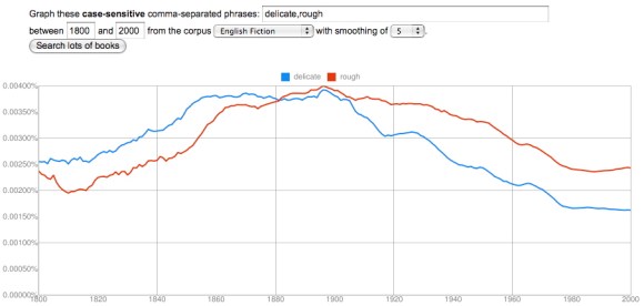
“Delicate” and “rough” correlate loosely (with an interesting lag), but peak much earlier than words for temperature or color, somewhere between 1880 and 1900. Now, it’s fair to question whether “delicate” and “rough” are actually antonyms. Perhaps the opposite of “rough” is actually “smooth”? As we get away from the simplest sensory categories there’s going to be more ambiguity than there was with “wet” and “dry,” and the neat structural parallels I traced in my previous post are going to be harder to find. I think it’s possible, however, that we’ll be able to discover some interesting patterns simply by paying attention to the things that do in practice correlate with each other at different times. The history of diction seems to be characterized by a sequence of long “waves” where different conceptual categories gradually rise to prominence, and then decline.
I should credit mmwm at the blog Beyond Rivalry for the clue that led to my next observation, which is that it’s not just certain sensory adjectives (like hot/cold/cool/warm) that rise to prominence from 1820 to 1940, but also a few nouns loosely related to temperature, like the seasons.
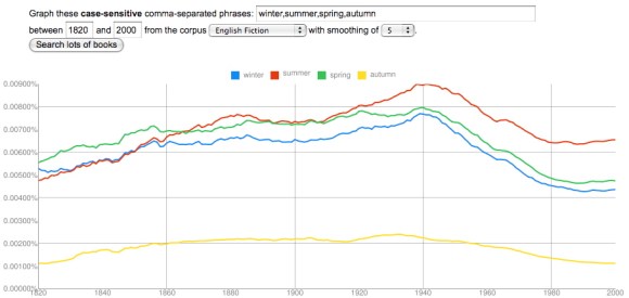
I’ve started this graph at 1820 rather than 2000, because the long s/f substitution otherwise creates noise at the very beginning. And I’ve chosen “autumn” rather than “fall” to avoid interference from the verb. But the pattern here is very similar to the pattern I described in my last post — there’s a low around 1820 and a high around 1940. (Looking at the data for fummer and fpring, I suspect that the frequency of all four seasons does increase as you go back before 1820.)
As I factor in some of this evidence, I’m no longer sure it’s adequate to characterize this trend generally as an increase in “concreteness” or “sensory vividness” — although that might be how Ernest Hemingway and D. H. Lawrence themselves would have imagined it. Instead, it may be necessary to describe particular categories that became more prominent in the early 20c (maybe temperature? color?) while others (perhaps delicacy/roughness?) began to decline. Needless to say, this is all extremely tentative; I don’t specialize in modernism, so I’m not going to try to explain what actually happened in the early 20c. We need more context to be confident that these patterns have significance, and I’ll leave the task of explaining their significance to people who know the literature more intimately. I’m just drawing attention to a few interesting patterns, which I hope might provoke speculation.
Finally, I should note that all of the changes I’ve graphed here, and in the last post, were based on the English fiction dataset. Some of these correlations are a little less striking in the main English dataset (although some are also more striking). I’m restricting myself to fiction right now to avoid cherry-picking the prettiest graphs.
The rise of a sensory style?
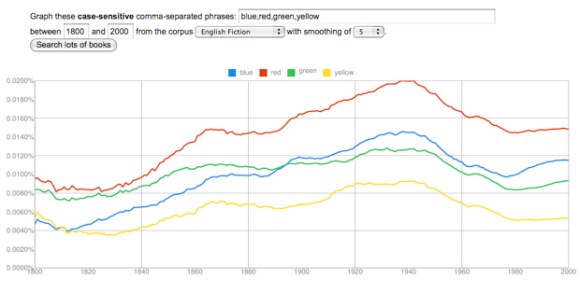
I ended my last post, on colors, by speculating that the best explanation for the rise of color vocabulary from 1820 to 1940 might simply be “a growing insistence on concrete and vivid sensory detail.” Here’s the graph once again to illustrate the shape of the trend.
It occurred to me that one might try to confirm this explanation by seeing what happened to other words that describe fairly basic sensory categories. Would words like “hot” and “cold” change in strongly correlated ways, as the names of primary colors did? And if so, would they increase in frequency across the same period from 1820 to 1940?
The results were interesting.
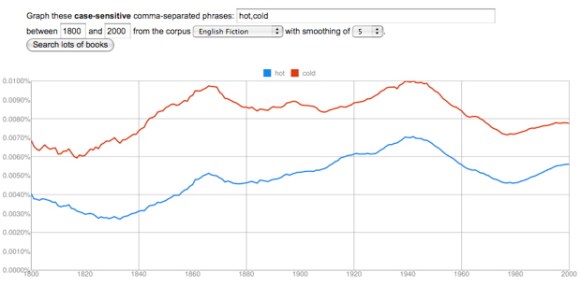
“Hot” and “cold” track each other closely. There is indeed a low around 1820 and a peak around 1940. “Cold” increases by about 60%, “hot” by more than 100%.
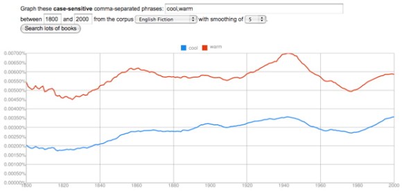
“Warm” and “cool” are also strongly correlated, increasing by more than 50%, with a low around 1820 and a high around 1940 — although “cool” doesn’t decline much from its high, probably because the word acquires an important new meaning related to style.
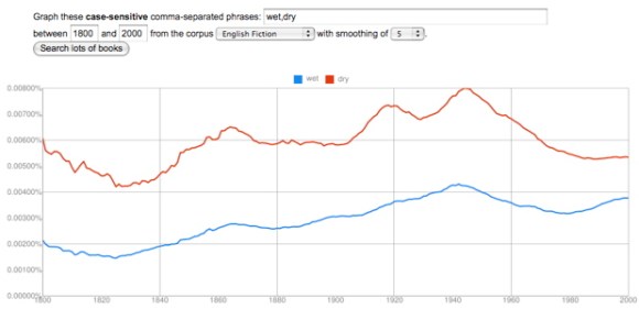
“Wet” and “dry” correlate strongly, and they both double in frequency. Once again, a low around 1820 and a peak around 1940, at which point the trend reverses.
There’s a lot of room for further investigation here. I think I glimpse a loosely similar pattern in words for texture (hard/soft and maybe rough/smooth), but it’s not clear whether the same pattern will hold true for the senses of smell, hearing, or taste.
More crucially, I have absolutely no idea why these curves head up in 1820 and reverse direction in 1940. To answer that question we would need to think harder about the way these kinds of adjectives actually function in specific works of fiction. But it’s beginning to seem likely that the pattern I noticed in color vocabulary is indeed part of a broader trend toward a heightened emphasis on basic sensory adjectives — at least in English fiction. I’m not sure that we literary critics have an adequate name for this yet. “Realism” and “naturalism” can only describe parts of a trend that extends from 1820 to 1940.
More generally, I feel like I’m learning that the words describing different poles or aspects of a fundamental opposition often move up or down as a unit. The whole semantic distinction seems to become more prominent or less so. This doesn’t happen in every case, but it happens too often to be accidental. Somewhere, Claude Lévi-Strauss can feel pretty pleased with himself.
