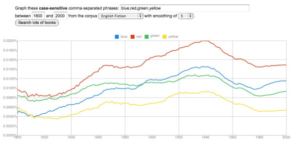
In my last post, I argued that groups of related terms that express basic sensory oppositions (wet/dry, hot/cold, red/green/blue/yellow) have a tendency to correlate strongly with each other in the Google dataset. When “wet” goes up in frequency, “dry” tends to go up as well, as if the whole sensory category were somehow becoming more prominent in writing. Primary colors rise and fall as a group as well.
In that post I focused on a group of categories (temperature, color, and wetness) that all seem to become more prominent from 1820 to 1940, and then start to decline. The pattern was so consistent that you might start to wonder whether it’s an artefact of some flaw in the data. Does every adjective go up from 1820 to 1940? Not at all. A lot of them (say, “melancholy”) peak roughly where the ones I’ve been graphing hit a minimum. And it’s possible to find many paired oppositions that correlate like hot/cold or wet/dry, but peak at a different point.
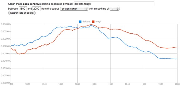
“Delicate” and “rough” correlate loosely (with an interesting lag), but peak much earlier than words for temperature or color, somewhere between 1880 and 1900. Now, it’s fair to question whether “delicate” and “rough” are actually antonyms. Perhaps the opposite of “rough” is actually “smooth”? As we get away from the simplest sensory categories there’s going to be more ambiguity than there was with “wet” and “dry,” and the neat structural parallels I traced in my previous post are going to be harder to find. I think it’s possible, however, that we’ll be able to discover some interesting patterns simply by paying attention to the things that do in practice correlate with each other at different times. The history of diction seems to be characterized by a sequence of long “waves” where different conceptual categories gradually rise to prominence, and then decline.
I should credit mmwm at the blog Beyond Rivalry for the clue that led to my next observation, which is that it’s not just certain sensory adjectives (like hot/cold/cool/warm) that rise to prominence from 1820 to 1940, but also a few nouns loosely related to temperature, like the seasons.
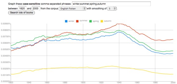
I’ve started this graph at 1820 rather than 2000, because the long s/f substitution otherwise creates noise at the very beginning. And I’ve chosen “autumn” rather than “fall” to avoid interference from the verb. But the pattern here is very similar to the pattern I described in my last post — there’s a low around 1820 and a high around 1940. (Looking at the data for fummer and fpring, I suspect that the frequency of all four seasons does increase as you go back before 1820.)
As I factor in some of this evidence, I’m no longer sure it’s adequate to characterize this trend generally as an increase in “concreteness” or “sensory vividness” — although that might be how Ernest Hemingway and D. H. Lawrence themselves would have imagined it. Instead, it may be necessary to describe particular categories that became more prominent in the early 20c (maybe temperature? color?) while others (perhaps delicacy/roughness?) began to decline. Needless to say, this is all extremely tentative; I don’t specialize in modernism, so I’m not going to try to explain what actually happened in the early 20c. We need more context to be confident that these patterns have significance, and I’ll leave the task of explaining their significance to people who know the literature more intimately. I’m just drawing attention to a few interesting patterns, which I hope might provoke speculation.
Finally, I should note that all of the changes I’ve graphed here, and in the last post, were based on the English fiction dataset. Some of these correlations are a little less striking in the main English dataset (although some are also more striking). I’m restricting myself to fiction right now to avoid cherry-picking the prettiest graphs.
Category: 20c
The rise of a sensory style?
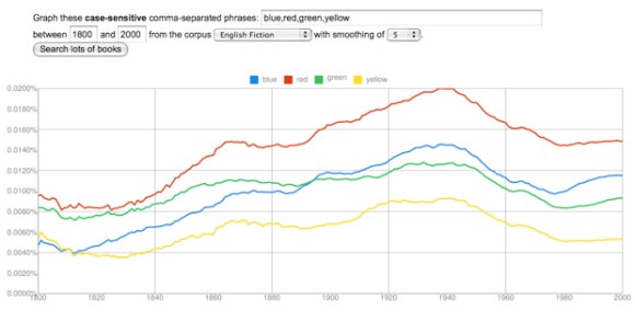
I ended my last post, on colors, by speculating that the best explanation for the rise of color vocabulary from 1820 to 1940 might simply be “a growing insistence on concrete and vivid sensory detail.” Here’s the graph once again to illustrate the shape of the trend.
It occurred to me that one might try to confirm this explanation by seeing what happened to other words that describe fairly basic sensory categories. Would words like “hot” and “cold” change in strongly correlated ways, as the names of primary colors did? And if so, would they increase in frequency across the same period from 1820 to 1940?
The results were interesting.
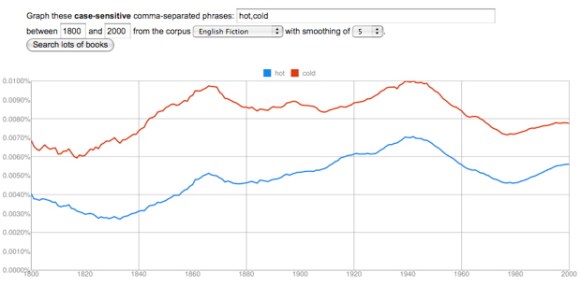
“Hot” and “cold” track each other closely. There is indeed a low around 1820 and a peak around 1940. “Cold” increases by about 60%, “hot” by more than 100%.
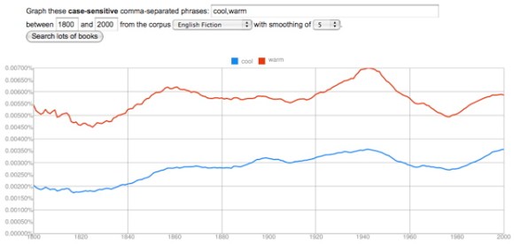
“Warm” and “cool” are also strongly correlated, increasing by more than 50%, with a low around 1820 and a high around 1940 — although “cool” doesn’t decline much from its high, probably because the word acquires an important new meaning related to style.
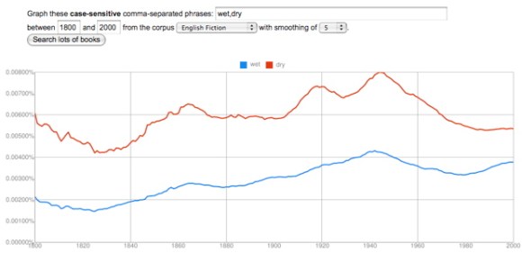
“Wet” and “dry” correlate strongly, and they both double in frequency. Once again, a low around 1820 and a peak around 1940, at which point the trend reverses.
There’s a lot of room for further investigation here. I think I glimpse a loosely similar pattern in words for texture (hard/soft and maybe rough/smooth), but it’s not clear whether the same pattern will hold true for the senses of smell, hearing, or taste.
More crucially, I have absolutely no idea why these curves head up in 1820 and reverse direction in 1940. To answer that question we would need to think harder about the way these kinds of adjectives actually function in specific works of fiction. But it’s beginning to seem likely that the pattern I noticed in color vocabulary is indeed part of a broader trend toward a heightened emphasis on basic sensory adjectives — at least in English fiction. I’m not sure that we literary critics have an adequate name for this yet. “Realism” and “naturalism” can only describe parts of a trend that extends from 1820 to 1940.
More generally, I feel like I’m learning that the words describing different poles or aspects of a fundamental opposition often move up or down as a unit. The whole semantic distinction seems to become more prominent or less so. This doesn’t happen in every case, but it happens too often to be accidental. Somewhere, Claude Lévi-Strauss can feel pretty pleased with himself.
It’s tempting to use the ngram viewer to stage semantic contrasts (efficiency vs. pleasure). It can be more useful to explore cases of semantic replacement (liberty vs. freedom). But a third category of comparison, perhaps even more interesting, involves groups of words that parallel each other quite closely as the whole group increases or decreases in prominence.
One example that is conveniently easy to visualize involves colors.
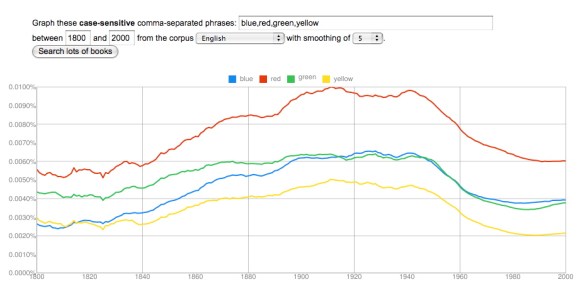
The trajectories of primary colors parallel each other very closely. They increase in frequency through the nineteenth century, peak in a period between 1900 and 1945, and then decline to a low around 1985, with some signs of recovery. (The recovery is more marked after 2000, but that data may not be reliable yet.) Blue increases most, by a factor of almost three, and green the least, by about 50%. Red and yellow roughly double in frequency.
Perhaps red increases because of red-baiting, and blue increases because jazz singers start to use it metaphorically? Perhaps. But the big picture here is that the relative prominence of different colors remains fairly stable (red being always most prominent), while they increase and decline significantly as a group. This is a bit surprising. Color seems like a basic dimension of human experience, and you wouldn’t expect its importance to fluctuate. (If you graph the numbers one, two, three, for instance, you get fairly flat lines all the way across.)
What about technological change? Color photography is really too late to be useful. Maybe synthetic dyes? They start to arrive on the scene in the 1860s, which is also a little late, since the curves really head up around 1840, but it’s conceivable that a consumer culture with a broader range of artefacts brightly differentiated by color might play a role here. If you graph British usage, there’s even an initial peak in the 1860s and 70s that looks plausibly related to the advent of synthetic dye.
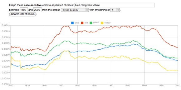
On the other hand, if this is a technological change, it’s a little surprising that it looks so different in different national traditions. (The French and German corpora may not be reliable yet, but at this point their colors behave altogether differently.) Moreover, a hypothesis about synthetic dyes wouldn’t do much to explain the equally significant decline from the 1950s to the 1980s. Maybe the problem is that we’re only looking at primary colors. Perhaps in the twentieth century a broader range of words for secondary colors proliferated, and subtracted from the frequency of words like red and green?
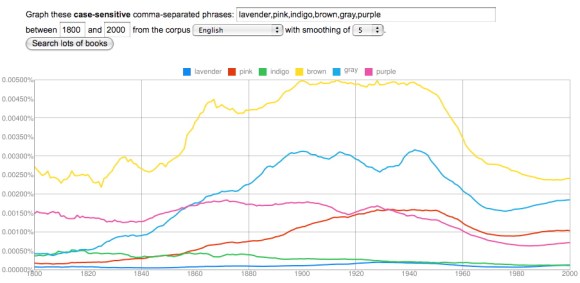
This is a hard hypothesis to test, because there are a lot of different words for color, and you’d need to explore perhaps a hundred before you had a firm answer. But at first glance, it doesn’t seem very helpful, because a lot of words for minor colors exhibit a pattern that closely resembles primary colors. Brown, gray, purple, and pink — the leaders in the graph above — all decline from 1950 to 1980. Even black and white (not graphed here) don’t help very much; they display a similar pattern of increase beginning around 1840 and decrease beginning around 1940, until the 1960s, when the racial meanings of the terms begin to clearly dominate other kinds of variation.
At the moment, I think we’re simply looking at a broad transformation of descriptive style that involves a growing insistence on concrete and vivid sensory detail. One word for this insistence might be “realism.” We ordinarily apply that word to fiction, of course, and it’s worth noting that the increase in color vocabulary does seem to begin slightly earlier in the corpus of fiction — as early perhaps as the 1820s.

But “realism,” “naturalism,” “imagism,” and so on are probably not adequate words for a transformation of diction that covers many different genres and proceeds for more than a century. (It proceeds fairly steadily, although I would really like to understand that plateau from 1860 to 1890.) More work needs to be done to understand this. But the example of color vocabulary already hints, I think, that broadly diachronic studies of diction may turn up literary phenomena that don’t fit easily into literary scholars’ existing grid of periods and genres. We may need to define a few new concepts.
