
 Force-directed graphs are tricky. At their best, the perspective they offer can be very helpful; data points cluster into formations that feel intuitive and look approachable. At their worst, though, they can be too cluttered, and the algorithms that make everything fall into place can deceive as much as they clarify.
But there’s still a good chance that, despite the problems that come along with making a network model of anything (and the problems introduced by making network models of texts), they can still be helpful for interpreting topic models. Visualizations aren’t exactly analysis, so what I share below is meant to raise more questions than answers. We also tried to represent as many aspects of the data as possible without breaking (or breaking only a little) the readability of the visualizations. There were some very unsuccessful tries before we arrived at what is below.
A Few Remarks on Method
As part of our work together, Ted has run some topic models on his 19th century literature dataset and computed the correlation of each topic to other topics. We decided to try this out to see topic distribution among genres, and to get a feel for how topics clustered with one another. Which documents belong to what topic aren’t important for now, although in time I’d like to have the nodes link to the text of the documents. Ted has also calculated the predominant genre to which each topic belongs. And, after building a network model where topic correlation equals edge value, I’ve run the Girvan-Newman algorithm to assess how the topics would cluster by their associations with other topics (I like this approach to grouping better than others for examinations of overall graph structure like this one, as we’re not as interested in individual cliques or clusters). What we get then, is two different ways to categorize the topic: on the one hand we have the genre the topic appears in most (with the genres being assigned to individual documents by a human expert), and on the other we see groupings based on co-occurence with other topics.
The visualizations shown here are all built using d3.js, the excellent open source javascript library created by Mike Bostock. Each of the graphs are force-directed: all nodes possess a negative charge and repel from one another. All links bond to these nodes and hold them together. Many force-directed models set their links to behave like springs and contract to the shortest possible distance between nodes, but these graphs below don’t exactly use Hooke’s law to calculate bond length. Instead, they aim for a specific bond length (in this case, 20 pixels) and draw a link as close as possible to that length given the charges acting on it.
I wanted physical proximity of nodes to one another to means something, so the graphs below have variable bond strengths, which means that depending on the value of the bond (which in these graphs is a function of the correlation of a topic with the topic to which it is linked), it will resist or cooperate with being “stretched” (or really, drawn at a longer distance as other stronger bonds take precedence in being drawn closer to the ideal length of 20px). This has implications for how to interpret distance between nodes in these images. The X and Y axes have no set value, so distance does not equal correlation. This is more of a Newtonian than Euclidean space, which means that a short link can indicate a strong bond between nodes, but strong bonds can also be stretched by opposing forces (like other bonds) exerted on nodes at either end of the bond. So distance between nodes can be significant, but only once considered in context of the whole model and its constitutive metaphor of a physical system. Click on the image below for a sample of what we’re talking about:
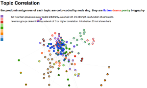
D3 allows this is to be an interactive visual, and mousing over an individual node will reveal the first ten words of the topic it represents. Also, clicking on a node allows for pulling and rearranging the graph. Doing this a few times helps reinforce the idea that distance between nodes is the result of a set of simulated physical properties. The colors assigned to the Newman groups are arbitrary, but there’s a key on the left to help distinguish among similar colors.
Comparing Two Graphs
Network graphs are more useful when you can compare them to other network graphs. We split the dataset into two halves, and Ted generated 100 topics for each half of the century. We used slightly different genre labels, but we calculated Newman groups again to produce the two graphs below (again, click through to interact with the graph):

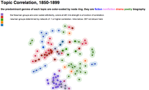
Like the first graph, Newman color assignments are arbitrary; what’s purple in the first 50 years of topics has nothing to do with what’s purple in the next 50 years of topics. I’ve modified these graphs in two key ways to help with reading them. Firstly, bond thickness now variable, and it is a function of bond strength (bond strength derived from correlation). This helps assess if a bond is longer because it’s being stretched or because it’s weak, or both. Secondly, I’ve added node “halos” to emphasize the degree to which the nodes cluster, as well as highlight the Newman groups.
Here’s an alternative graph that colors the nodes by genre instead of Newman group, leaving only the halo to represent group affiliation:

I won’t pretend that any of these are easy to read immediately, but one of our experiments in this was to try to represent as many dimensions as possible to create an exploratory framework for a topic model. Halo and node diameter are set, but the two elements on the visualization are independent and could represent topic size, degree of genre predominance in a topic, etc.
My hope is that these visualizations can be insightful and might help us work through the benefits and disadvantages of force-directed layouts for visualizing topic models.
As for interpretation and analysis, here is the part where I punt to domain experts in 19th century literature and history…

8 replies on “Visualizing Topic Models with Force-Directed Graphs”
… and the 19c domain expert is also going to punt on analysis for now, except to observe that I’ve also visualized the second of Michael’s interactive graphs (the 1850-1899 one) in a static form, borrowing his idea of using mouseover to get more information about each node. The next stage is to make it possible to click on topics for more information, and in fact I’m working on that …
A large topic model can be very hard to browse. I’m interested in network graphing less as a mode of analysis than as a way of organizing browsing by giving the reader a visual “path” through the model. What I especially like about Michael’s interactive networks is that you can pick them up, shake them around, and tuck branch A next to branch B. As Michael put it in conversation, this helps dramatize that we’re in “Newtonian space” rather than “Euclidean space”; the Euclidean distance between two nodes is not necessarily meaningful.
There’s going to be another blog post coming in a couple of weeks (with Andrew Goldstone) on topic-modeling PMLA. In that case I’ll have a little more to say about the “domain” side of things — i.e., how we might get specific literary-historical leads from a topic model.
I would also add that Michael’s graphs make very clear something I’ve observed generally in topic-modeling large collections that contain both fiction and nonfiction — which is that “literary” topics clump together much more tightly than nonfiction topics.
My take on this is simply that nonfiction books tend to have a more differentiated range of subjects, whereas there’s a lot of vocabulary that novels have in common simply qua novels. Drama and poetry also tend to clump, though perhaps not quite as tightly:
http://isda.ncsa.illinois.edu/~mpsimeon/topics/FDE/indexvml.html
Wow! Ted, Michael. I really like this work. Correlations are hard to visualize, so force-directed graphs were a natural choice. But you guys took it to the next level when you color-coded the nodes by genre. The first two graphs were hard to interpret the way that force-directed graphs can often be, but the genre-coded one I understood the instant I saw at it. The topics were clearly “clumping up” by genre, and the force-directed layout combined with the colors made that immediately obvious. Moreover, I can’t think of a tool that would have revealed that kind of correlation instantly. So overall, a really great combination of data and visualization.
It was the first time I’ve looked at a force-directed graph and thought, hey, this is the right tool for the job ( I’d never felt that before, even with my own force-directed data vis projects, and I had all but given up on them). You’ve inspired me to re-think how I approach them.
Now I’m just speculating, but I wonder if a third dimension of information (such as time, author gender, country of origin) might somehow be introduced by making the spatial location of nodes meaningful. I keep thinking of this old “Semantic Substrates” graph visualization technique from UMD’s Human-Computer Interaction lab. They were working on large, dense, interconnected legal case networks: http://www.cs.umd.edu/hcil/nvss/
(there was also a shorter paper: http://igva2012.wikispaces.asu.edu/file/view/Shneiderman_Aris_2006_NW_VIZ_Sem.pdf)
What would happen if you used this “semantic substrates” technique to visualize the inverse of this data? I mean, visualizing links between works of literature based on shared topics. This summer, I saw a force-directed graph from Matt Jockers, who’d done it as part of his 500 themes topic modeling project, with (I think) exactly the same data that you have. But his graphs were very huge and dense. I didn’t give it another thought because I had given up on force-directed graphs at the time. Now, I think some graph visualization “theory” about spatial layouts and color codes might find a great application with your work.
Thanks, Aditi. Michael deserves credit for making me reconsider force-directed graphs.
That “Semantic Substrates” example is intriguing. I’ll have to think about how something like that might be used.
The data here is actually different from Matt’s. Same century, but Matt’s collection is primarily fiction, whereas ours is spread out across several different genres.
For some purposes that’s useful, but I’m finding that it’s actually a bit difficult to interpret topic models that cover multiple genres. The differences between genres can be so strong that they swamp everything else.
[…] Michael Simeone, Visualizing Topic Models with Force-Directed Graphs […]
[…] Graph of Topic Correlation Network Layout, 1800-1849, from Michael Simeone, “Visualizing Topic Models with Force-Directed Graphs,” generated with tool at […]
prada 偽物
[…] cet exemple, les liens entre les termes correspondent à leur probabilité d’association dans un ensemble de termes lemmatisés, où […]